Gold
The Historical Returns by Asset Class Over the Last Decade
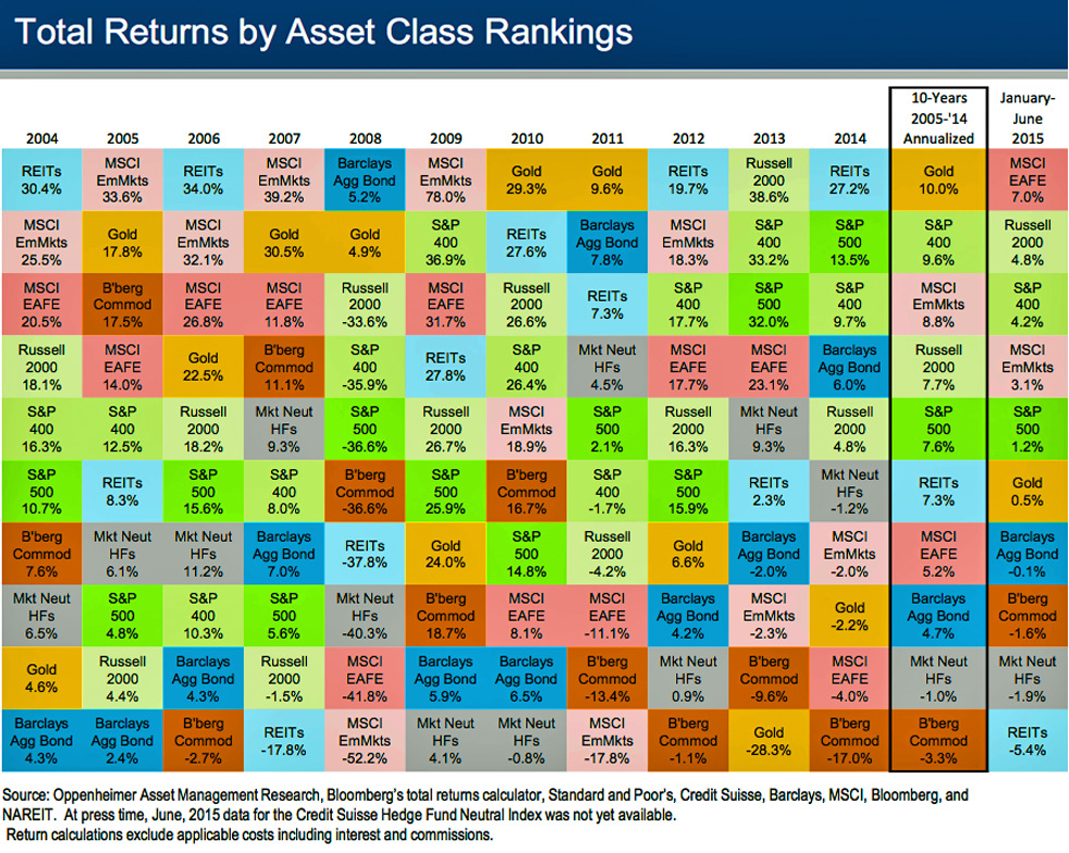
The Historical Returns by Asset Class Over the Last Decade
Recently, we’ve looked at different crisis events through history, and the returns by asset classes for each period of time.
Today’s chart is more general and breaks down performance over the last decade. It’s sorted by different baskets of assets such as bonds, commodities, gold, stocks, real estate, and emerging markets. Note that the chart uses indices that serve as a proxy for specific asset classes. For example, the Bloomberg Commodities Index acts as a broad representation of the performance of all commodities in different sectors. Scroll to the bottom of this post to see a legend that gives a description for each item on the chart.
There are a few lessons worth noting here. First, despite gold having a difficult last few years, it is actually the best performing asset class over the last decade, returning 10.0% annualized. Gold was also the #1 or #2 performer for five of seven years straight between 2005 and 2011. It just goes to show the intensity of bull and bear markets in the metal, and reinforces the fact that it takes multiple years to cool down that momentum before the next upswing may start.
Next, the importance of diversification is almost self-evident. Stocks in emerging markets, for example, just crush other assets in the good years. In the bad years, they are the worst performing assets on the chart. Imagine having a portfolio of just stocks in emerging markets, and you have a financial roller coaster that would make any investor queasy.
Lastly, outside of highly-leveraged Wall Street traders, most investors consider bonds to be quite boring. In the last decade, returns of the Barclays Aggregate Bond Index have ranged between -2.0% and 7.8%. Bonds are typically considered a relatively consistent and less volatile asset class, which help create a baseline for a portfolio. However, on this chart, bonds are all over the map because it is the other investments that are swinging with volatility. In the 2008 crisis, bonds were actually the best performing class with a 5.2% return.
To be fair, there is much speculation of a bond bubble lately, so bonds may not be boring for long.
Returns by asset class chart legend:
- REITs: Real estate investment trusts, a proxy for property and real estate.
- MSCI EmMkts: Index tracking 838 companies in 23 emerging markets countries.
- MSCI EAFE: Measures performance in Europe, Australasia, and Far East. Essentially a barometer for equity performance outside of the US and Canada.
- Russell 2000: Index tracking 2000 smallcap equities in the United States.
- S&P 400: The S&P Midcap 400 is a benchmark for midcap companies in the United States.
- S&P 500: The S&P 500, one of the most commonly followed indices, covers a diverse set of 500 large companies with common stock on the NYSE and NASDAQ exchanges in the US.
- B’berg Commod: A broadly diversified commodity index tracking the futures of 22 different commodity markets in seven sectors.
- Mkt Neut HFs: Market-neutral hedge funds seek to avoid forms of market risk by hedging.
- Gold: The price of gold.
- Barclays Agg Bond: Broad base index includes treasury securities, government agency bonds, mortgage-backed bonds, corporate bonds, and a small amount of foreign bonds traded in the US.
Original graphic by: Business Insider


Mining
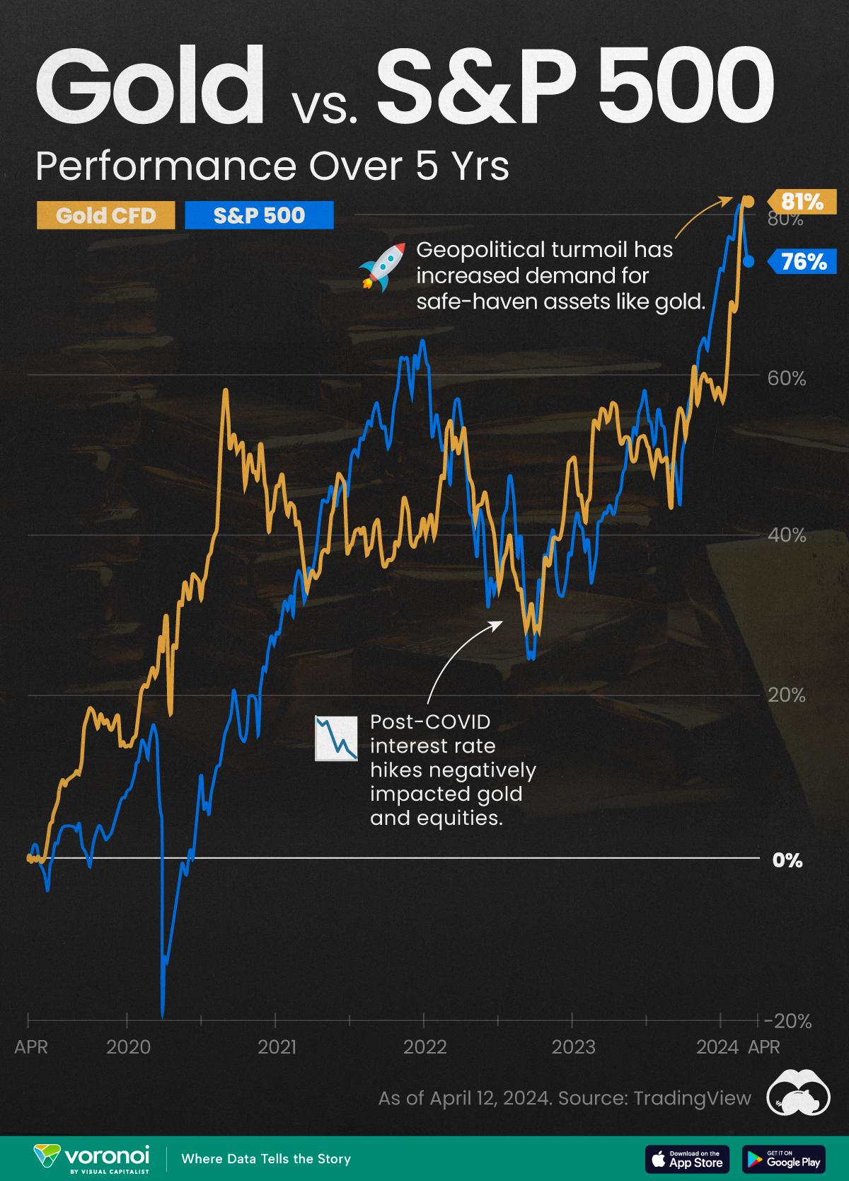
Gold vs. S&P 500: Which Has Grown More Over Five Years?
The price of gold has set record highs in 2024, but how has this precious metal performed relative to the S&P 500?
Gold vs. S&P 500: Which Has Grown More Over Five Years?
This was originally posted on our Voronoi app. Download the app for free on Apple or Android and discover incredible data-driven charts from a variety of trusted sources.
Gold is considered a unique asset due to its enduring value, historical significance, and application in various technologies like computers, spacecraft, and communications equipment.
Commonly regarded as a “safe haven asset”, gold is something investors typically buy to protect themselves during periods of global uncertainty and economic decline.
It is for this reason that gold has performed rather strongly in recent years, and especially in 2024. Persistent inflation combined with multiple wars has driven up demand for gold, helping it set a new all-time high of over $2,400 per ounce.
To put this into perspective, we visualized the performance of gold alongside the S&P 500. See the table below for performance figures as of April 12, 2024.
| Asset/Index | 1 Yr (%) | 5 Yr (%) |
|---|---|---|
| 🏆 Gold | +16.35 | +81.65 |
| 💼 S&P 500 | +25.21 | +76.22 |
Over the five-year period, gold has climbed an impressive 81.65%, outpacing even the S&P 500.
Get Your Gold at Costco
Perhaps a sign of how high the demand for gold is becoming, wholesale giant Costco is reportedly selling up to $200 million worth of gold bars every month in the United States. The year prior, sales only amounted to $100 million per quarter.
Consumers aren’t the only ones buying gold, either. Central banks around the world have been accumulating gold in very large quantities, likely as a hedge against inflation.
According to the World Gold Council, these institutions bought 1,136 metric tons in 2022, marking the highest level since 1950. Figures for 2023 came in at 1,037 metric tons.
See More Graphics on Gold
If you’re fascinated by gold, be sure to check out more Visual Capitalist content including 200 Years of Global Gold Production, by Country or Ranked: The Largest Gold Reserves by Country.

-

 Money2 weeks ago
Which States Have the Highest Minimum Wage in America?
-

 Misc1 week ago
Airline Incidents: How Do Boeing and Airbus Compare?
-

 Environment1 week ago
Top Countries By Forest Growth Since 2001
-

 United States2 weeks ago
Where U.S. Inflation Hit the Hardest in March 2024
-

 Demographics2 weeks ago
The Smallest Gender Wage Gaps in OECD Countries
-

 Markets2 weeks ago
The Top 10 States by Real GDP Growth in 2023
-

 Countries2 weeks ago
Population Projections: The World’s 6 Largest Countries in 2075
-

 Travel2 weeks ago
Ranked: The World’s Top Flight Routes, by Revenue