Markets
Most Banks Are Screwing Up On Their Stock Picks
Let’s say that a bank such as Goldman Sachs publishes a recommendation to “Buy Stock X”.
It’s hard to ignore a bet by a powerful investment bank such as Goldman. We are mere mortals in the pecking order, and they are supposed to be the all-knowing smart money from Wall Street.
Do we buy the stock, or is it simply wiser to pass?
Bank Performance Overall
The folks at InterTrader have done considerable legwork to dive deep into the data on investment bank recommendations made in 2015. They looked at every bet made by the 16 top banks throughout the year to assess both potential returns and accuracy.
The results are pretty underwhelming.
If you bought every stock recommended and held until the end of the year, here’s what your performance would look like:
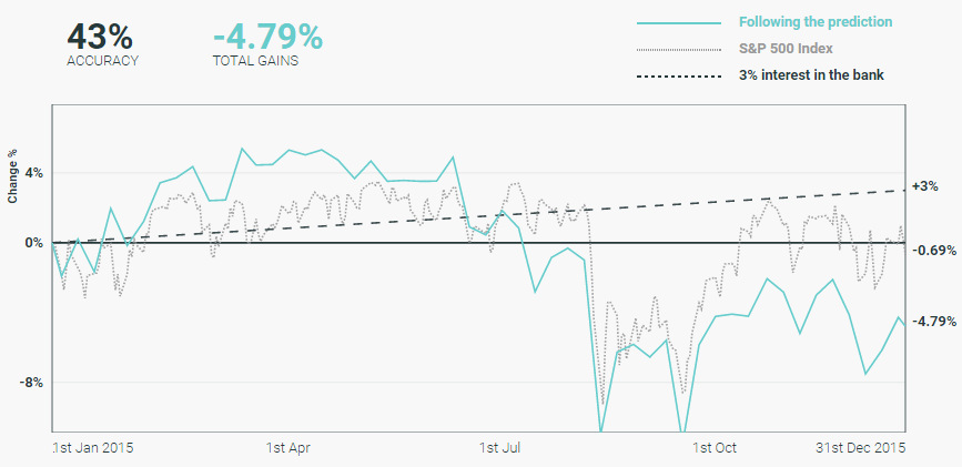
Overall, when holding the stock picks for the year, banks were only 43% accurate with their predictions.
That’s right – flipping a coin would have been potentially more effective than buying bank stock picks, which ended up down -4.79% on the year. The S&P 500 finished down only -0.69%, but simply just making any interest in a savings account would have been more effective as well.
A Closer Look at Individual Banks
While banks as a whole struggled with picks in 2015, it’s also important to look at banks on a more micro level to see how they performed.
Here’s a look at the recommendations by Deutsche Bank, and how they did:
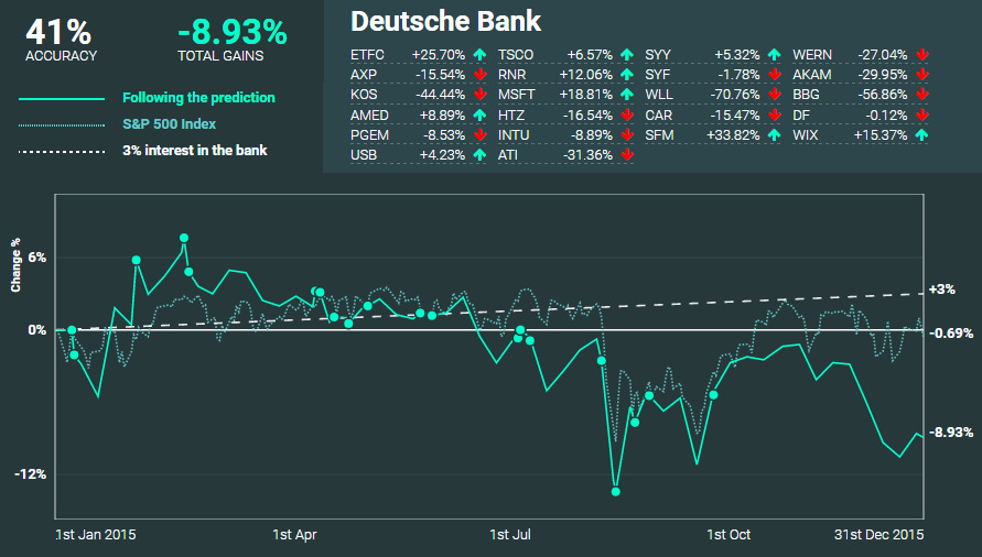
Deutsche Bank nailed 41% of their predictions, and had a -8.93% return if picks were held throughout the year.
As you can see, some of their picks such as Microsoft and Wix.com gained double digits. On the other hand, recommendations such as Whiting Petroleum got absolutely crushed throughout the year, dropping -70.1%.
Overall, Deutsche Bank’s performance here definitely didn’t do much to help the struggling company get out of its rut.
Which Banks Were Most Accurate?
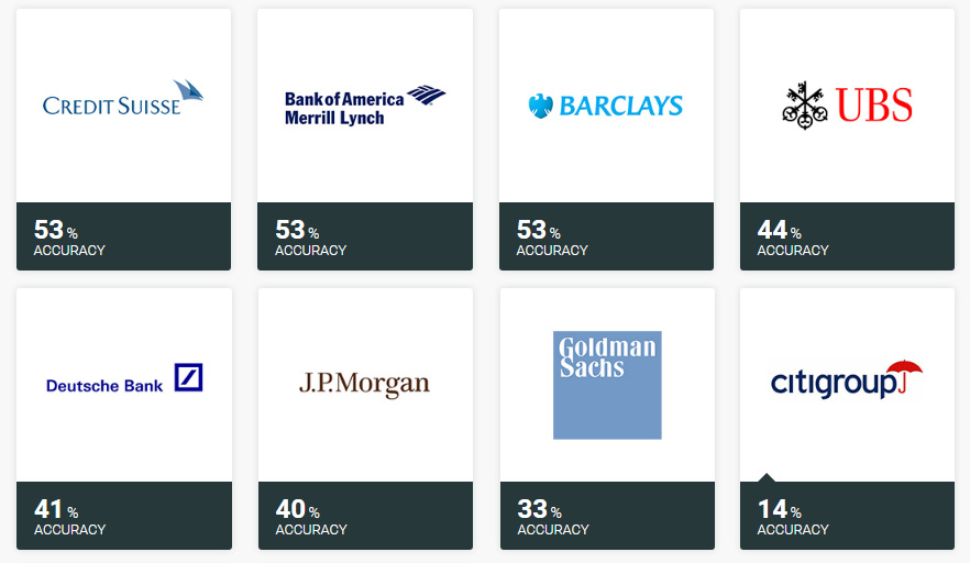
Here are the banks, from best to worst, based on accuracy of their calls:

Nomura, Credit Suisse, BAML, and Barclays all batted above .500 if stocks were held throughout the year, while 10 banks all did worse than a coin flip.
Citigroup had an off year, only nailing 14% of its picks.
Which Banks Had the Best Returns?
Here are the banks, from best to worst, based on the performance of these recommendations:
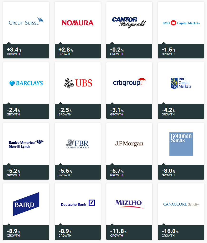
Just two banks, Credit Suisse and Nomura, had positive returns if stocks were held through the year. Meanwhile, Canaccord Genuity’s picks were knocked down -16% over the course of 2015.
An Important Caveat
Throughout the above article, we are showing the results if stock picks were held from when they were made until the end of the year.
However, it is worth noting that the investment banks actually did slightly better if picks were held for shorter durations of time:
| Time | Accuracy | Gains % |
|---|---|---|
| 30 Days | 55% | 0.80% |
| 90 Days | 49% | -1.48% |
| 180 Days | 42% | -3.66% |
| End of Year | 43% | -4.79% |
In other words – if you sold all stock recommendations exactly 30 days after buying, you would have actually made a 0.8% return throughout the year. This is still a lower return than a savings account, but it is an improvement on losing -4.79%!
For a more in-depth dive into the data, we highly recommend checking out InterTrader’s interactive version of the results.


Markets
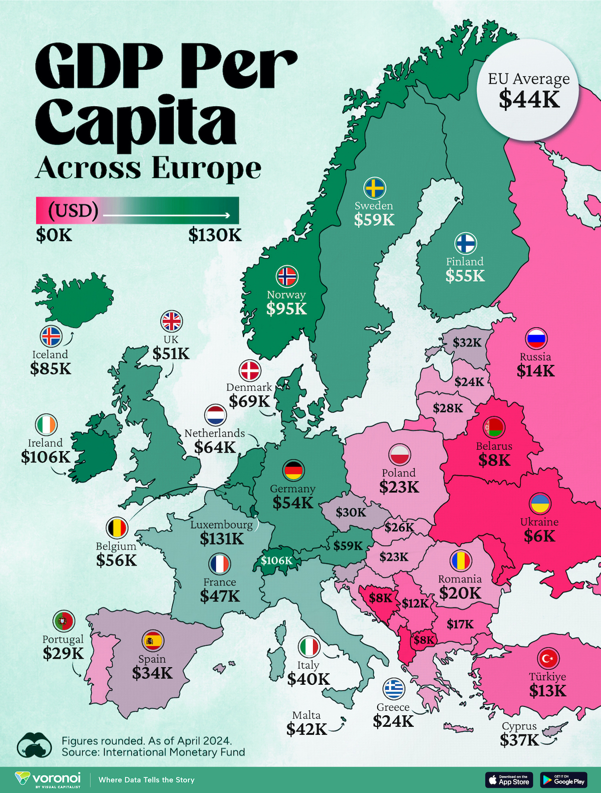
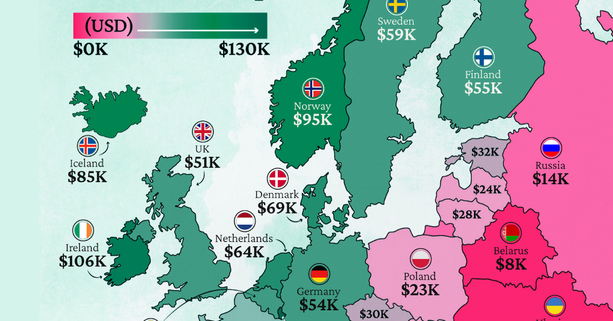
Mapped: Europe’s GDP Per Capita, by Country
Which European economies are richest on a GDP per capita basis? This map shows the results for 44 countries across the continent.
Mapped: Europe’s GDP Per Capita, by Country (2024)
This was originally posted on our Voronoi app. Download the app for free on iOS or Android and discover incredible data-driven charts from a variety of trusted sources.
Europe is home to some of the largest and most sophisticated economies in the world. But how do countries in the region compare with each other on a per capita productivity basis?
In this map, we show Europe’s GDP per capita levels across 44 nations in current U.S. dollars. Data for this visualization and article is sourced from the International Monetary Fund (IMF) via their DataMapper tool, updated April 2024.
Europe’s Richest and Poorest Nations, By GDP Per Capita
Luxembourg, Ireland, and Switzerland, lead the list of Europe’s richest nations by GDP per capita, all above $100,000.
| Rank | Country | GDP Per Capita (2024) |
|---|---|---|
| 1 | 🇱🇺 Luxembourg | $131,380 |
| 2 | 🇮🇪 Ireland | $106,060 |
| 3 | 🇨🇭 Switzerland | $105,670 |
| 4 | 🇳🇴 Norway | $94,660 |
| 5 | 🇮🇸 Iceland | $84,590 |
| 6 | 🇩🇰 Denmark | $68,900 |
| 7 | 🇳🇱 Netherlands | $63,750 |
| 8 | 🇸🇲 San Marino | $59,410 |
| 9 | 🇦🇹 Austria | $59,230 |
| 10 | 🇸🇪 Sweden | $58,530 |
| 11 | 🇧🇪 Belgium | $55,540 |
| 12 | 🇫🇮 Finland | $55,130 |
| 13 | 🇩🇪 Germany | $54,290 |
| 14 | 🇬🇧 UK | $51,070 |
| 15 | 🇫🇷 France | $47,360 |
| 16 | 🇦🇩 Andorra | $44,900 |
| 17 | 🇲🇹 Malta | $41,740 |
| 18 | 🇮🇹 Italy | $39,580 |
| 19 | 🇨🇾 Cyprus | $37,150 |
| 20 | 🇪🇸 Spain | $34,050 |
| 21 | 🇸🇮 Slovenia | $34,030 |
| 22 | 🇪🇪 Estonia | $31,850 |
| 23 | 🇨🇿 Czech Republic | $29,800 |
| 24 | 🇵🇹 Portugal | $28,970 |
| 25 | 🇱🇹 Lithuania | $28,410 |
| 26 | 🇸🇰 Slovakia | $25,930 |
| 27 | 🇱🇻 Latvia | $24,190 |
| 28 | 🇬🇷 Greece | $23,970 |
| 29 | 🇭🇺 Hungary | $23,320 |
| 30 | 🇵🇱 Poland | $23,010 |
| 31 | 🇭🇷 Croatia | $22,970 |
| 32 | 🇷🇴 Romania | $19,530 |
| 33 | 🇧🇬 Bulgaria | $16,940 |
| 34 | 🇷🇺 Russia | $14,390 |
| 35 | 🇹🇷 Türkiye | $12,760 |
| 36 | 🇲🇪 Montenegro | $12,650 |
| 37 | 🇷🇸 Serbia | $12,380 |
| 38 | 🇦🇱 Albania | $8,920 |
| 39 | 🇧🇦 Bosnia & Herzegovina | $8,420 |
| 40 | 🇲🇰 North Macedonia | $7,690 |
| 41 | 🇧🇾 Belarus | $7,560 |
| 42 | 🇲🇩 Moldova | $7,490 |
| 43 | 🇽🇰 Kosovo | $6,390 |
| 44 | 🇺🇦 Ukraine | $5,660 |
| N/A | 🇪🇺 EU Average | $44,200 |
Note: Figures are rounded.
Three Nordic countries (Norway, Iceland, Denmark) also place highly, between $70,000-90,000. Other Nordic peers, Sweden and Finland rank just outside the top 10, between $55,000-60,000.
Meanwhile, Europe’s biggest economies in absolute terms, Germany, UK, and France, rank closer to the middle of the top 20, with GDP per capitas around $50,000.
Finally, at the end of the scale, Eastern Europe as a whole tends to have much lower per capita GDPs. In that group, Ukraine ranks last, at $5,660.
A Closer Look at Ukraine
For a broader comparison, Ukraine’s per capita GDP is similar to Iran ($5,310), El Salvador ($5,540), and Guatemala ($5,680).
According to experts, Ukraine’s economy has historically underperformed to expectations. After the fall of the Berlin Wall, the economy contracted for five straight years. Its transition to a Western, liberalized economic structure was overshadowed by widespread corruption, a limited taxpool, and few revenue sources.
Politically, its transformation from authoritarian regime to civil democracy has proved difficult, especially when it comes to institution building.
Finally, after the 2022 invasion of the country, Ukraine’s GDP contracted by 30% in a single year—the largest loss since independence. Large scale emigration—to the tune of six million refugees—is also playing a role.
Despite these challenges, the country’s economic growth has somewhat stabilized while fighting continues.

-

 Markets7 days ago
The Most Valuable Companies in Major EU Economies
-

 Wealth2 weeks ago
Charted: Which City Has the Most Billionaires in 2024?
-

 Technology2 weeks ago
All of the Grants Given by the U.S. CHIPS Act
-

 Green2 weeks ago
The Carbon Footprint of Major Travel Methods
-

 United States2 weeks ago
Visualizing the Most Common Pets in the U.S.
-

 Culture2 weeks ago
The World’s Top Media Franchises by All-Time Revenue
-

 voronoi1 week ago
Best Visualizations of April on the Voronoi App
-

 Wealth1 week ago
Charted: Which Country Has the Most Billionaires in 2024?