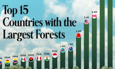

Together, the top five countries with the largest forests account for more than half of the world’s entire forest cover.
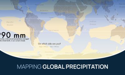

What does the global precipitation map look like if we split it in two, one half with below average rainfall and the other above?
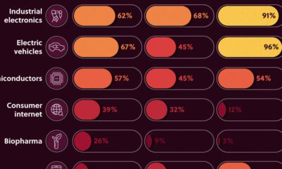

We look at the share of Asian companies in the top 3,000 global firms—measured by market capitalization in 2020—broken down by industry.
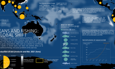

Where do our fish come from? This map charts ocean fishing activity and the amount of fish coming from aquaculture.
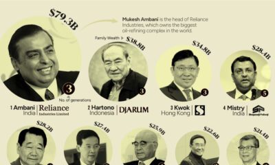

This graphic shows the 15 richest families in Asia. From energy to banking, these dynasties have built fortunes across many sectors.
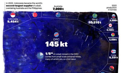

Cobalt, an essential component for certain types of EV batteries, has seen a significant shift in its global production landscape.
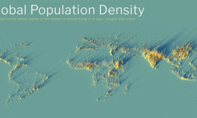

What does population density look like on a global scale? These detailed 3D renders illustrate our biggest urban areas and highlight population trends.
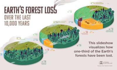

How much has the world’s land use changed over the last 10,000 years, and how have forests been impacted?
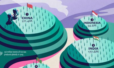

Over half of the world’s population lives on rice as a staple food, but just a few countries dominate global rice production.
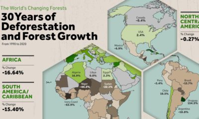

Where are the world's forests still shrinking, and where are they seeing net gains? We map deforestation by country between 1990-2020.


 Creator Program