Demographics
3D Map: The World’s Largest Population Density Centers
Article/Editing:
Click here to view the full version of this graphic
A 3D Look at the Largest Population Density Centers
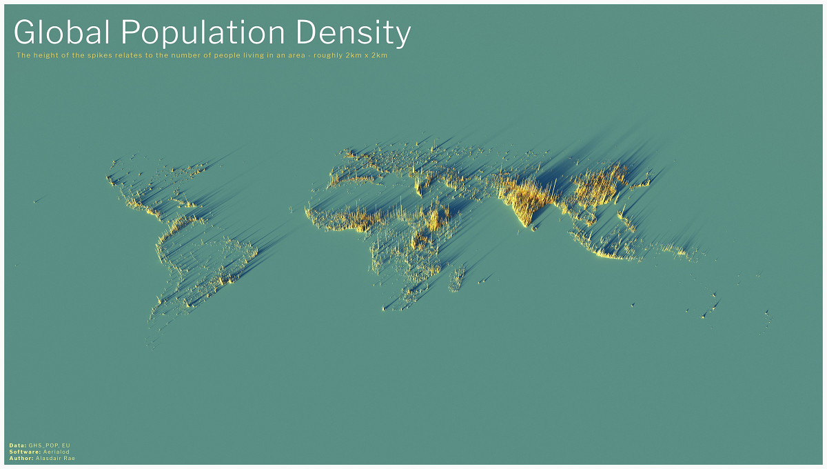
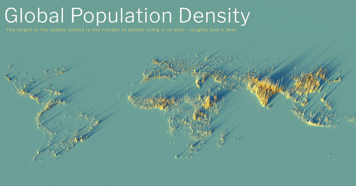
It can be difficult to comprehend the true sizes of megacities, or the global spread of 8 billion people, but this series of population density maps makes the picture abundantly clear.
Created using the EU’s population density data and mapping tool Aerialod by Alasdair Rae, the 3D-rendered maps highlight demographic trends and geographic constraints.
Though they appear topographical and even resemble urban areas, the maps visualize population density in squares. The height of each bar represents the number of people living in that specific square, with the global map displaying 2km x 2km squares and subsequent maps displaying 1km x 1km squares.
Each region and country tells its own demographic story, but the largest population clusters are especially illuminating.
China vs U.S. — Clusters vs Sprawl
Click here to view the high resolution version.
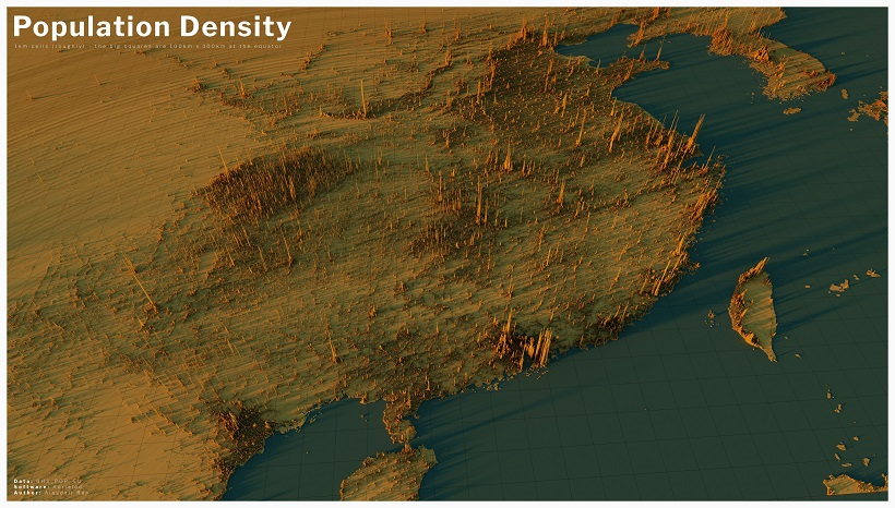
Zooming into the most populated country in the world, China and its surrounding neighbors demonstrate massive clusters of urbanization.
Most people are familiar with the large density centers around Hong Kong, Guangzhou, and Shanghai, but the concentration in central China is surprising. The cities of Chengdu and Chonqing, in the Sichuan Basin, are part of a massive population center.
Interestingly, more than 93% of China’s population lives in the Eastern half of the country. It’s a similar story in neighboring South Korea and Taiwan, where the population is clustered along the west coasts.
Click here to view the high resolution version.
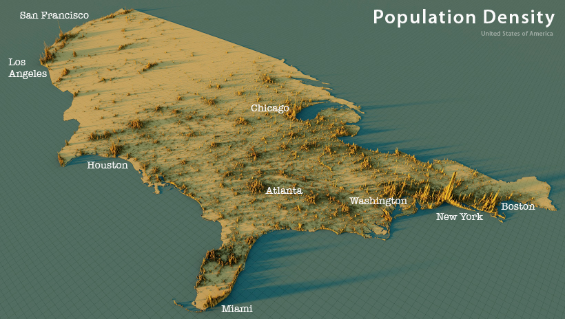
The U.S. also has large population clusters along the coasts, but far more sprawl compared to its Asian counterparts. Though the Boston-Washington corridor is home to over 50 million residents, major centers spread out the population across the South and the Midwest.
Clearly visible are clusters in Florida (and not exclusively focused around Miami like some might believe), Illinois, Georgia, and Texas. The population is sparse in the West as expected, but California’s Los Angeles and Bay Area metros make up for the discrepancy and are just behind New York City’s density spikes in height.
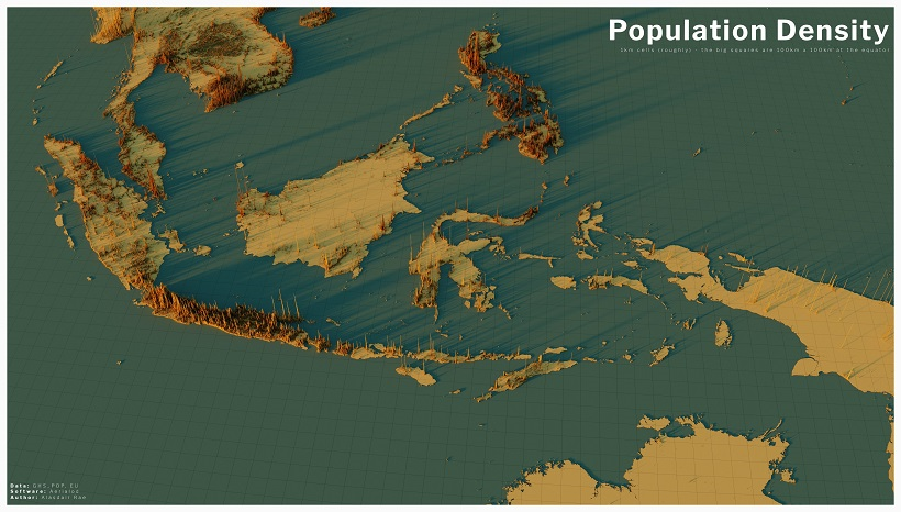
India & Southeast Asia — Massive Density in Tight Areas
Click here to view the high resolution version.
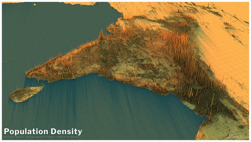
At 1.38 billion people, India’s population is just behind China’s in terms of size. However, this sizable population fits into an area just one-third of China’s total land area, with the above map demonstrating what the same amount of people looks like in a smaller region.
On one hand, you still have clear clusters, such as in Mumbai, New Delhi, Kolkata, and Bangladesh’s Dhaka. On the other, there is a finite amount of room for a massive amount of people, so those density “spikes” are more like density “peaks” with the entire country covered in high density bars.
However, we can still see geographic trends. India’s population is more densely focused in the North before fading into the Himalayas. Bangladesh is equally if not more densely populated, with the exception of the protected Sundarbans mangrove forest along the coast. And Pakistan’s population seen in the distance is clustered along the Indus River.
Click here to view the high resolution version.
Geographic constraints have always been the biggest deciding factor when it comes to population density, and nowhere is this more apparent than Southeast Asia.
Take Indonesia, the fourth largest country by population. Despite spanning across many islands, more than half of the country’s 269 million inhabitants are clustered on the single island of Java. The metros of Jakarta and Surabaya have experienced massive growth, but spreading that growth across oceans to entirely new islands (covered by rainforests) is a tall order.
When the distance is smaller, that cross-water growth is more likely to occur. Nearby in the Philippines, more than 100 million people have densely populated a series of islands no bigger than the state of Arizona.
Indeed, despite being one of the most populated areas in the world, each country in Southeast Asia has had its own growing problems. Some are limited by space (Singapore, Philippines), while others are limited by forests (Thailand, Vietnam).
A World of Different Density Pictures
Though the above maps cover the five most populated countries on Earth, accounting for nearly half of the world’s population, they only show a small part of the global picture.
As the full global density map at the top of the page highlights, the population patterns can accurately illustrate some geographic patterns and constraints, while others need further exploration.
For example, the map clearly gives an outline of Africa and the sparse area that makes up the Sahara Desert. At the same time, landmasses like Australia and New Zealand are almost invisible save for a few clusters along the coast.
To get a closer and more intricate picture of each country’s density map, head to Alasdair Rae’s long thread of rendered maps and start scrolling up to find yours!

This article was published as a part of Visual Capitalist's Creator Program, which features data-driven visuals from some of our favorite Creators around the world.


Demographics
The Smallest Gender Wage Gaps in OECD Countries
Which OECD countries have the smallest gender wage gaps? We look at the 10 countries with gaps lower than the average.
The Smallest Gender Pay Gaps in OECD Countries
This was originally posted on our Voronoi app. Download the app for free on iOS or Android and discover incredible data-driven charts from a variety of trusted sources.
Among the 38 member countries in the Organization for Economic Cooperation and Development (OECD), several have made significant strides in addressing income inequality between men and women.
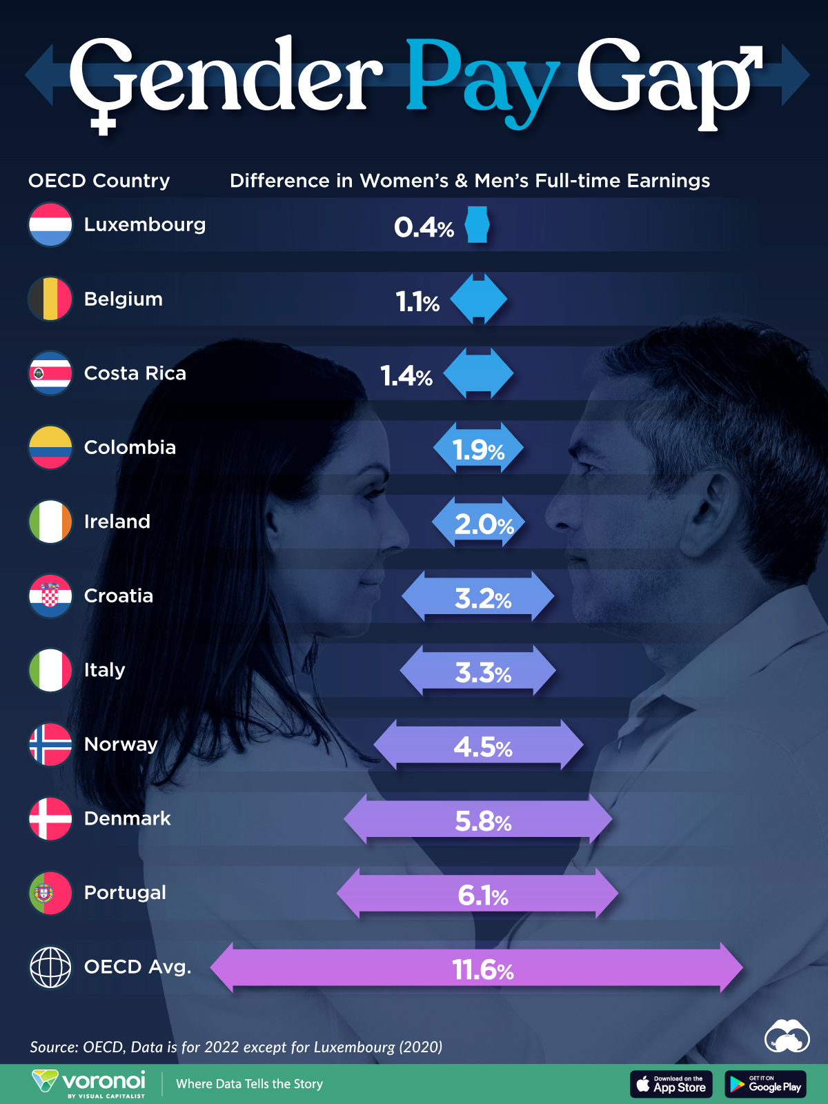
In this graphic we’ve ranked the OECD countries with the 10 smallest gender pay gaps, using the latest data from the OECD for 2022.
The gender pay gap is calculated as the difference between median full-time earnings for men and women divided by the median full-time earnings of men.
Which Countries Have the Smallest Gender Pay Gaps?
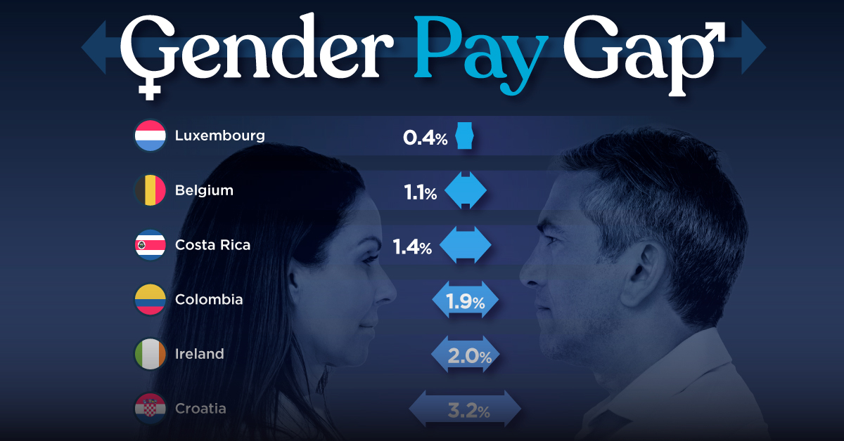
Luxembourg’s gender pay gap is the lowest among OECD members at only 0.4%—well below the OECD average of 11.6%.
| Rank | Country | Percentage Difference in Men's & Women's Full-time Earnings |
|---|---|---|
| 1 | 🇱🇺 Luxembourg | 0.4% |
| 2 | 🇧🇪 Belgium | 1.1% |
| 3 | 🇨🇷 Costa Rica | 1.4% |
| 4 | 🇨🇴 Colombia | 1.9% |
| 5 | 🇮🇪 Ireland | 2.0% |
| 6 | 🇭🇷 Croatia | 3.2% |
| 7 | 🇮🇹 Italy | 3.3% |
| 8 | 🇳🇴 Norway | 4.5% |
| 9 | 🇩🇰 Denmark | 5.8% |
| 10 | 🇵🇹 Portugal | 6.1% |
| OECD Average | 11.6% |
Notably, eight of the top 10 countries with the smallest gender pay gaps are located in Europe, as labor equality laws designed to target gender differences have begun to pay off.
The two other countries that made the list were Costa Rica (1.4%) and Colombia (1.9%), which came in third and fourth place, respectively.
How Did Luxembourg (Nearly) Eliminate its Gender Wage Gap?
Luxembourg’s virtually-non-existent gender wage gap in 2020 can be traced back to its diligent efforts to prioritize equal pay. Since 2016, firms that have not complied with the Labor Code’s equal pay laws have been subjected to penalizing fines ranging from €251 to €25,000.
Higher female education rates also contribute to the diminishing pay gap, with Luxembourg tied for first in the educational attainment rankings of the World Economic Forum’s Global Gender Gap Index Report for 2023.
See More Graphics about Demographics and Money
While these 10 countries are well below the OECD’s average gender pay gap of 11.6%, many OECD member countries including the U.S. are significantly above the average. To see the full list of the top 10 OECD countries with the largest gender pay gaps, check out this visualization.

-

 Real Estate2 weeks ago
Visualizing America’s Shortage of Affordable Homes
-

 Technology1 week ago
Ranked: Semiconductor Companies by Industry Revenue Share
-

 Money1 week ago
Which States Have the Highest Minimum Wage in America?
-

 Real Estate1 week ago
Ranked: The Most Valuable Housing Markets in America
-

 Business2 weeks ago
Charted: Big Four Market Share by S&P 500 Audits
-

 AI2 weeks ago
The Stock Performance of U.S. Chipmakers So Far in 2024
-

 Misc2 weeks ago
Almost Every EV Stock is Down After Q1 2024
-

 Money2 weeks ago
Where Does One U.S. Tax Dollar Go?