The Roller Coaster of Emotional Investing and Its Impact on Portfolios
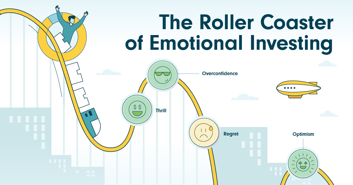
The Roller Coaster of Emotional Investing
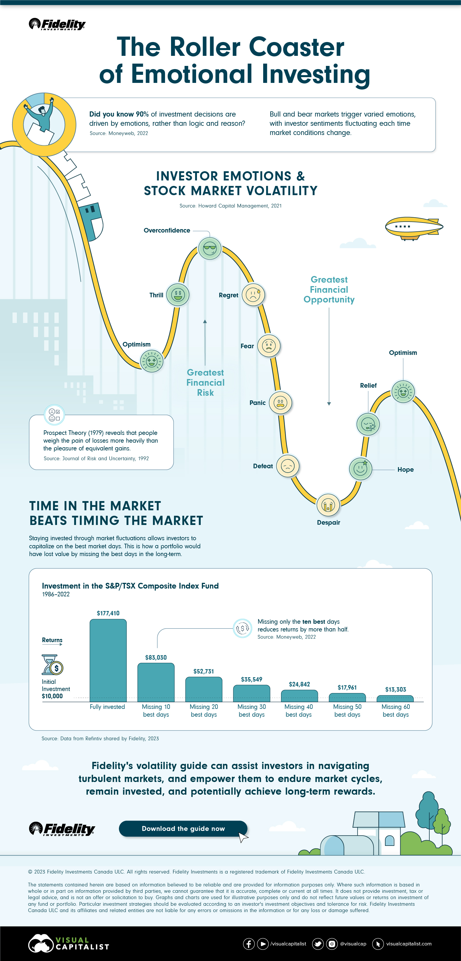
Did you know that 90% of investment decisions are influenced by emotions? And this is amplified during extreme bull and bear markets, putting investors’ impulses to test.
In this infographic sponsored by Fidelity Investments, we delve into behavioral finance to uncover the highs and lows of emotional investing and understand why time in the market beats timing the market.
The Emotional Investing Journey
According to the Prospect Theory (1979), losses have a higher emotional impact than equivalent gains. This means that the emotional toll of losing $100,000 outweighs the satisfaction of gaining the same amount. This, in turn, impacts how investors adjust their strategies.
For example, despite the common knowledge that when markets dip, it is a golden time for investors to enter, they respond with uncertainty, according to research by Howard Capital Management.
Then, as the market rebounds, surging investor optimism can often lead to overestimations of how high the next peak will be.
Time vs. Timing
Staying invested through market fluctuations allows investors to benefit from the best market days without having to make big buy or sell decisions.
Here, using Refinitiv’s research, we consider a $10,000 investment from 1986 to 2022 and compare its performance when consistently invested versus missing the top market days.
| Portfolio Value | Change in Value From Peak | |
|---|---|---|
| Stayed fully invested | $177,410 | - |
| Missed 10 best days | $83,030 | -$94,380 |
| Missed 20 best days | $52,731 | -$124,679 |
| Missed 30 best days | $35,549 | -$141,861 |
| Missed 40 best days | $24,842 | -$152,568 |
| Missed 50 best days | $17,961 | -$159,449 |
| Missed 60 best days | $13,303 | -$164,107 |
This shows that missing only the 10 best days reduces returns by more than half. Hence, staying invested amid market fluctuations enables investors to optimize their returns.
Fidelity’s volatility guide serves as a compass to help investors navigate turbulence and maintain a long-term perspective.
Download Fidelity’s volatility guide.

-
 Investor Education6 months ago
The 20 Most Common Investing Mistakes, in One Chart
Here are the most common investing mistakes to avoid, from emotionally-driven investing to paying too much in fees.
-
 Stocks10 months ago
Visualizing BlackRock’s Top Equity Holdings
BlackRock is the world’s largest asset manager, with over $9 trillion in holdings. Here are the company’s top equity holdings.
-
 Investor Education11 months ago
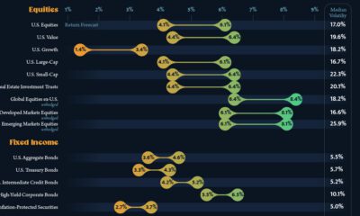
10-Year Annualized Forecasts for Major Asset Classes
This infographic visualizes 10-year annualized forecasts for both equities and fixed income using data from Vanguard.
-
 Investor Education1 year ago
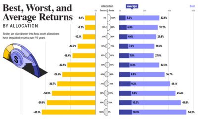
Visualizing 90 Years of Stock and Bond Portfolio Performance
How have investment returns for different portfolio allocations of stocks and bonds compared over the last 90 years?
-
 Debt2 years ago
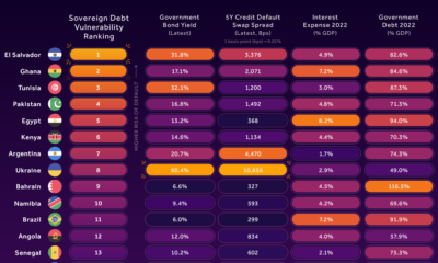
Countries with the Highest Default Risk in 2022
In this infographic, we examine new data that ranks the top 25 countries by their default risk.
-
 Markets2 years ago
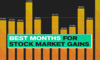
The Best Months for Stock Market Gains
This infographic analyzes over 30 years of stock market performance to identify the best and worst months for gains.