Demographics
Visualizing Racial Diversity in America’s 10 Largest States
![]() See this visualization first on the Voronoi app.
See this visualization first on the Voronoi app.

Visualizing Racial Diversity in America’s 10 Largest States
This was originally posted on our Voronoi app. Download the app for free on iOS or Android and discover incredible data-driven charts from a variety of trusted sources.
Over the last decade, America has become increasingly more diverse as demographic patterns shift across the population.
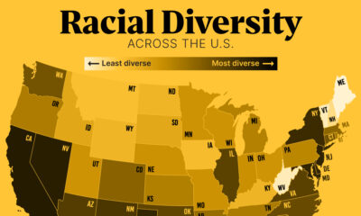
With over 39 million people, California is not only the most populous state, but one of the most diverse in the country.
This graphic shows the racial diversity of the 10 biggest states by population, based on data from the U.S. Census.
How Diverse Are America’s Most Populous States?
Here is the racial breakdown of the 10 largest U.S. states:
| State | White (%) | Black (%) | Asian (%) | Other (%) |
|---|---|---|---|---|
| California | 56 | 6 | 15 | 23 |
| Texas | 69 | 12 | 5 | 14 |
| Florida | 72 | 16 | 3 | 10 |
| New York | 62 | 15 | 9 | 14 |
| Pennsylvania | 79 | 11 | 4 | 6 |
| Illinois | 70 | 14 | 6 | 11 |
| Ohio | 80 | 12 | 2 | 5 |
| Georgia | 57 | 32 | 4 | 7 |
| North Carolina | 68 | 21 | 3 | 8 |
| Michigan | 78 | 14 | 3 | 6 |
As the table above shows, California has the highest proportion of Asian Americans across the top 10 states, comprising 15% of the population.
Meanwhile, Georgia’s ethnic makeup includes 32% of Black Americans, the highest across the most populous states. As diversity has risen over the last decade, it has significantly influenced politics at both the state and national level. The state voted Republican for every presidential election from 1996-2016, but flipped blue in 2020.
With 80% of the population being White Americans, Ohio has the highest share across the biggest states. While diversity has increased since 2010, it has been seen mostly in urban and suburban districts while diversity has stagnated in rural areas.
Overall, 24% of rural areas in the U.S. are made up of non-White Americans, rising by a median rate of 3.5% across counties since 2010. While this debunks the myth that “rural” is synonymous with “white”, racial diversity across rural areas falls below the national average of 42% of the population being people of color.
Beyond the top 10 states, ethnic diversity is the highest in Hawaii, Nevada, and Maryland.


Demographics
The Countries That Have Become Sadder Since 2010
Tracking Gallup survey data for more than a decade reveals some countries are witnessing big happiness declines, reflecting their shifting socio-economic conditions.


The Countries That Have Become Sadder Since 2010
This was originally posted on our Voronoi app. Download the app for free on iOS or Android and discover incredible data-driven charts from a variety of trusted sources.
Can happiness be quantified?
Some approaches that try to answer this question make a distinction between two differing components of happiness: a daily experience part, and a more general life evaluation (which includes how people think about their life as a whole).
The World Happiness Report—first launched in 2012—has been making a serious go at quantifying happiness, by examining Gallup poll data that asks respondents in nearly every country to evaluate their life on a 0–10 scale. From this they extrapolate a single “happiness score” out of 10 to compare how happy (or unhappy) countries are.
More than a decade later, the 2024 World Happiness Report continues the mission. Its latest findings also include how some countries have become sadder in the intervening years.
Which Countries Have Become Unhappier Since 2010?
Afghanistan is the unhappiest country in the world right now, and is also 60% unhappier than over a decade ago, indicating how much life has worsened since 2010.
In 2021, the Taliban officially returned to power in Afghanistan, after nearly two decades of American occupation in the country. The Islamic fundamentalist group has made life harder, especially for women, who are restricted from pursuing higher education, travel, and work.
On a broader scale, the Afghan economy has suffered post-Taliban takeover, with various consequent effects: mass unemployment, a drop in income, malnutrition, and a crumbling healthcare system.
| Rank | Country | Happiness Score Loss (2010–24) | 2024 Happiness Score (out of 10) |
|---|---|---|---|
| 1 | 🇦🇫 Afghanistan | -2.6 | 1.7 |
| 2 | 🇱🇧 Lebanon | -2.3 | 2.7 |
| 3 | 🇯🇴 Jordan | -1.5 | 4.2 |
| 4 | 🇻🇪 Venezuela | -1.3 | 5.6 |
| 5 | 🇲🇼 Malawi | -1.2 | 3.4 |
| 6 | 🇿🇲 Zambia | -1.2 | 3.5 |
| 7 | 🇧🇼 Botswana | -1.2 | 3.4 |
| 8 | 🇾🇪 Yemen | -1.0 | 3.6 |
| 9 | 🇪🇬 Egypt | -1.0 | 4.0 |
| 10 | 🇮🇳 India | -0.9 | 4.1 |
| 11 | 🇧🇩 Bangladesh | -0.9 | 3.9 |
| 12 | 🇨🇩 DRC | -0.7 | 3.3 |
| 13 | 🇹🇳 Tunisia | -0.7 | 4.4 |
| 14 | 🇨🇦 Canada | -0.6 | 6.9 |
| 15 | 🇺🇸 U.S. | -0.6 | 6.7 |
| 16 | 🇨🇴 Colombia | -0.5 | 5.7 |
| 17 | 🇵🇦 Panama | -0.5 | 6.4 |
| 18 | 🇵🇰 Pakistan | -0.5 | 4.7 |
| 19 | 🇿🇼 Zimbabwe | -0.5 | 3.3 |
| 20 | 🇮🇪 Ireland | -0.5 | 6.8 |
| N/A | 🌍 World | +0.1 | 5.5 |
Nine countries in total saw their happiness score drop by a full point or more, on the 0–10 scale.
Noticeably, many of them have seen years of social and economic upheaval. Lebanon, for example, has been grappling with decades of corruption, and a severe liquidity crisis since 2019 that has resulted in a banking system collapse, sending poverty levels skyrocketing.
In Jordan, unprecedented population growth—from refugees leaving Iraq and Syria—has aggravated unemployment rates. A somewhat abrupt change in the line of succession has also raised concerns about political stability in the country.

-

 Education1 week ago
How Hard Is It to Get Into an Ivy League School?
-

 Technology2 weeks ago
Ranked: Semiconductor Companies by Industry Revenue Share
-

 Markets2 weeks ago
Ranked: The World’s Top Flight Routes, by Revenue
-

 Demographics2 weeks ago
Population Projections: The World’s 6 Largest Countries in 2075
-

 Markets2 weeks ago
The Top 10 States by Real GDP Growth in 2023
-

 Demographics2 weeks ago
The Smallest Gender Wage Gaps in OECD Countries
-

 Economy2 weeks ago
Where U.S. Inflation Hit the Hardest in March 2024
-

 Green2 weeks ago
Top Countries By Forest Growth Since 2001