

This visual heatmap of unemployment claims by state highlights New York, California, and Alaska leading the country by a wide margin.


This graphic compares the nominal vs. inflation-adjusted value of the U.S. minimum wage, from 1940 to 2023.


We look at the world's 10 richest people in finance, from Warren Buffett to Michael Bloomberg, in this visualization.
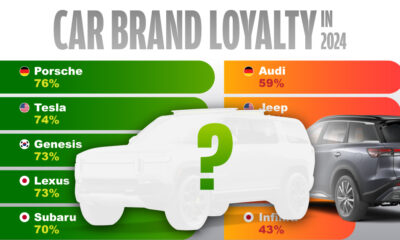

This ranking of car brand loyalty shows what percentage of owners would buy from the same brand for their next vehicle.
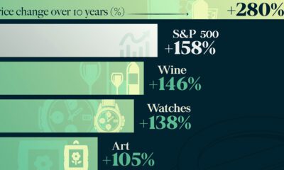

How does investing in luxury goods like expensive watches and rare whisky compare to other goods, or to the S&P 500?
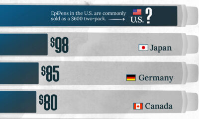

This visualization compares EpiPen prices around the world, with the U.S. having the highest prices by far.
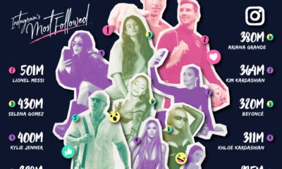

From athletes and musicians to actors and celebrity personalities, here are the top 10 most followed people on Instagram.


Advanced economies are the happiest countries for older people, likely due to their stronger social security systems.


We visualize Asia’s population patterns to see where 4.6 billion people, or two-thirds of the world’s population, actually live.
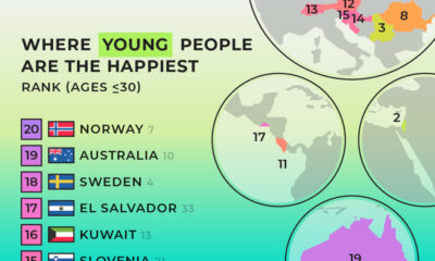

We summarized results from the World Happiness Report 2024 to see where young people are the happiest.


