Mapped: Europe’s GDP Per Capita, by Country
The Growth of a $1,000 Equity Investment, by Stock Market
Mapped: The Most Valuable Company in Each Southeast Asian Country
Visualizing Global Inflation Forecasts (2024-2026)
The World’s Fastest Growing Emerging Markets (2024-2029 Forecast)
Countries With the Highest Rates of Crypto Ownership
Mapped: The Number of AI Startups By Country
All of the Grants Given by the U.S. CHIPS Act
Visualizing AI Patents by Country
How Tech Logos Have Evolved Over Time
Visualizing the Tax Burden of Every U.S. State
Charted: What Frustrates Americans About the Tax System
Ranked: The Top 20 Countries in Debt to China
Charted: Which Country Has the Most Billionaires in 2024?
Charted: Which City Has the Most Billionaires in 2024?
Life Expectancy by Region (1950-2050F)
What Causes Preventable Child Deaths?
The Cost of an EpiPen in Major Markets
Charted: Global Tobacco Use by Country and Sex
Visualized: What Lives in Your Gut Microbiome?
Who’s Building the Most Solar Energy?
Mapped: The Age of Energy Projects in Interconnection Queues, by State
Ranked: The Top 10 EV Battery Manufacturers in 2023
The World’s Biggest Nuclear Energy Producers
The World’s Biggest Oil Producers in 2023
The Largest Earthquakes in the New York Area (1970-2024)
Mapped: Average Wages Across Europe
Mapped: Asia’s Population Patterns by Density
A Map of Global Happiness By Country in 2024
Mapped: Population Growth by Region (1900-2050F)
Where the World’s Aluminum is Smelted, by Country
Visualizing Global Gold Production in 2023
Gold vs. S&P 500: Which Has Grown More Over Five Years?
Charted: The Value Gap Between the Gold Price and Gold Miners
How People Get Around in America, Europe, and Asia
The Carbon Footprint of Major Travel Methods
Ranking the Top 15 Countries by Carbon Tax Revenue
Ranked: The Countries With the Most Air Pollution in 2023
Top Countries By Forest Growth Since 2001
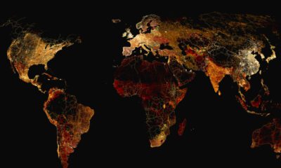
What does a road map of the world look like? Here’s a deep view of roads visualized by type across countries and continents.
This month, we dive into bonus content from our new Generational Power Index, as well as topical visualizations in the news.
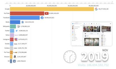
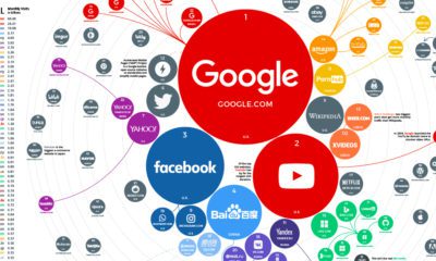
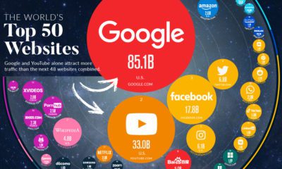
This animation provides an interesting overview of the websites with the highest traffic over the last few decades, and how the rankings have changed.
This chart looks at some of the common items that are sold on the Dark Web, and how much they sold for on average in 2022.
The top 100 websites ranking reveals how people around the world search for information, which services they use, and how they spend time online.
How new media has ushered in a better experience for investors. Welcome to the modern era of investor relations.
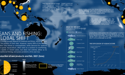
Where do our fish come from? This map charts ocean fishing activity and the amount of fish coming from aquaculture.
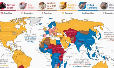
By examining meat consumption by country, we uncover regional differences in how much, and what type of meat people around the world prefer.
In this visualization, we rank the top 50 websites that receive the most internet traffic, from Google to CNN.
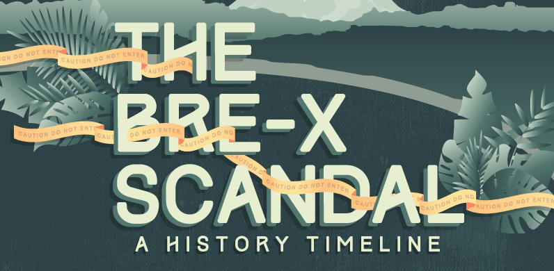
This infographic details the rise and fall of Bre-X and the Busang gold discovery in Indonesia - one of the biggest scandals in capital markets history.


 Creator Program