Misc
Mapping Civil Unrest in the United States (2000–2020)
Note: Due to widespread nature of protests related to the killing of George Floyd, we only evaluated the 32 urban areas in the U.S. with populations of 1.5 million or more.
Mapping Civil Unrest in the United States (2000–2020)
See a static version of these maps by clicking here.
Protests are a regular feature of democratic society, but they can occasionally cross over from non-violent demonstrations into civil unrest. Even protests that are largely peaceful can still result in arrests, violence, police aggression, and property damage.
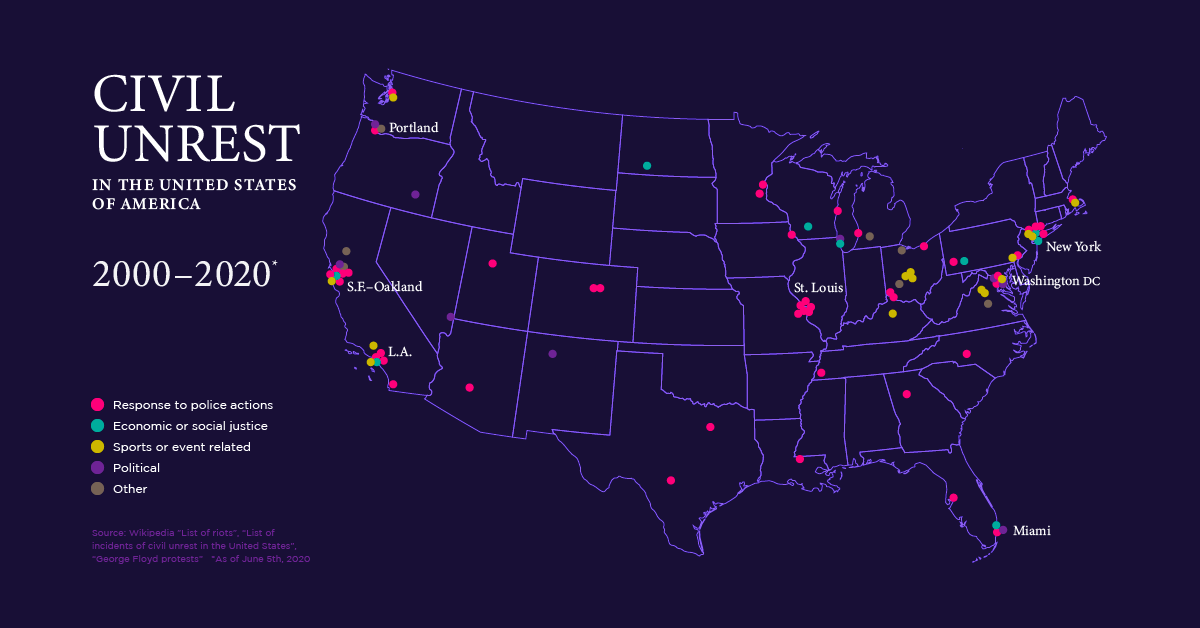
Our animated map above looks at the last two decades of civil unrest in the United States using lists compiled on Wikipedia.
Instances of civil unrest eventually leave the news cycle, and we rarely have the chance to examine the bigger picture or see where they fit within a nation-wide pattern.
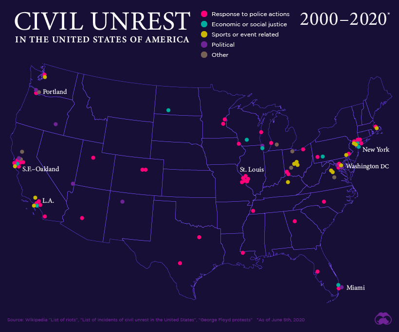
From this map we can see that certain cities, such as St. Louis and Oakland, have been disproportionately impacted by civil unrest. As well, universities have also been hotspots for rioting, though often for much different reasons.
Looking back over two decades, we see that instances of civil unrest in the United States have fallen into roughly four categories:
- Economic and social injustice
- Sports and event related riots
- Politically motivated civil unrest
- Reaction to police actions
Let’s take a look at a prominent example in each of these categories, to get further context.
Examples of Civil Unrest, by Category
1. Economic and Social Justice
One of the most prominent examples in this category is the Occupy Wall Street movement. The protests began in September 2011 in Downtown Manhattan, and soon spread through cities throughout the world.
In 2016, the Dakota Access Pipeline protests grabbed headlines around the world as protesters faced off against armed soldiers and police with riot gear and military equipment. By the time camps were broken up the next year, hundreds of people had been arrested.
2. Sports and Event Related Riots
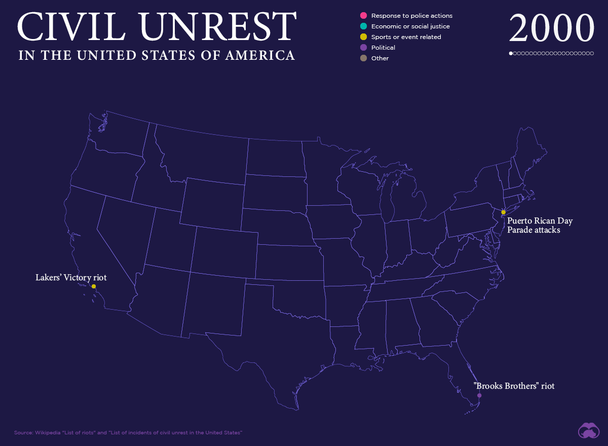
Between 2000 and 2010, the majority of incidents plotted on the map are related to sports and events. This includes major sporting events like the L.A. Lakers championship win in 2000, but also the University of Maryland riot of 2004, where rowdy post-game celebrations crossed over into arson and property damage.
A more recent example is the Philadelphia Eagles’ first-ever Super Bowl victory in 2018, where celebrations eventually got out of hand.
3. Politically Motivated Civil Unrest
The political divide has been growing in America for years now, but those differences more frequently resulted in confrontations and civil unrest in 2016. After the election of Donald Trump, for example, protests erupted in many cities, with riots breaking out in Portland, Oregon, and Oakland, California.
Of course, the “Bundy standoff” – an armed confrontation between supporters of cattle rancher Cliven Bundy and law enforcement over withheld grazing fees – showed that not all civil unrest takes place in America’s cities.
4. Reaction to Police Actions
Some of the biggest flashpoints seen in recent years have been in response to people who were killed by police.
In fact, more than half of the points on our map were a direct response to incidents in which a person – typically a black male – died at the hands of law enforcement officials. In previous years, the unrest that followed was typically confined to the cities where the death took place, but protests are now increasingly erupting in cities around the country.
The Situation Now
The death of George Floyd – the latest black male to be killed during an encounter with law enforcement – has had a ripple effect, spawning protests in cities around the United States and internationally.
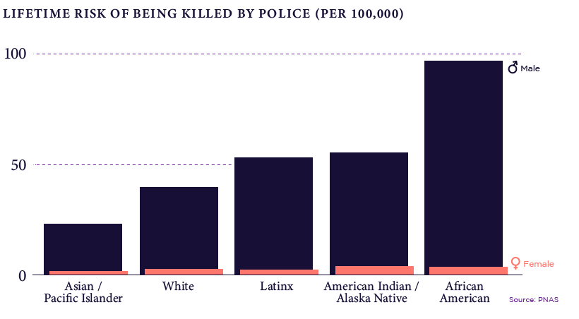
As our map showing the history of civil unrest makes clear, excessive force from police against black citizens is nothing new. The data shows that black men have by far the highest risk of being killed in an encounter with law enforcement.
Until these systemic issues are addressed, history may not be repeat exactly, but the rhyme will sound very, very familiar.


VC+
VC+: Get Our Key Takeaways From the IMF’s World Economic Outlook
A sneak preview of the exclusive VC+ Special Dispatch—your shortcut to understanding IMF’s World Economic Outlook report.

Have you read IMF’s latest World Economic Outlook yet? At a daunting 202 pages, we don’t blame you if it’s still on your to-do list.
But don’t worry, you don’t need to read the whole April release, because we’ve already done the hard work for you.
To save you time and effort, the Visual Capitalist team has compiled a visual analysis of everything you need to know from the report—and our VC+ Special Dispatch is available exclusively to VC+ members. All you need to do is log into the VC+ Archive.
If you’re not already subscribed to VC+, make sure you sign up now to access the full analysis of the IMF report, and more (we release similar deep dives every week).
For now, here’s what VC+ members get to see.
Your Shortcut to Understanding IMF’s World Economic Outlook
With long and short-term growth prospects declining for many countries around the world, this Special Dispatch offers a visual analysis of the key figures and takeaways from the IMF’s report including:
- The global decline in economic growth forecasts
- Real GDP growth and inflation forecasts for major nations in 2024
- When interest rate cuts will happen and interest rate forecasts
- How debt-to-GDP ratios have changed since 2000
- And much more!

Get the Full Breakdown in the Next VC+ Special Dispatch
VC+ members can access the full Special Dispatch by logging into the VC+ Archive, where you can also check out previous releases.
Make sure you join VC+ now to see exclusive charts and the full analysis of key takeaways from IMF’s World Economic Outlook.
Don’t miss out. Become a VC+ member today.
What You Get When You Become a VC+ Member
VC+ is Visual Capitalist’s premium subscription. As a member, you’ll get the following:
- Special Dispatches: Deep dive visual briefings on crucial reports and global trends
- Markets This Month: A snappy summary of the state of the markets and what to look out for
- The Trendline: Weekly curation of the best visualizations from across the globe
- Global Forecast Series: Our flagship annual report that covers everything you need to know related to the economy, markets, geopolitics, and the latest tech trends
- VC+ Archive: Hundreds of previously released VC+ briefings and reports that you’ve been missing out on, all in one dedicated hub
You can get all of the above, and more, by joining VC+ today.

-

 Mining1 week ago
Gold vs. S&P 500: Which Has Grown More Over Five Years?
-

 Markets2 weeks ago
Ranked: The Most Valuable Housing Markets in America
-

 Money2 weeks ago
Which States Have the Highest Minimum Wage in America?
-

 AI2 weeks ago
Ranked: Semiconductor Companies by Industry Revenue Share
-

 Markets2 weeks ago
Ranked: The World’s Top Flight Routes, by Revenue
-

 Countries2 weeks ago
Population Projections: The World’s 6 Largest Countries in 2075
-

 Markets2 weeks ago
The Top 10 States by Real GDP Growth in 2023
-

 Demographics2 weeks ago
The Smallest Gender Wage Gaps in OECD Countries