Money
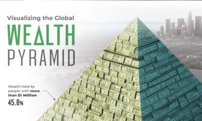
Visualizing the Distribution of Household Wealth, By Country
Article/Editing:
var divElement = document.getElementById(‘viz1647990048405’); var vizElement = divElement.getElementsByTagName(‘object’)[0]; vizElement.style.width=’1200px’;vizElement.style.height=’807px’; var scriptElement = document.createElement(‘script’); scriptElement.src = ‘https://public.tableau.com/javascripts/api/viz_v1.js’; vizElement.parentNode.insertBefore(scriptElement, vizElement);
Visualizing the Distribution of Household Wealth, By Country
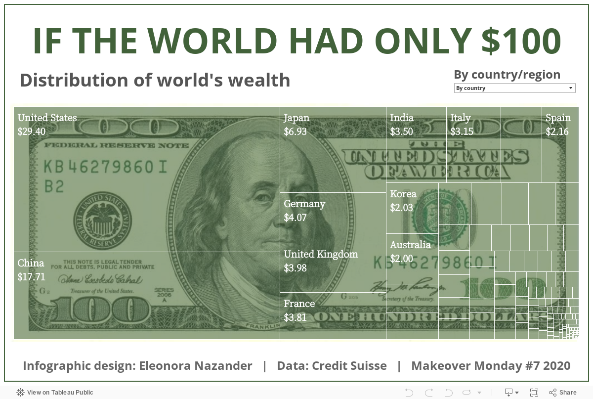
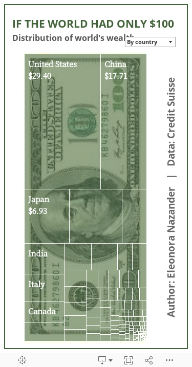
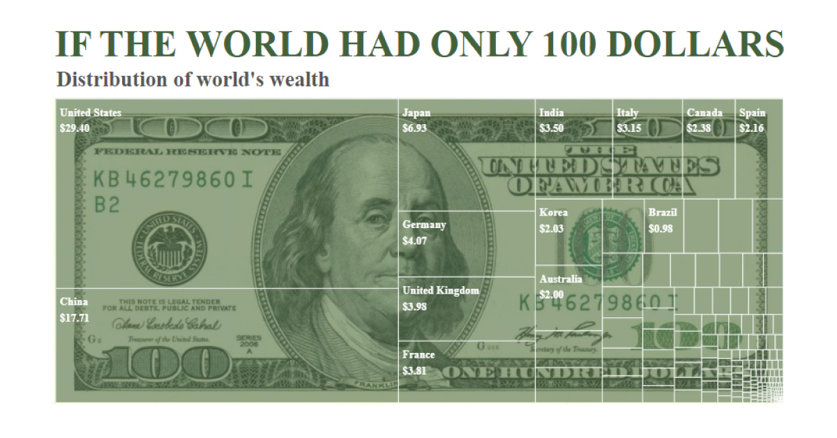
A majority of the world’s wealth is concentrated in just a few countries. In fact, almost a third of household wealth is held by Americans, while China’s population accounts for nearly a fifth.
Using data from Credit Suisse, this graphic by Eleonora Nazander shows the distribution of household wealth worldwide, highlighting the wealth gap that exists across regions.
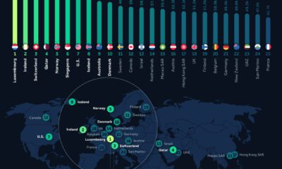
Top 10 Wealthiest Countries
To help simplify things, this graphic shows how much household wealth each country would have if the world only had $100.
As the graphic illustrates, the top 10 wealthiest countries would hold an estimated $77, or 77% of global household wealth. Here’s a breakdown of what their cut of $100 would be:
| Country | Total Wealth ($B) | Share of $100 |
|---|---|---|
| 🇺🇸 United States | $105,990 | $29.40 |
| 🇨🇳 China | $63,827 | $17.71 |
| 🇯🇵 Japan | $24,992 | $6.93 |
| 🇩🇪 Germany | $14,660 | $4.07 |
| 🇬🇧 United Kingdom | $14,341 | $3.98 |
| 🇫🇷 France | $13,729 | $3.81 |
| 🇮🇳 India | $12,614 | $3.50 |
| 🇮🇹 Italy | $11,358 | $3.15 |
| 🇨🇦 Canada | $8,573 | $2.38 |
| 🇪🇸 Spain | $7,772 | $2.16 |
| Total | $278 Trillion | $77.09 |
The U.S. comes in first place, holding $29.40, or almost a third of total wealth, while China comes in second, accounting for $17.71.
This makes sense considering the high concentration of ultra-wealthy individuals in both countries—China and the U.S. are home to more than half of the world’s billionaires, and eight of the 10 richest people on the planet are Americans, including the world’s richest, Elon Musk.
Japan ranks third on the list, accounting for $6.93. Like the U.S. and China, Japan also has a high portion of ultra-high net worth citizens, or individuals with a net worth of $30 million or more.
Interestingly, India ranks seventh on the list, despite having the third-highest number of billionaires worldwide and a massive population of 1.4 billion. One contributing factor to this could be the country’s relatively high levels of poverty.
Wealth Inequality
It’s important to note that, while the U.S. and China hold a majority of the world’s wealth, both countries still struggle with wealth inequality.
Currently, the top 1% of U.S. households hold 31.7% of the country’s household wealth. And while China has made progress on poverty in the last decade through rapid economic growth, the wealth gap between the country’s rich and poor has widened in recent years.
Governments in both countries have announced plans to tackle wealth inequality. For instance, the Biden administration is working to pass legislation that would increase taxes on businesses and wealthy Americans. Meanwhile, the Chinese government announced its five-year plan to crack down on private enterprise, in an attempt to break up monopolies and ultimately achieve “common prosperity.”

This article was published as a part of Visual Capitalist's Creator Program, which features data-driven visuals from some of our favorite Creators around the world.


Money
Charted: Which City Has the Most Billionaires in 2024?
Just two countries account for half of the top 20 cities with the most billionaires. And the majority of the other half are found in Asia.


Charted: Which Country Has the Most Billionaires in 2024?
This was originally posted on our Voronoi app. Download the app for free on iOS or Android and discover incredible data-driven charts from a variety of trusted sources.
Some cities seem to attract the rich. Take New York City for example, which has 340,000 high-net-worth residents with investable assets of more than $1 million.
But there’s a vast difference between being a millionaire and a billionaire. So where do the richest of them all live?
Using data from the Hurun Global Rich List 2024, we rank the top 20 cities with the highest number of billionaires in 2024.
A caveat to these rich lists: sources often vary on figures and exact rankings. For example, in last year’s reports, Forbes had New York as the city with the most billionaires, while the Hurun Global Rich List placed Beijing at the top spot.
Ranked: Top 20 Cities with the Most Billionaires in 2024
The Chinese economy’s doldrums over the course of the past year have affected its ultra-wealthy residents in key cities.
Beijing, the city with the most billionaires in 2023, has not only ceded its spot to New York, but has dropped to #4, overtaken by London and Mumbai.
| Rank | City | Billionaires | Rank Change YoY |
|---|---|---|---|
| 1 | 🇺🇸 New York | 119 | +1 |
| 2 | 🇬🇧 London | 97 | +3 |
| 3 | 🇮🇳 Mumbai | 92 | +4 |
| 4 | 🇨🇳 Beijing | 91 | -3 |
| 5 | 🇨🇳 Shanghai | 87 | -2 |
| 6 | 🇨🇳 Shenzhen | 84 | -2 |
| 7 | 🇭🇰 Hong Kong | 65 | -1 |
| 8 | 🇷🇺 Moscow | 59 | No Change |
| 9 | 🇮🇳 New Delhi | 57 | +6 |
| 10 | 🇺🇸 San Francisco | 52 | No Change |
| 11 | 🇹🇭 Bangkok | 49 | +2 |
| 12 | 🇹🇼 Taipei | 45 | +2 |
| 13 | 🇫🇷 Paris | 44 | -2 |
| 14 | 🇨🇳 Hangzhou | 43 | -5 |
| 15 | 🇸🇬 Singapore | 42 | New to Top 20 |
| 16 | 🇨🇳 Guangzhou | 39 | -4 |
| 17T | 🇮🇩 Jakarta | 37 | +1 |
| 17T | 🇧🇷 Sao Paulo | 37 | No Change |
| 19T | 🇺🇸 Los Angeles | 31 | No Change |
| 19T | 🇰🇷 Seoul | 31 | -3 |
In fact all Chinese cities on the top 20 list have lost billionaires between 2023–24. Consequently, they’ve all lost ranking spots as well, with Hangzhou seeing the biggest slide (-5) in the top 20.
Where China lost, all other Asian cities—except Seoul—in the top 20 have gained ranks. Indian cities lead the way, with New Delhi (+6) and Mumbai (+3) having climbed the most.
At a country level, China and the U.S combine to make up half of the cities in the top 20. They are also home to about half of the world’s 3,200 billionaire population.
In other news of note: Hurun officially counts Taylor Swift as a billionaire, estimating her net worth at $1.2 billion.

-

 Debt1 week ago
How Debt-to-GDP Ratios Have Changed Since 2000
-

 Markets2 weeks ago
Ranked: The World’s Top Flight Routes, by Revenue
-

 Countries2 weeks ago
Population Projections: The World’s 6 Largest Countries in 2075
-

 Markets2 weeks ago
The Top 10 States by Real GDP Growth in 2023
-

 Demographics2 weeks ago
The Smallest Gender Wage Gaps in OECD Countries
-

 United States2 weeks ago
Where U.S. Inflation Hit the Hardest in March 2024
-

 Green2 weeks ago
Top Countries By Forest Growth Since 2001
-

 United States2 weeks ago
Ranked: The Largest U.S. Corporations by Number of Employees