Green
Visualizing All the World’s Carbon Emissions by Country
Visualizing All The World’s Carbon Emissions By Country
The greenhouse effect, essential for sustaining Earth’s life-friendly temperatures, has been intensified by burning fossil fuels.
This amplification of the natural greenhouse effect has led to significant alterations to the planet’s climate system.
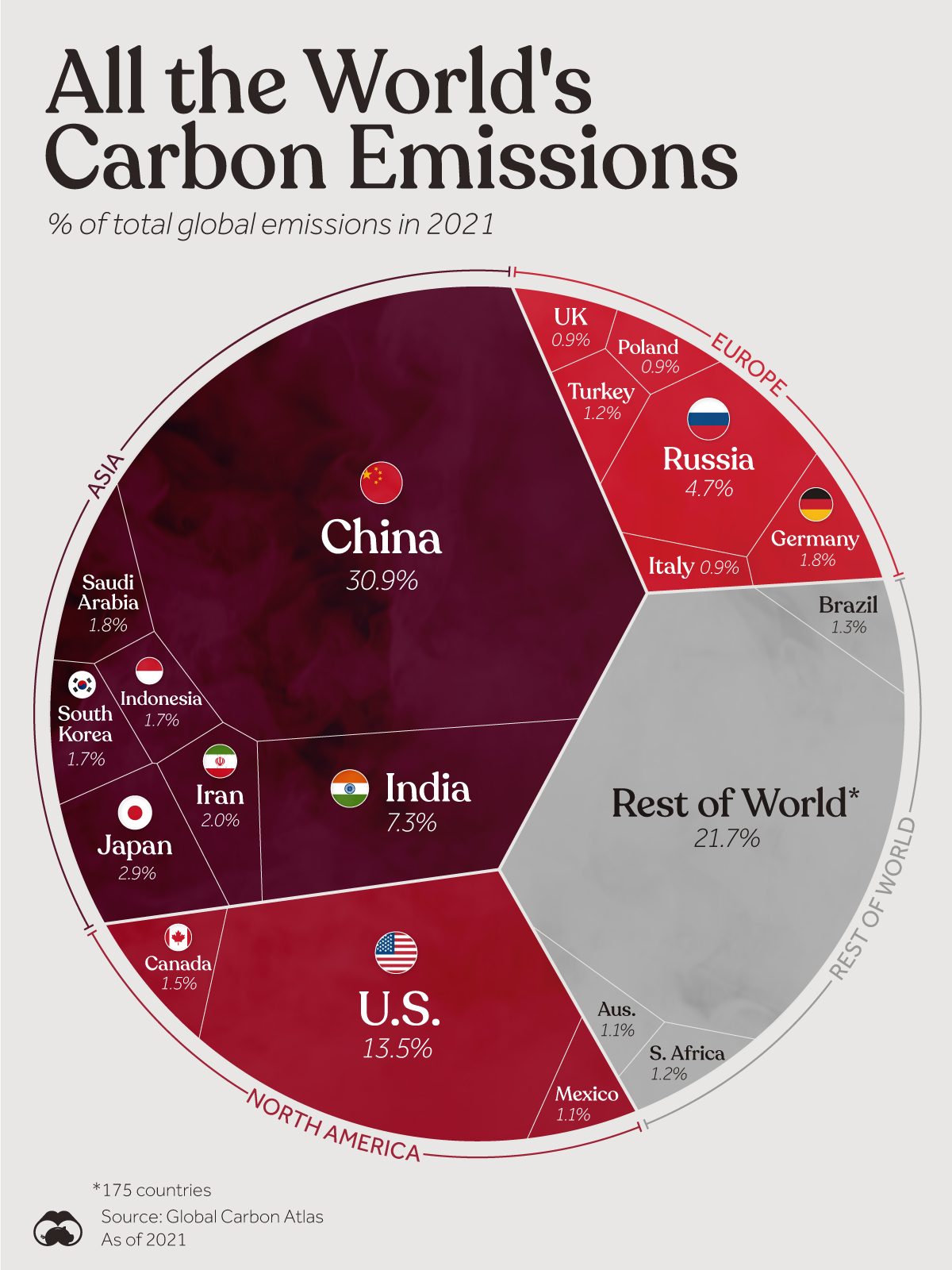
The graphic above uses data from the Global Carbon Atlas to explore which countries contribute the most to CO₂ emissions.
Ranked: Global CO₂ Emissions by Country
According to the Global Carbon Atlas, the world’s top polluters are China, India, and the U.S., which accounted for 52% of the world’s CO₂ in 2021.
These countries are also the biggest in terms of population.
| Rank | Country | Region | Total Emissions (%) |
|---|---|---|---|
| #1 | 🇨🇳 China | Asia | 30.9% |
| #2 | 🇺🇸 U.S. | North America | 13.5% |
| #3 | 🇮🇳 India | Asia | 7.3% |
| #4 | 🇷🇺 Russia | Europe | 4.7% |
| #5 | 🇯🇵 Japan | Asia | 2.9% |
| #6 | 🇮🇷 Iran | Asia | 2.0% |
| #7 | 🇩🇪 Germany | Europe | 1.8% |
| #8 | 🇸🇦 Saudi Arabia | Other | 1.8% |
| #9 | 🇮🇩 Indonesia | Asia | 1.7% |
| #10 | 🇰🇷 South Korea | Asia | 1.7% |
| #11 | 🇨🇦 Canada | North America | 1.5% |
| #12 | 🇧🇷 Brazil | South America | 1.3% |
| #13 | 🇹🇷 Türkiye | Europe | 1.2% |
| #14 | 🇿🇦 South Africa | Africa | 1.2% |
| #15 | 🇲🇽 Mexico | North America | 1.1% |
| #16 | 🇦🇺 Australia | Oceania | 1.1% |
| #17 | 🇬🇧 UK | Europe | 0.9% |
| #18 | 🇮🇹 Italy | Europe | 0.9% |
| #19 | 🇵🇱 Poland | Europe | 0.9% |
| n/a | 🌐 Rest of World | Other | 21.7% |
In terms of CO₂ emissions per capita (metric tons), the U.S. is relatively high at 15.32, while China and India rank lower at 7.44 and 1.89, respectively.
Historically, the U.S. has been the largest carbon emitter, releasing 422 billion metric tons of CO₂ into the atmosphere since the Industrial Revolution. This is equivalent to almost a quarter of all CO₂ produced from fossil fuels and industrial activities.
Given their massive populations and the fact that countries typically increase their emissions as they become more developed, China and India may continue to grow their shares even further. The International Energy Agency (IEA) forecasts that India’s share of global emissions could rise to 10% by 2030.
All of these major contributors of carbon to the atmosphere have set goals to reduce emissions over the next decades. While the U.S. targets net-zero emissions by 2050, China aims for carbon neutrality by 2060 and India recently set a target of 2070.


Automotive
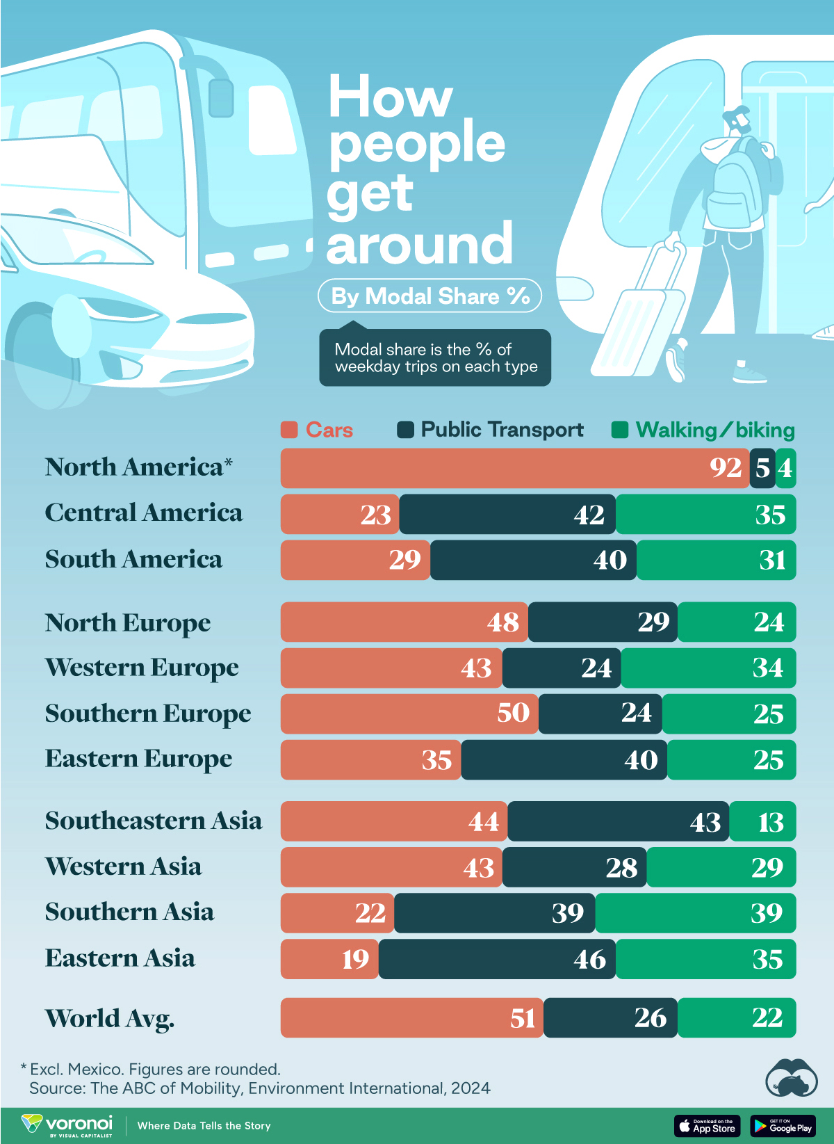
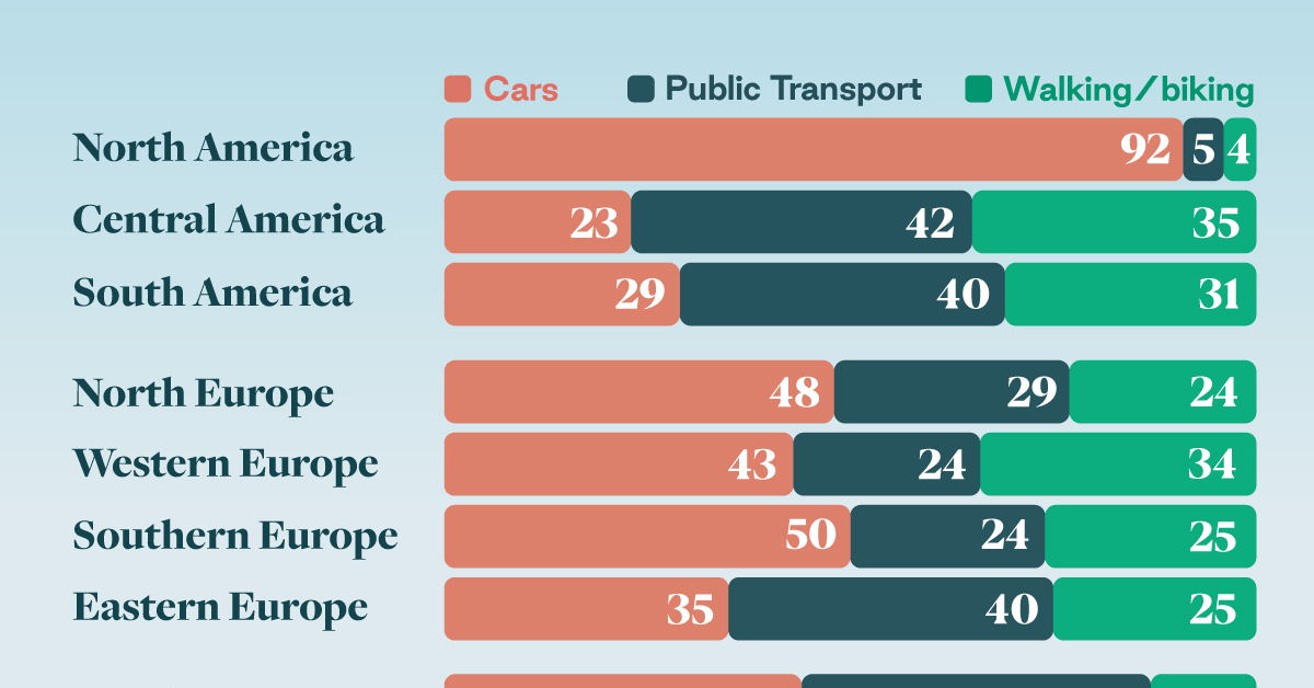
How People Get Around in America, Europe, and Asia
Examining how people get around using cars, public transit, and walking or biking, and the regional differences in usage.
How People Get Around in America, Europe, and Asia
This was originally posted on our Voronoi app. Download the app for free on iOS or Android and discover incredible data-driven charts from a variety of trusted sources.
This chart highlights the popularity of different transportation types in the Americas, Europe, and Asia, calculated by modal share.
Data for this article and visualization is sourced from ‘The ABC of Mobility’, a research paper by Rafael Prieto-Curiel (Complexity Science Hub) and Juan P. Ospina (EAFIT University), accessed through ScienceDirect.
The authors gathered their modal share data through travel surveys, which focused on the primary mode of transportation a person employs for each weekday trip. Information from 800 cities across 61 countries was collected for this study.
North American Car Culture Contrasts with the Rest of the World
In the U.S. and Canada, people heavily rely on cars to get around, no matter the size of the city. There are a few exceptions of course, such as New York, Toronto, and smaller college towns across the United States.
| Region | 🚗 Cars | 🚌 Public Transport | 🚶 Walking/Biking |
|---|---|---|---|
| North America* | 92% | 5% | 4% |
| Central America | 23% | 42% | 35% |
| South America | 29% | 40% | 31% |
| Northern Europe | 48% | 29% | 24% |
| Western Europe | 43% | 24% | 34% |
| Southern Europe | 50% | 24% | 25% |
| Eastern Europe | 35% | 40% | 25% |
| Southeastern Asia | 44% | 43% | 13% |
| Western Asia | 43% | 28% | 29% |
| Southern Asia | 22% | 39% | 39% |
| Eastern Asia | 19% | 46% | 35% |
| World | 51% | 26% | 22% |
Note: *Excluding Mexico. Percentages are rounded.
As a result, North America’s share of public transport and active mobility (walking and biking) is the lowest amongst all surveyed regions by a significant amount.
On the other hand, public transport reigns supreme in South and Central America as well as Southern and Eastern Asia. It ties with cars in Southeastern Asia, and is eclipsed by cars in Western Asia.
As outlined in the paper, Europe sees more city-level differences in transport popularity.
For example, Utrecht, Netherlands prefers walking and biking. People in Paris and London like using their extensive transit systems. And in Manchester and Rome, roughly two out of three journeys are by car.

-
 Markets5 days ago
Visualizing Global Inflation Forecasts (2024-2026)
-

 Green2 weeks ago
The Carbon Footprint of Major Travel Methods
-

 United States2 weeks ago
Visualizing the Most Common Pets in the U.S.
-

 Culture2 weeks ago
The World’s Top Media Franchises by All-Time Revenue
-

 voronoi1 week ago
Best Visualizations of April on the Voronoi App
-

 Wealth1 week ago
Charted: Which Country Has the Most Billionaires in 2024?
-

 Business1 week ago
The Top Private Equity Firms by Country
-

 Markets1 week ago
The Best U.S. Companies to Work for According to LinkedIn