

This graphic highlights France and Canada as the global leaders when it comes to generating carbon tax revenue.
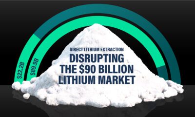

Visual Capitalist and EnergyX explore how direct lithium extraction could disrupt the $90B lithium industry.
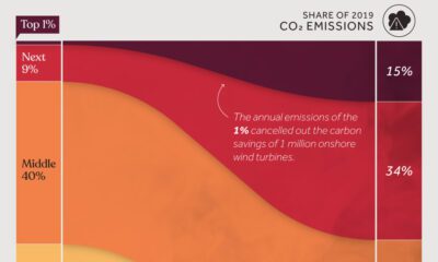

We visualize global CO2 emissions by income group, showing the impact of different wealth brackets on carbon generation.
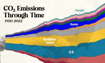

In this streamgraph, we break down global CO2 emissions between 1950 and 2022 using data from Berkeley Earth and Global Carbon Project.
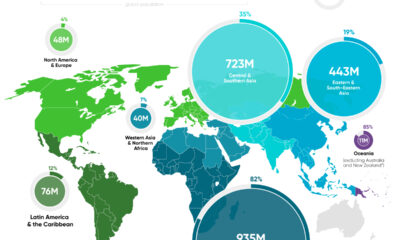

In this graphic, we map the number of people relying on harmful cooking fuels by region, using data from the World Health Organization.
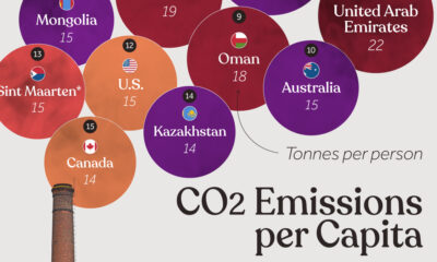

Which countries rank the highest in per capita carbon emissions, and how do they impact the world's total carbon emissions?
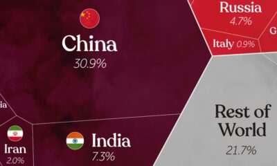

China, India, and the U.S. together account for roughly half of the world's CO₂. This visual breaks down all carbon emissions by country.
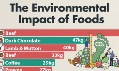

Which foods are linked with high CO2 emissions and high water use? We look at the environmental impacts of food production in this chart.
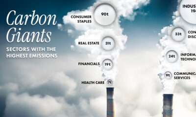

Comparing average Scope 1 emission intensities by sector according to an analysis done by S&P Global Inc.
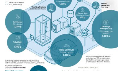

Discover how the average person's carbon footprint impacts the environment and learn how carbon credits can offset your carbon footprint.


