Economy
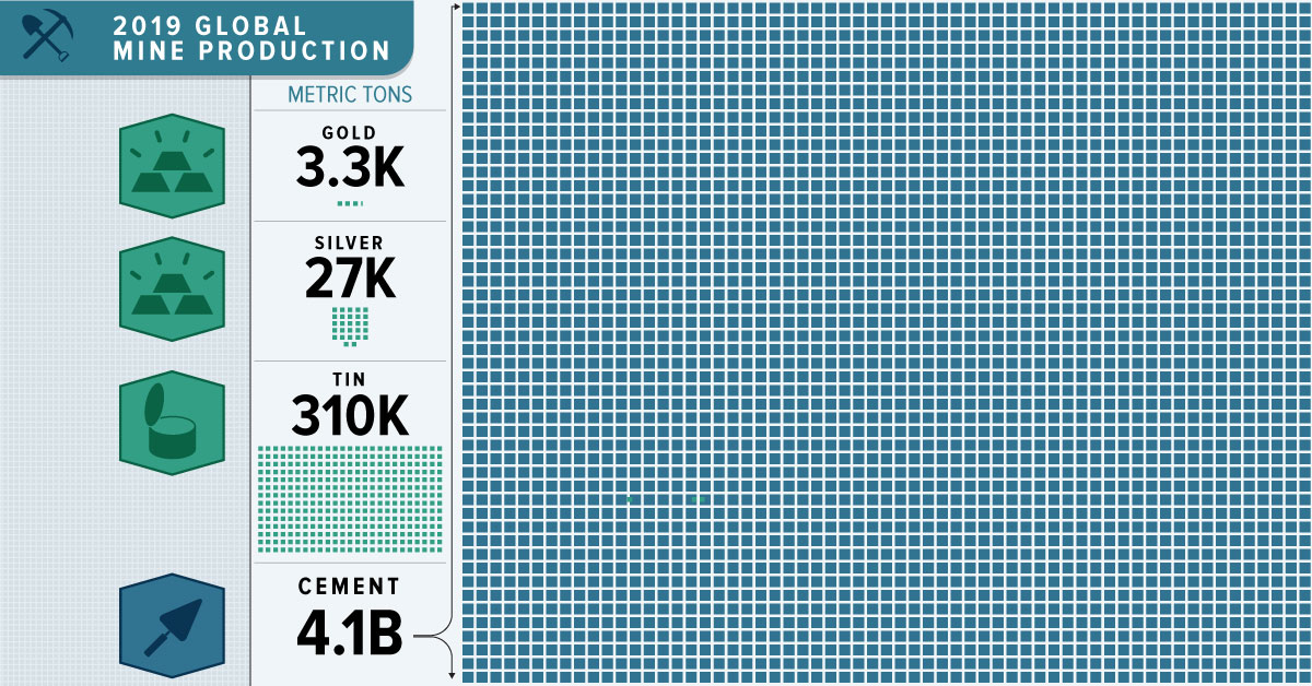
All the World’s Metals and Minerals in One Visualization

 Can I share this graphic?
 When do I need a license?
 Interested in this piece?
All the World’s Metals and Minerals in One Visualization
We live in a material world, in that we rely on materials to make our lives better. Without even realizing it, humans consume enormous amounts of metals and minerals with every convenient food package, impressive building, and technological innovation.
Every year, the United States Geological Service (USGS) publishes commodity summaries outlining global mining statistics for over 90 individual minerals and materials. Today’s infographic visualizes the data to reveal the dramatic scale of 2019 non-fuel mineral production.
Read all the way to the bottom; the data will surprise you.
Non-Fuel Minerals: USGS Methodology
A wide variety of minerals can be classified as “non-fuel”, including precious metals, base metals, industrial minerals, and materials used for construction.
Non-fuel minerals are those not used for fuel, such as oil, natural gas and coal. Once non-fuel minerals are used up, there is no replacing them. However, many can be recycled continuously.
The USGS tracked both refinery and mine production of these various minerals. This means that some minerals are the essential ingredients for others on the list. For example, iron ore is critical for steel production, and bauxite ore gets refined into aluminum.
Top 10 Minerals and Metals by Production
Sand and gravel are at the top of the list of non-fuel mineral production.
As these materials are the basic components for the manufacturing of concrete, roads, and buildings, it’s not surprising they take the lead.
| Rank | Metal/Mineral | 2019 Production (millions of metric tons) |
|---|---|---|
| #1 | Sand and Gravel | 50,000 |
| #2 | Cement | 4,100 |
| #3 | Iron and Steel | 3,200 |
| #4 | Iron Ore | 2,500 |
| #5 | Bauxite | 500 |
| #6 | Lime | 430 |
| #7 | Salt | 293 |
| #8 | Phosphate Rock | 240 |
| #9 | Nitrogen | 150 |
| #10 | Gypsum | 140 |
These materials fertilize the food we eat, and they also form the structures we live in and the roads we drive on. They are the bones of the global economy.
Let’s dive into some more specific categories covered on the infographic.
Base Metals
While cement, sand, and gravel may be the bones of global infrastructure, base metals are its lifeblood. Their consumption is an important indicator of the overall health of an economy.
Base metals are non-ferrous, meaning they contain no iron. They are often more abundant in nature and sometimes easier to mine, so their prices are generally lower than precious metals.
| Rank | Base Metal | 2019 Production (millions of metric tons) |
|---|---|---|
| #1 | Aluminum | 64.0 |
| #2 | Copper | 20.0 |
| #3 | Zinc | 13.0 |
| #4 | Lead | 4.5 |
| #5 | Nickel | 2.7 |
| #6 | Tin | 0.3 |
Base metals are also the critical materials that will help to deliver a green and renewable future. The electrification of everything will require vast amounts of base metals to make everything from batteries to solar cells work.
Precious Metals
Gold and precious metals grab the headlines because of their rarity — and their production shows just how rare they are.
| Rank | Precious Metal | 2019 Production (metric tons) |
|---|---|---|
| #1 | Silver | 27,000 |
| #2 | Gold | 3,300 |
| #3 | Palladium | 210 |
| #4 | Platinum | 180 |
While metals form the structure and veins of the global economy, ultimately it is humans and animals that make the flesh of the world, driving consumption patterns.
A Material World: A Perspective on Scale
The global economy’s appetite for materials has quadrupled since 1970, faster than the population, which only doubled. On average, each human uses more than 13 metric tons of materials per year.
In 2017, it’s estimated that humans consumed 100.6B metric tons of material in total. Half of the total comprises sand, clay, gravel, and cement used for building, along with the other minerals mined to produce fertilizer. Coal, oil, and gas make up 15% of the total, while metal makes up 10%. The final quarter are plants and trees used for food and fuel.


Wealth
Visualizing the Tax Burden of Every U.S. State
Tax burden measures the percent of an individual’s income that is paid towards taxes. See where it’s the highest by state in this graphic.
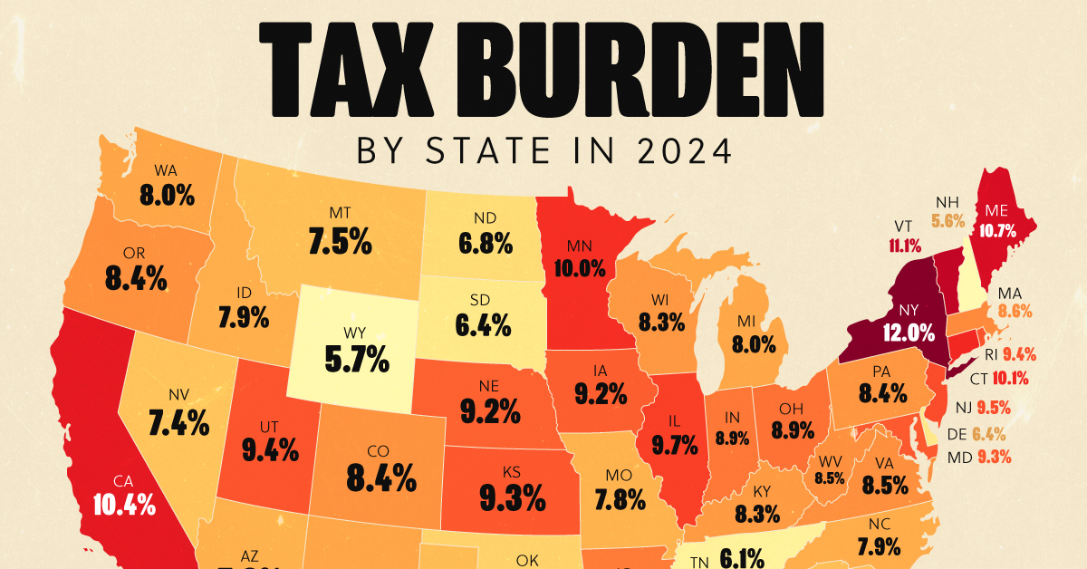
Visualizing the Tax Burden of Every U.S. State
This was originally posted on our Voronoi app. Download the app for free on iOS or Android and discover incredible data-driven charts from a variety of trusted sources.
This map graphic visualizes the total tax burden in each U.S. state as of March 2024, based on figures compiled by WalletHub.
It’s important to understand that under this methodology, the tax burden measures the percent of an average person’s income that is paid towards state and local taxes. It considers property taxes, income taxes, and sales & excise tax.
Data and Methodology
The figures we used to create this graphic are listed in the table below.
| State | Total Tax Burden |
|---|---|
| New York | 12.0% |
| Hawaii | 11.8% |
| Vermont | 11.1% |
| Maine | 10.7% |
| California | 10.4% |
| Connecticut | 10.1% |
| Minnesota | 10.0% |
| Illinois | 9.7% |
| New Jersey | 9.5% |
| Rhode Island | 9.4% |
| Utah | 9.4% |
| Kansas | 9.3% |
| Maryland | 9.3% |
| Iowa | 9.2% |
| Nebraska | 9.2% |
| Ohio | 8.9% |
| Indiana | 8.9% |
| Arkansas | 8.8% |
| Mississippi | 8.8% |
| Massachusetts | 8.6% |
| Virginia | 8.5% |
| West Virginia | 8.5% |
| Oregon | 8.4% |
| Colorado | 8.4% |
| Pennsylvania | 8.4% |
| Wisconsin | 8.3% |
| Louisiana | 8.3% |
| Kentucky | 8.3% |
| Washington | 8.0% |
| New Mexico | 8.0% |
| Michigan | 8.0% |
| North Carolina | 7.9% |
| Idaho | 7.9% |
| Arizona | 7.8% |
| Missouri | 7.8% |
| Georgia | 7.7% |
| Texas | 7.6% |
| Alabama | 7.5% |
| Montana | 7.5% |
| South Carolina | 7.5% |
| Nevada | 7.4% |
| Oklahoma | 7.0% |
| North Dakota | 6.8% |
| South Dakota | 6.4% |
| Delaware | 6.4% |
| Tennessee | 6.1% |
| Florida | 6.1% |
| Wyoming | 5.7% |
| New Hampshire | 5.6% |
| Alaska | 4.9% |
From this data we can see that New York has the highest total tax burden. Residents in this state will pay, on average, 12% of their income to state and local governments.
Breaking this down into its three components, the average New Yorker pays 4.6% of their income on income taxes, 4.4% on property taxes, and 3% in sales & excise taxes.
At the other end of the spectrum, Alaska has the lowest tax burden of any state, equaling 4.9% of income. This is partly due to the fact that Alaskans do not pay state income tax.
Hate Paying Taxes?
In addition to Alaska, there are several other U.S. states that don’t charge income taxes. These are: Florida, Nevada, South Dakota, Tennessee, Texas, Washington, and Wyoming.
It’s also worth noting that New Hampshire does not have a regular income tax, but does charge a flat 4% on interest and dividend income according to the Tax Foundation.
Learn More About Taxation From Visual Capitalist
If you enjoyed this post, be sure to check out this graphic which ranks the countries with the lowest corporate tax rates, from 1980 to today.

-
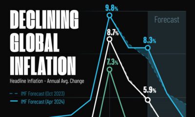
 Markets5 days ago
Visualizing Global Inflation Forecasts (2024-2026)
-

 Green2 weeks ago
The Carbon Footprint of Major Travel Methods
-

 United States2 weeks ago
Visualizing the Most Common Pets in the U.S.
-

 Culture2 weeks ago
The World’s Top Media Franchises by All-Time Revenue
-

 voronoi1 week ago
Best Visualizations of April on the Voronoi App
-

 Wealth1 week ago
Charted: Which Country Has the Most Billionaires in 2024?
-

 Business1 week ago
The Top Private Equity Firms by Country
-

 Markets1 week ago
The Best U.S. Companies to Work for According to LinkedIn