Markets
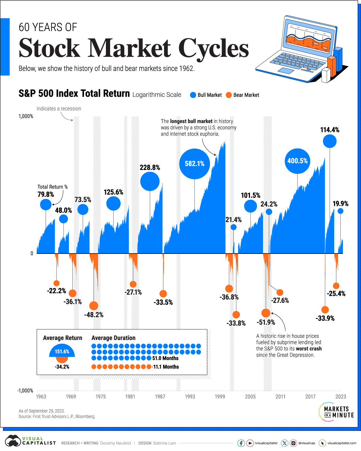
Visualizing 60 Years of Stock Market Cycles
Subscribe to the Advisor Channel free mailing list for more like this
Visualizing 60 Years of Stock Market Cycles
This was originally posted on Advisor Channel. Sign up to the free mailing list to get beautiful visualizations on financial markets that help advisors and their clients.
Today’s stock market is nothing short of unusual.
The S&P 500 has climbed over 24% to date against a backdrop of strong economic growth and rising interest rates. Despite these factors, the unemployment rate has remained low at 3.7% as of November, and inflation has moderated.
To give some context on the current stock market cycle, this graphic shows 60 years of bull and bear markets, with data from First Trust.
Bulls and Bears Over History
A bear market takes place when a stock market index declines 20% from its peak.
Once stocks fully recover and exceed this peak, it enters a bull market. This can happen over the course of months or years. But as the table below shows, bear markets have been much shorter than bull markets since 1962:
| Market | Average Return* | Average Duration |
|---|---|---|
| 📈 Bull Market | +151.6% | 51.0 Months |
| 📉 Bear Market | -34.2% | 11.1 Months |
*As of September 29, 2022.
The longest bear markets over this period were in the early 1970s and 1980s, both lasting roughly 20 months. In both cases, high inflation led the Fed to tighten monetary policy, triggering each recession. In 1974, the S&P plummeted 48.2% from its peak, in one of the sharpest declines since WWII.
On the other hand, the longest bull market took place through the 1990s amid a roaring U.S. economy. Lasting over 12 years, it reached an apex during the Dotcom boom. Over the course of the bull market, the S&P 500 advanced 582.1%.
After the 2008 Global Financial Crisis, the stock market witnessed another expansive bull run, this time lasting 11 years. Ultra-low interest rates and the outperformance of big tech in particular defined the cycle.
In many cases, stock market peaks happen before a recession begins. Consider how in 2007, the S&P 500 hit a high in October before the recession officially began in December. Similarly, the S&P 500 peaked in September 2000, six months before the 2001 recession officially started.
How Can Investors Prepare for a Bear Market?
No one knows when a bear market will begin, but there are strategies that investors can use to build a more resilient portfolio.
Diversifying across sectors is one approach. Consider how cyclical sectors, such as tech and real estate tend to rise when the market is on the upswing. By contrast, when the market takes a turn, traditionally more defensive sectors like consumer staples outperform.
Asset class diversification is another tactic. Including bonds in a portfolio typically reduces risk given their stable cash flows and historically low correlation to stocks. International stocks also have a lower correlation to U.S. equities which means that when U.S. stocks are down, these types of assets can help buffer the loss.
The good news is that the S&P 500 has seen +11.5% average historical returns since 1928. Overall, the majority of stock market cycles take place in bull territory both in terms of net return appreciation and length of time by a wide margin.


Markets
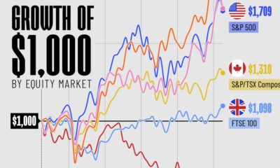
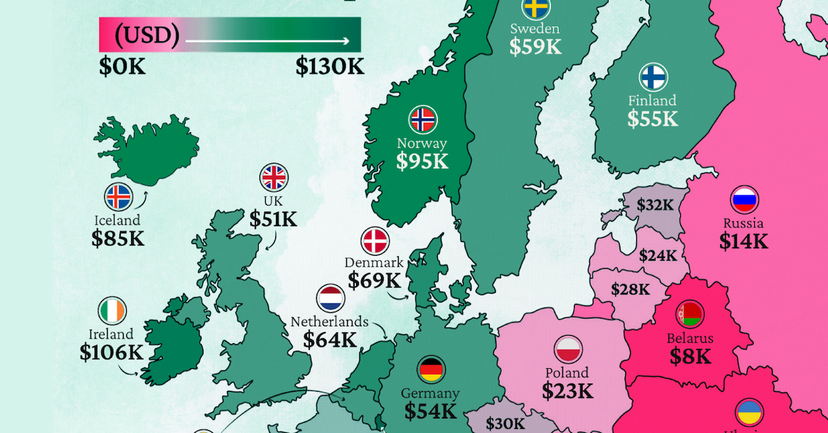
Mapped: Europe’s GDP Per Capita, by Country
Which European economies are richest on a GDP per capita basis? This map shows the results for 44 countries across the continent.
Mapped: Europe’s GDP Per Capita, by Country (2024)
This was originally posted on our Voronoi app. Download the app for free on iOS or Android and discover incredible data-driven charts from a variety of trusted sources.
Europe is home to some of the largest and most sophisticated economies in the world. But how do countries in the region compare with each other on a per capita productivity basis?
In this map, we show Europe’s GDP per capita levels across 44 nations in current U.S. dollars. Data for this visualization and article is sourced from the International Monetary Fund (IMF) via their DataMapper tool, updated April 2024.
Europe’s Richest and Poorest Nations, By GDP Per Capita
Luxembourg, Ireland, and Switzerland, lead the list of Europe’s richest nations by GDP per capita, all above $100,000.
| Rank | Country | GDP Per Capita (2024) |
|---|---|---|
| 1 | 🇱🇺 Luxembourg | $131,380 |
| 2 | 🇮🇪 Ireland | $106,060 |
| 3 | 🇨🇭 Switzerland | $105,670 |
| 4 | 🇳🇴 Norway | $94,660 |
| 5 | 🇮🇸 Iceland | $84,590 |
| 6 | 🇩🇰 Denmark | $68,900 |
| 7 | 🇳🇱 Netherlands | $63,750 |
| 8 | 🇸🇲 San Marino | $59,410 |
| 9 | 🇦🇹 Austria | $59,230 |
| 10 | 🇸🇪 Sweden | $58,530 |
| 11 | 🇧🇪 Belgium | $55,540 |
| 12 | 🇫🇮 Finland | $55,130 |
| 13 | 🇩🇪 Germany | $54,290 |
| 14 | 🇬🇧 UK | $51,070 |
| 15 | 🇫🇷 France | $47,360 |
| 16 | 🇦🇩 Andorra | $44,900 |
| 17 | 🇲🇹 Malta | $41,740 |
| 18 | 🇮🇹 Italy | $39,580 |
| 19 | 🇨🇾 Cyprus | $37,150 |
| 20 | 🇪🇸 Spain | $34,050 |
| 21 | 🇸🇮 Slovenia | $34,030 |
| 22 | 🇪🇪 Estonia | $31,850 |
| 23 | 🇨🇿 Czech Republic | $29,800 |
| 24 | 🇵🇹 Portugal | $28,970 |
| 25 | 🇱🇹 Lithuania | $28,410 |
| 26 | 🇸🇰 Slovakia | $25,930 |
| 27 | 🇱🇻 Latvia | $24,190 |
| 28 | 🇬🇷 Greece | $23,970 |
| 29 | 🇭🇺 Hungary | $23,320 |
| 30 | 🇵🇱 Poland | $23,010 |
| 31 | 🇭🇷 Croatia | $22,970 |
| 32 | 🇷🇴 Romania | $19,530 |
| 33 | 🇧🇬 Bulgaria | $16,940 |
| 34 | 🇷🇺 Russia | $14,390 |
| 35 | 🇹🇷 Türkiye | $12,760 |
| 36 | 🇲🇪 Montenegro | $12,650 |
| 37 | 🇷🇸 Serbia | $12,380 |
| 38 | 🇦🇱 Albania | $8,920 |
| 39 | 🇧🇦 Bosnia & Herzegovina | $8,420 |
| 40 | 🇲🇰 North Macedonia | $7,690 |
| 41 | 🇧🇾 Belarus | $7,560 |
| 42 | 🇲🇩 Moldova | $7,490 |
| 43 | 🇽🇰 Kosovo | $6,390 |
| 44 | 🇺🇦 Ukraine | $5,660 |
| N/A | 🇪🇺 EU Average | $44,200 |
Note: Figures are rounded.
Three Nordic countries (Norway, Iceland, Denmark) also place highly, between $70,000-90,000. Other Nordic peers, Sweden and Finland rank just outside the top 10, between $55,000-60,000.
Meanwhile, Europe’s biggest economies in absolute terms, Germany, UK, and France, rank closer to the middle of the top 20, with GDP per capitas around $50,000.
Finally, at the end of the scale, Eastern Europe as a whole tends to have much lower per capita GDPs. In that group, Ukraine ranks last, at $5,660.
A Closer Look at Ukraine
For a broader comparison, Ukraine’s per capita GDP is similar to Iran ($5,310), El Salvador ($5,540), and Guatemala ($5,680).
According to experts, Ukraine’s economy has historically underperformed to expectations. After the fall of the Berlin Wall, the economy contracted for five straight years. Its transition to a Western, liberalized economic structure was overshadowed by widespread corruption, a limited taxpool, and few revenue sources.
Politically, its transformation from authoritarian regime to civil democracy has proved difficult, especially when it comes to institution building.
Finally, after the 2022 invasion of the country, Ukraine’s GDP contracted by 30% in a single year—the largest loss since independence. Large scale emigration—to the tune of six million refugees—is also playing a role.
Despite these challenges, the country’s economic growth has somewhat stabilized while fighting continues.

-

 Brands5 days ago
The Evolution of U.S. Beer Logos
-

 Culture2 weeks ago
The World’s Top Media Franchises by All-Time Revenue
-

 voronoi2 weeks ago
Best Visualizations of April on the Voronoi App
-

 Wealth2 weeks ago
Charted: Which Country Has the Most Billionaires in 2024?
-

 Business1 week ago
The Top Private Equity Firms by Country
-

 Markets1 week ago
The Best U.S. Companies to Work for According to LinkedIn
-

 Economy1 week ago
Ranked: The Top 20 Countries in Debt to China
-

 Politics1 week ago
Charted: Trust in Government Institutions by G7 Countries