Energy
The Decline of Coal in Three Charts
The Decline of Coal in Three Charts
How coal went from hero to zero in just five short years.
The Chart of the Week is a weekly Visual Capitalist feature on Fridays.
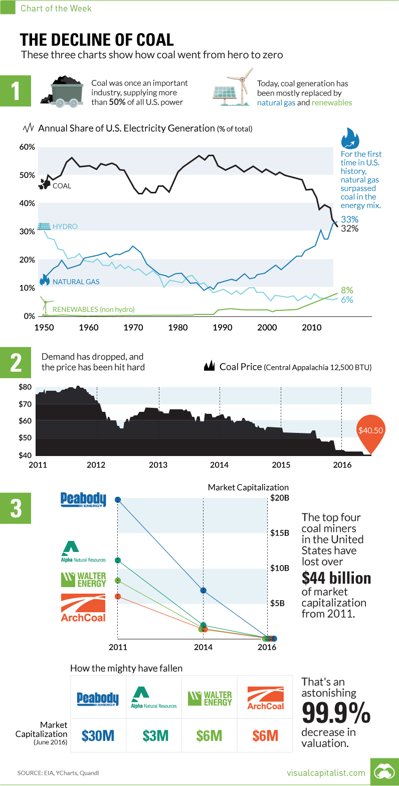
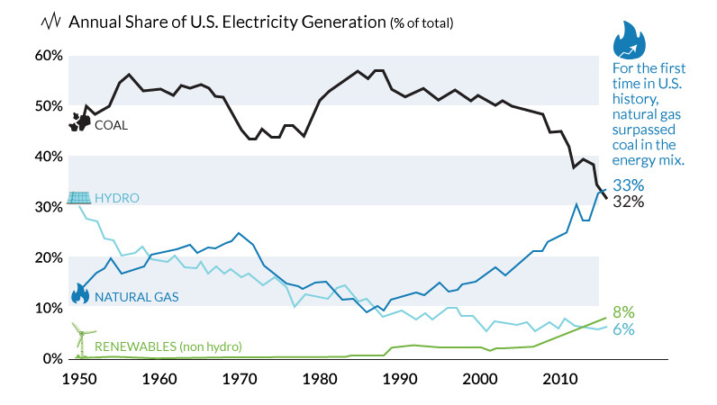
There was a time in the not so distant past that coal was the unquestioned all-star of the energy mix.
Just over a decade ago, coal-fired power generated more than 50% of U.S. electricity. Coal is cheap and found almost everywhere, but it’s also extremely easy to scale with. If you need more power, just burn more coal.
However, the decline of coal has been swift and unprecedented. That’s why it is expected that by 2020, only 22% of electricity will be generated from the fossil fuel.
What’s Behind the Decline of Coal?
While there is obvious environmental pressure on miners and utilities in the coal business, the number one coal killer is an unlikely source: hydraulic fracturing and horizontal drilling.
These two technologies have led to a natural gas supply boom, making the United States the top natural gas producer in the world. From 2005 to 2010, natural gas mostly traded in a range between $5-10 per mcf. Today, excess supply has brought it to a range between $2-3 per mcf, making it extremely desirable for utilities.
This year, for the first time ever, natural gas has surpassed coal in use for power generation in the United States. The EIA expects natural gas and coal to make up 33% and 32% respectively in the energy mix for 2016.
How the Mighty Have Fallen
Not surprisingly, shrinking demand has led to a collapse in coal prices.
The decrease in revenues have slashed margins, and now equity in some of the biggest coal miners in the world is almost worthless. Similar to some oil and gas companies, many coal miners accumulated major debt loads when prices were high and demand seemed sustainable.
Now major US coal miners such as Peabody Energy and ArchCoal have been obliterated:
| 2011 | 2014 | 2016 | |
|---|---|---|---|
| Peabody | $19.7 billion | $7 billion | $0.030 billion |
| Arch Coal | $6.0 billion | $1 billion | $0.006 billion |
| Alpha Natural | $10.7 billion | $1.6 billion | $0.003 billion |
| Walter Energy | $8.2 billion | $1 billion | $0.006 billion |
| Total | $44.6 billion | $10.6 billion | $0.045 billion |
The top four miners have lost over $44 billion in market capitalization from their recent peaks in 2011.
That’s an astonishing 99.9% decrease in value, and possibly exemplifies the decline of coal better than anything else.


Energy
Mapped: The Age of Energy Projects in Interconnection Queues, by State
This map shows how many energy projects are in interconnection queues by state and how long these projects have been queued up, on average.
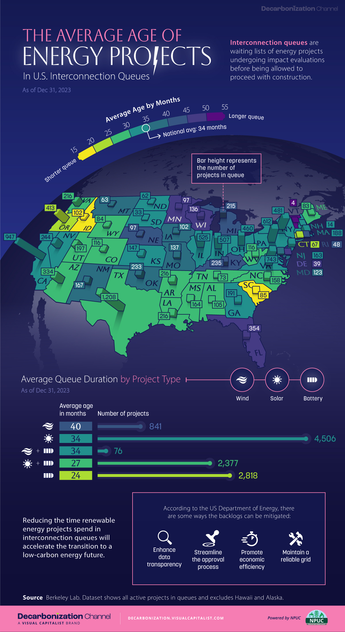
Age of Energy Projects in Interconnection Queues, by State
This was originally posted on our Voronoi app. Download the app for free on iOS or Android and discover incredible data-driven charts from a variety of trusted sources.
By the end of 2023, more than 11,000 energy projects were in interconnection queues in the United States, waiting for a green-light from regional grid operators to proceed with construction.
This map, created in partnership with the National Public Utilities Council, maps out the average age of active energy projects in interconnection queues by state, using data from Berkeley Lab.
Interconnection Queues, Explained
Interconnection queues are lists of energy projects that have made interconnection requests to their regional grid operators. Once submitted, these requests formally initiate the impact study process that each project goes through before grid connection, forming waiting lists for approval known as interconnection queues.
In recent years, both the number and generation capacity of queued projects have surged in the United States, along with the length of time spent in queue.
According to Berkeley Lab, the amount of generation capacity entering queues each year has risen by more than 550% from 2015 to 2023, with average queue duration rising from 3 years to 5 years the same period.
As a result of the growing backlog, a large proportion of projects ultimately withdraw from queues, leading to only 19% of applications reaching commercial operations.
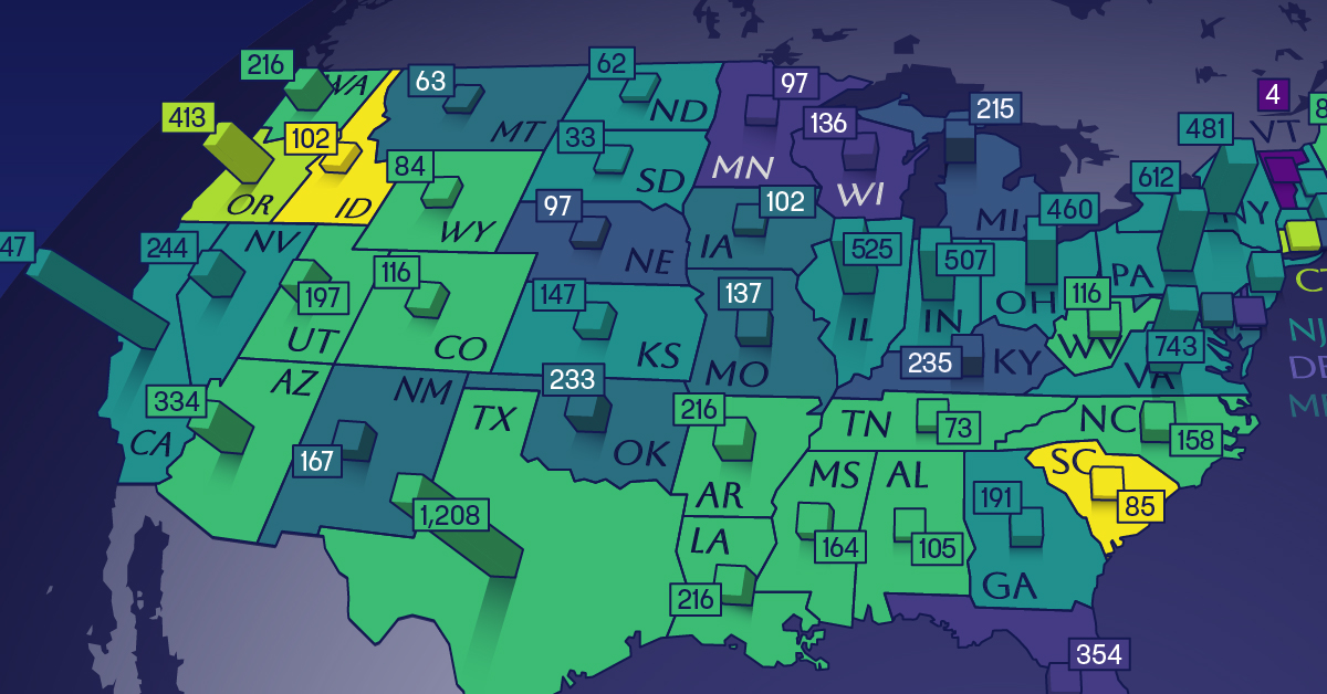
The Backlog: Number of Projects and Average Wait Times
Of the 11,000 active projects in U.S. queues at the end of 2023, Texas, California, and Virginia had the most in queue; 1,208, 947, and 743, respectively.
When looking at the average ages of these projects, all three states hovered around the national average of 34 months (2.83 years), with Texas sporting 28 months, California 33, and Virginia 34.
Vermont, Minnesota, Wisconsin, and Florida, on the other hand, had the highest average queue durations; 54, 49, 47, and 46 months, respectively.
Average Queue Duration by Project Type
At the end of 2023, more than 95% of the generation capacity in active interconnection queues was for emission-free resources. The table below provides a breakdown.
| Project Type | Average Queue Duration (As of 12/31/2023) | Number of Projects in Queue |
|---|---|---|
| Wind | 40 months | 841 |
| Solar | 34 months | 4,506 |
| Wind+Battery | 34 months | 76 |
| Solar+Battery | 27 months | 2,377 |
| Battery | 24 months | 2,818 |
Wind projects had the highest wait times at the end of 2023 with an average age of 40 months (3.33 years). Solar projects, on the other hand, made up more than 40% of projects in queue.
Overall, reducing the time that these renewable energy projects spend in queues can accelerate the transition to a low-carbon energy future.
According to the U.S. Department of Energy, enhancing data transparency, streamlining approval processes, promoting economic efficiency, and maintaining a reliable grid are some of the ways this growing backlog can be mitigated.

-

 Money6 days ago
Charted: Which Country Has the Most Billionaires in 2024?
-

 Energy2 weeks ago
Ranked: The Top 10 EV Battery Manufacturers in 2023
-

 Countries2 weeks ago
Countries With the Largest Happiness Gains Since 2010
-

 Economy2 weeks ago
VC+: Get Our Key Takeaways From the IMF’s World Economic Outlook
-

 Demographics2 weeks ago
The Countries That Have Become Sadder Since 2010
-

 Money2 weeks ago
Charted: Who Has Savings in This Economy?
-

 Technology2 weeks ago
Visualizing AI Patents by Country
-

 Economy1 week ago
Economic Growth Forecasts for G7 and BRICS Countries in 2024