Misc
Visualized: Comparing the Titanic to a Modern Cruise Ship
View the full-resolution version of this infographic


Remembering the Tragedy of the Titanic
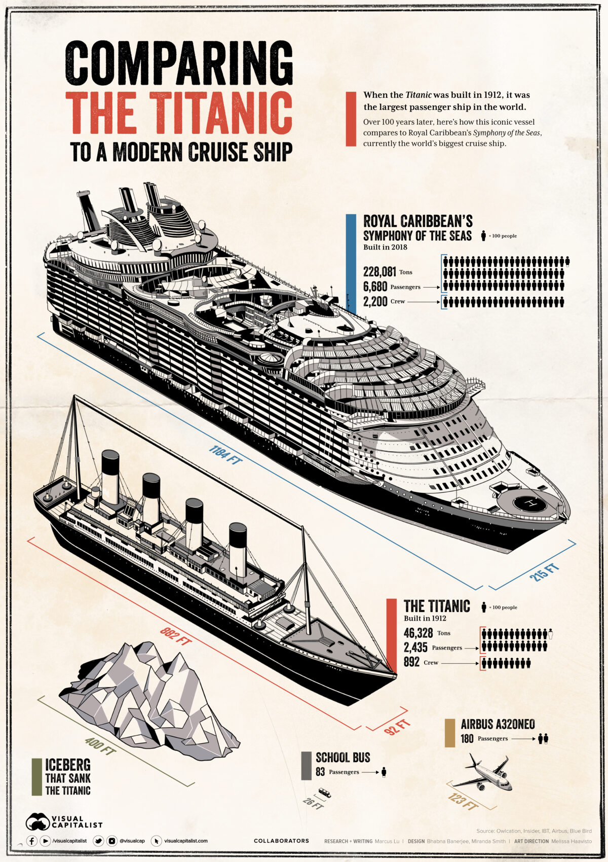
When the Titanic was completed on April 2, 1912, it was the largest and perhaps most luxurious ship in the world. The vessel could hold over 3,300 people including crew members, and boasted various amenities including a swimming pool and squash court.
The Titanic’s impressive size attracted many of the world’s wealthiest individuals, and on April 10, 1912, it set out on its maiden voyage. Just five days later, the ship sank after hitting an iceberg, resulting in more than 1,500 deaths.
It’s been over 100 years since the Titanic’s demise, so how have passenger ships evolved?
To find out, we’ve visualized it beside Royal Caribbean’s Symphony of the Seas, currently the world’s largest cruise ship.
The Size of the Titanic, in Perspective
The following table lists the dimensions of both ships to provide a better understanding of the Titanic’s relative size.
| RMS Titanic | Symphony of the Seas | |
|---|---|---|
| Year Built | 1912 | 2018 |
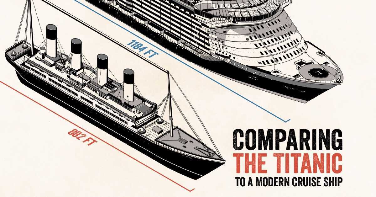
| Length | 882ft (269m) | 1,184ft (361m) |
| Width | 92ft (28m) | 215ft (66m) |
| Height | 175ft (53m) | 238ft (73m) |
| Internal volume | 46,328 gross register tonnage (grt) | 228,081 gross tonnage (gt) |
| Passengers | 2,435 | 6,680 |
| Crew | 892 | 2,200 |
Source: Owlcation, Insider
Note: Gross register tonnage (grt) is a historic measure of a ship’s internal volume. This metric was replaced by gross tonnage (gt) on July 18, 1982.
One of the biggest differences between these two ships is width, with the latter being more than twice as wide. This is likely due to the vast amenities housed within the Symphony of the Seas, which includes 24 pools, 22 restaurants, 2 rock climbing walls, an ice-skating rink, and more. With accommodations for 6,680 passengers, the Symphony of the Seas also supports a crew that is 147% larger.
The Symphony of the Seas clearly surpasses the Titanic in terms of size, but there’s also a substantial difference in cost. When converted to today’s dollars, the bill for the Titanic equates to roughly $400 million, less than half of the Symphony of the Seas’ cost of $1.35 billion.
Lessons Learned from the Disaster
Inadequate safety preparations were a contributor to the Titanic’s high death toll. During its journey, the vessel carried enough lifeboats to accommodate just 33% of its total passengers and crew. This was legal at the time, as regulations based a ship’s number of required lifeboats on its weight, rather than its passenger capacity.
To make matters worse, investigations determined that the Titanic’s lifeboats had not been used to their full capacity, and that a scheduled lifeboat drill had been cancelled by the ship’s captain. These shortfalls, among others, paved the way for numerous improvements in maritime safety regulation.
These include the creation of the International Convention for the Safety of Life at Sea Treaty (SOLAS) in 1914, which is still in force today. Regarded as the most important international treaty on ship safety, SOLAS has been updated numerous times and is followed by 164 states, which together flag 99% of merchant ships (by gross tonnage) on the high seas today.


VC+
VC+: Get Our Key Takeaways From the IMF’s World Economic Outlook
A sneak preview of the exclusive VC+ Special Dispatch—your shortcut to understanding IMF’s World Economic Outlook report.

Have you read IMF’s latest World Economic Outlook yet? At a daunting 202 pages, we don’t blame you if it’s still on your to-do list.
But don’t worry, you don’t need to read the whole April release, because we’ve already done the hard work for you.
To save you time and effort, the Visual Capitalist team has compiled a visual analysis of everything you need to know from the report—and our VC+ Special Dispatch is available exclusively to VC+ members. All you need to do is log into the VC+ Archive.
If you’re not already subscribed to VC+, make sure you sign up now to access the full analysis of the IMF report, and more (we release similar deep dives every week).
For now, here’s what VC+ members get to see.
Your Shortcut to Understanding IMF’s World Economic Outlook
With long and short-term growth prospects declining for many countries around the world, this Special Dispatch offers a visual analysis of the key figures and takeaways from the IMF’s report including:
- The global decline in economic growth forecasts
- Real GDP growth and inflation forecasts for major nations in 2024
- When interest rate cuts will happen and interest rate forecasts
- How debt-to-GDP ratios have changed since 2000
- And much more!

Get the Full Breakdown in the Next VC+ Special Dispatch
VC+ members can access the full Special Dispatch by logging into the VC+ Archive, where you can also check out previous releases.
Make sure you join VC+ now to see exclusive charts and the full analysis of key takeaways from IMF’s World Economic Outlook.
Don’t miss out. Become a VC+ member today.
What You Get When You Become a VC+ Member
VC+ is Visual Capitalist’s premium subscription. As a member, you’ll get the following:
- Special Dispatches: Deep dive visual briefings on crucial reports and global trends
- Markets This Month: A snappy summary of the state of the markets and what to look out for
- The Trendline: Weekly curation of the best visualizations from across the globe
- Global Forecast Series: Our flagship annual report that covers everything you need to know related to the economy, markets, geopolitics, and the latest tech trends
- VC+ Archive: Hundreds of previously released VC+ briefings and reports that you’ve been missing out on, all in one dedicated hub
You can get all of the above, and more, by joining VC+ today.

-

 Education1 week ago
How Hard Is It to Get Into an Ivy League School?
-

 Technology2 weeks ago
Ranked: Semiconductor Companies by Industry Revenue Share
-

 Markets2 weeks ago
Ranked: The World’s Top Flight Routes, by Revenue
-

 Demographics2 weeks ago
Population Projections: The World’s 6 Largest Countries in 2075
-

 Markets2 weeks ago
The Top 10 States by Real GDP Growth in 2023
-

 Demographics2 weeks ago
The Smallest Gender Wage Gaps in OECD Countries
-

 Economy2 weeks ago
Where U.S. Inflation Hit the Hardest in March 2024
-

 Environment2 weeks ago
Top Countries By Forest Growth Since 2001