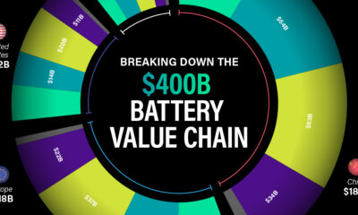

In this graphic, we break down where the $400 billion lithium battery industry will generate revenue in 2030.
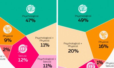

This infographic shows the types of workplace violence and harassment faced by people in the global workplace.
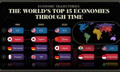

We provide a historical and predictive overview of the top economies in the world, including projections all the way to 2075.
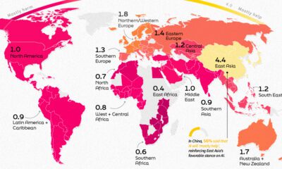

This infographic shows public perception of AI all over the globe and how this sentiment is affected by where you live.
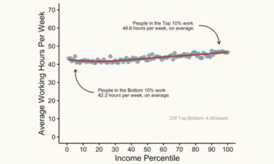

This graphic shows the average working hours between higher and lower-income groups in America, based on income percentile.
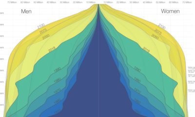

The world is in the midst of a notable demographic transition. Here's how the world population pyramid will change as we close in on the year...
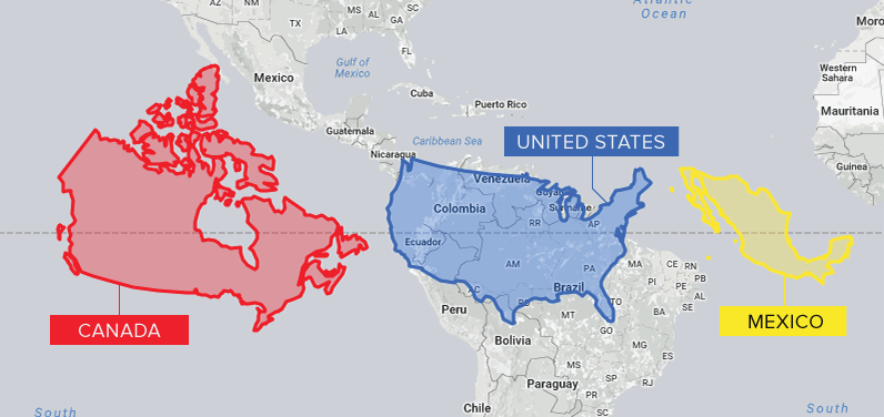
Conventional cartographic techniques have caused many to have a skewed perception of the true size of countries. Can an equal-area map provide clarity?
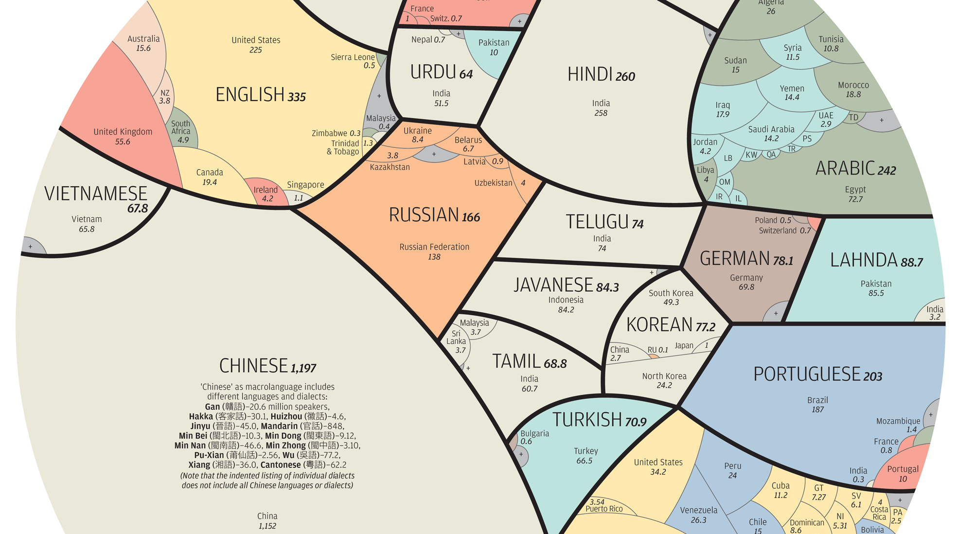
See the world's major languages broken down by country in this stunning visualization.
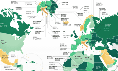

These maps show the most (and least) costly countries for starting a business by relative costs.
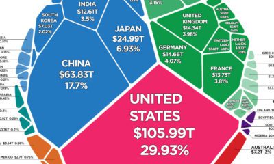

There is $360.6 trillion of wealth globally. This graphic shows how it breaks down by country, to show who owns all of the world's wealth.


 Creator Program