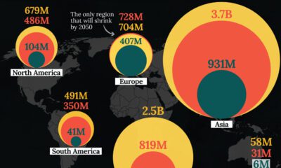

In this visualization, we map the populations of major regions at three different points in time: 1900, 2000, and 2050 (forecasted).
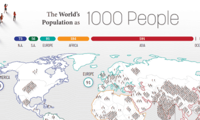

How would all the people in the world be spread out if there were only 1,000 people on Earth? This interactive map examines the breakdown.
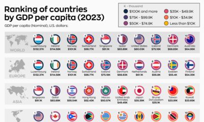

What are the world's top countries by GDP per capita? How do those rankings change when we adjust for purchasing power parity?
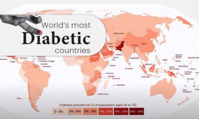

Diabetes affects millions of people around the world, but the spread isn't equal. This map highlights diabetes rates by country in 2021.
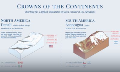

What are the highest mountains in different parts of the world? This visual maps the three tallest mountains by elevation in each continent.
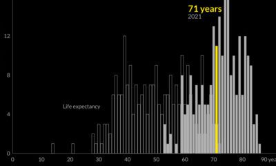

Global life expectancy has been increasing worldwide over the last 70 years. But how does the picture break down by region and by sex?
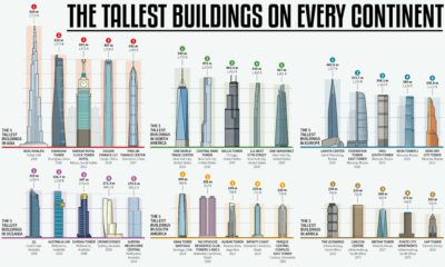

How much higher and further into the skies can we reach? This infographic looks at the most impressive skyscrapers gracing every continent.
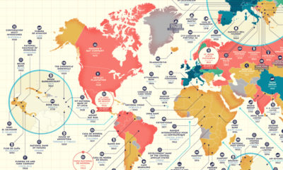

Which companies have stood the test of time? This detailed map highlights the oldest company in every country that is still in business.