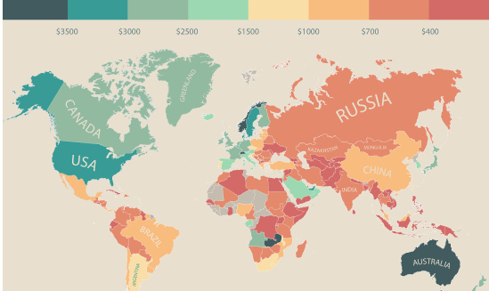
In this infographic, monthly disposable income around the world is mapped by state and country. Switzerland leads the pack with $6,301 in income per month.
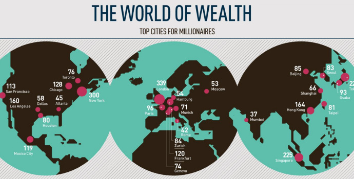
This infographic breaks down the top cities for millionaires sorted by density and total population, as well as providing demographics.
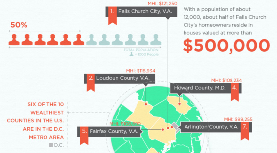
The richest counties in America by median income are not located near Silicon Valley or adjacent to Wall Street. They are not in oil rich Texas...
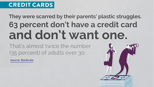
What do Millennials think about money? This infographic covers interesting points on Millennial beliefs in personal finances.
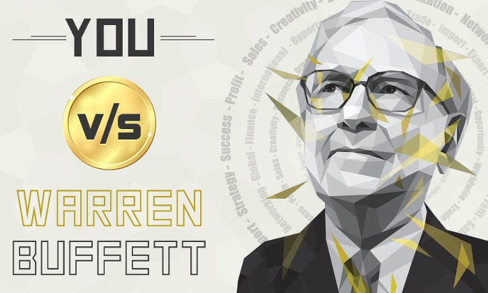
How do you stack up against Warren Buffett? This infographic shows what you could buy with his income as well as sound advice for 2015.

This infographic, Part 1 of 4, covers the properties and history of silver, with its use in monetary, health, and industrial areas.
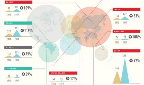
Where do the world's millionaires live? In these infographics, we look at country, density per city, and also developing countries.
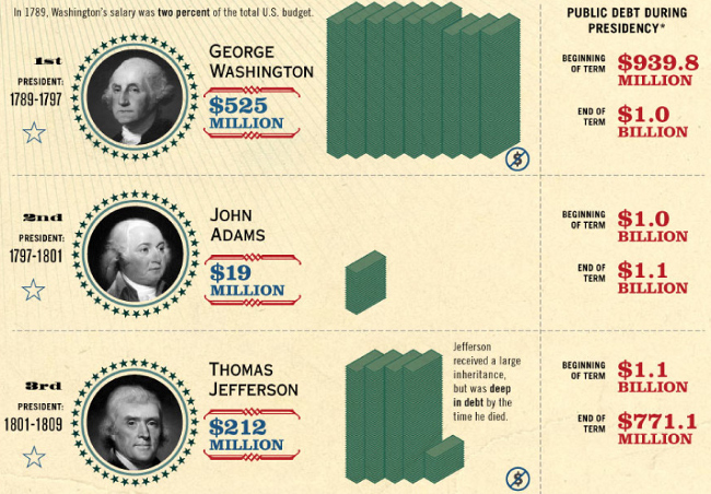
Who were the wealthiest US presidents in history? A look at wealth, debt, and net worth of every US president since George Washington.

How many billionaires are there and how much wealth do they control? Source: Investing Tips 360


