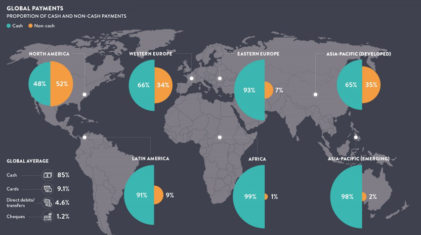
The world is increasingly becoming a cashless society. See the progress in this monumental shift, along with the pros and cons behind the death of cash.
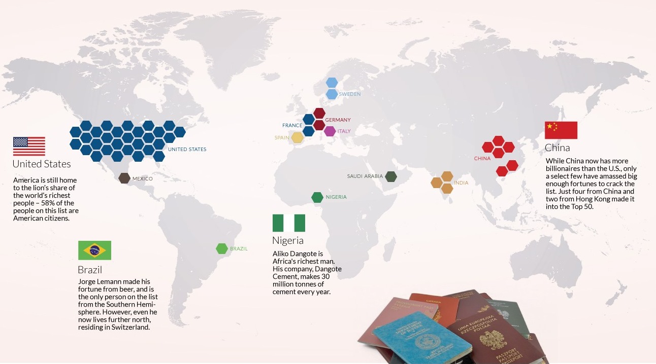
This stunning data visualization breaks down the top 50 wealthiest billionaires by industry, age, country, as well as the size of their fortunes.
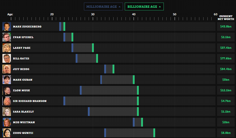
Is it the first million or billion that is the hardest? See how long it took these entrepreneurs to go from millionaire to billionaire.
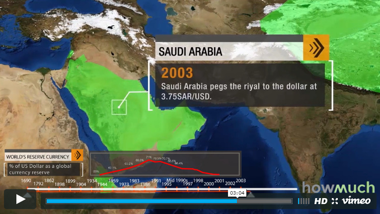
The U.S. dollar is the dominant reserve currency, making up 64% of global reserves. How did this come to be, and what does the future hold...

The Money Project uses rich visuals such as infographics and data visualizations to explore the concept and implications of money.
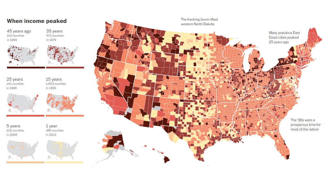
This map visualizes when the household median incomes of U.S. counties reached "peak income". For more than 80% of counties, this was over 15 years ago.
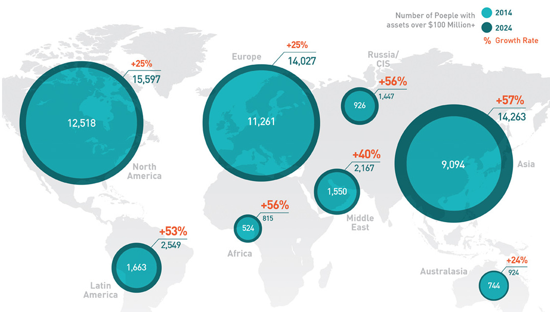
In the old days, speculators would follow the gold rushes. Now, it's emerging markets that provide the big chance to become the next centimillionaire.
This infographic covers 33 little-known U.S. currency facts about the bills and coins in circulation today.
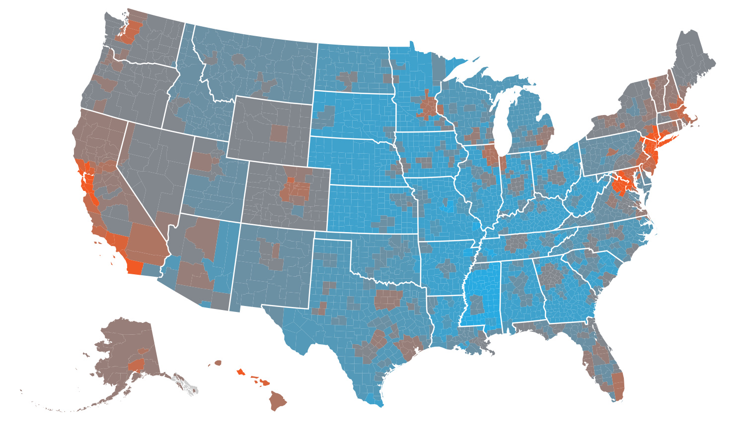
The cost of living by state and county varies significantly. Here's how far $100 will go in every part of America.

Who are the world's wealthiest people in 2015? This infographic shows the trends as well as the top 10 billionaires, and how they amassed their fortunes.


