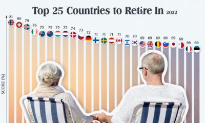

Which countries are the best equipped to support their aging population? This graphic show the best countries to retire in around the world.
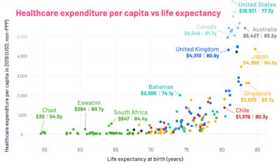

This graphic looks at average life expectancies in countries around the world, compared to each country's healthcare spending per capita.
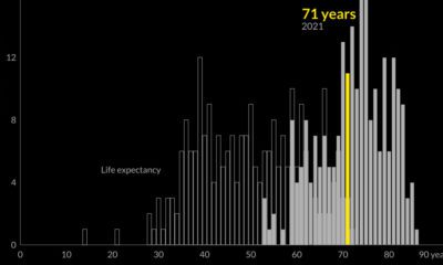

Global life expectancy has been increasing worldwide over the last 70 years. But how does the picture break down by region and by sex?
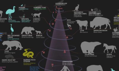

Human life expectancy is more than twice as long as it was in the 19th century. How do our lifespans rank compared to 49 other animals?
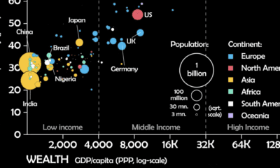

This unique animated visualization uses health and wealth measurements to chart the evolution of countries over time.


 Creator Program