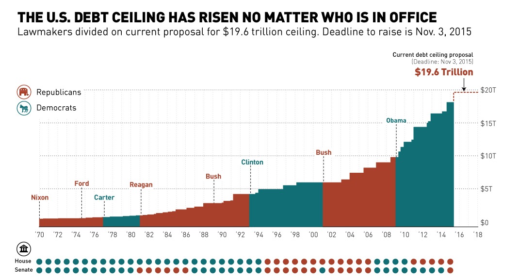
This chart shows the history of the U.S. debt ceiling from 1970 until today, including the current proposal to increase it to $19.6 trillion.
The euro has fallen precipitously since the beginning of the Financial Crisis in terms of USD. Crises plague the eurozone - will it be able to...
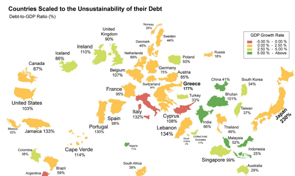
What if the world was remapped based on national debt levels? What would the largest country be? See the world map of debt.
In terms of actual capacity to pay debt, the United States has the 2nd highest amount in the world. We compare debt to revenue in this...
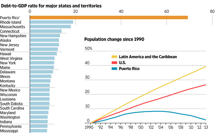
Puerto Rico is the latest jurisdiction to toss in the towel, with the Governor warning that the island is close to falling into a debt "death...
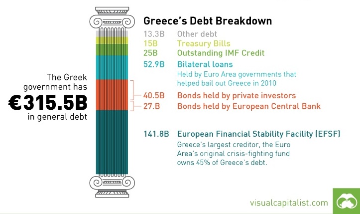
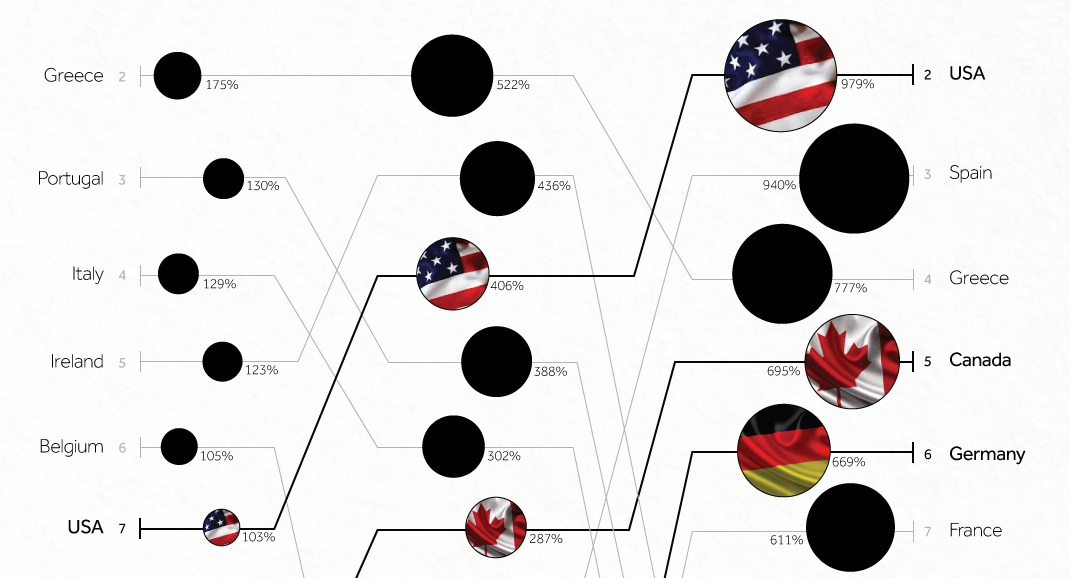
Today's Chart of the Week looks at Greece's debt and which countries and entities are on the hook if a default takes place.

How did the European Debt Crisis begin? This video explains how countries in the Eurozone built up such troublesome debt.

If a junior mining company is in a dire enough situation, they may hit the "reset" button and rollback their stock. Here's how it works.

What do Millennials think about money? This infographic covers interesting points on Millennial beliefs in personal finances.

The Gold Series Part 5: 2014 Trends and Beyond This infographic, the finale of our five part 2014 Gold Series, covers gold trends that investors should...


