Visualizing Global Inflation Forecasts (2024-2026)
The World’s Fastest Growing Emerging Markets (2024-2029 Forecast)
The Most Valuable Companies in Major EU Economies
Visualized: Interest Rate Forecasts for Advanced Economies
The Best U.S. Companies to Work for According to LinkedIn
All of the Grants Given by the U.S. CHIPS Act
Visualizing AI Patents by Country
How Tech Logos Have Evolved Over Time
Ranked: Semiconductor Companies by Industry Revenue Share
The Stock Performance of U.S. Chipmakers So Far in 2024
Ranked: The Top 20 Countries in Debt to China
Charted: Which Country Has the Most Billionaires in 2024?
Charted: Which City Has the Most Billionaires in 2024?
Charted: Who Has Savings in This Economy?
How Debt-to-GDP Ratios Have Changed Since 2000
What Causes Preventable Child Deaths?
The Cost of an EpiPen in Major Markets
Charted: Global Tobacco Use by Country and Sex
Visualized: What Lives in Your Gut Microbiome?
Charted: Average Years Left to Live by Age
Who’s Building the Most Solar Energy?
Mapped: The Age of Energy Projects in Interconnection Queues, by State
Ranked: The Top 10 EV Battery Manufacturers in 2023
The World’s Biggest Nuclear Energy Producers
The World’s Biggest Oil Producers in 2023
The Largest Earthquakes in the New York Area (1970-2024)
Mapped: Average Wages Across Europe
Mapped: Asia’s Population Patterns by Density
A Map of Global Happiness By Country in 2024
Mapped: Population Growth by Region (1900-2050F)
Visualizing Global Gold Production in 2023
Gold vs. S&P 500: Which Has Grown More Over Five Years?
Charted: The Value Gap Between the Gold Price and Gold Miners
Charted: Global Uranium Reserves, by Country
The Carbon Footprint of Major Travel Methods
Ranking the Top 15 Countries by Carbon Tax Revenue
Ranked: The Countries With the Most Air Pollution in 2023
Top Countries By Forest Growth Since 2001
Ranked: Top Countries by Total Forest Loss Since 2001
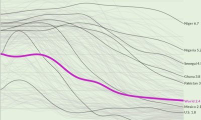
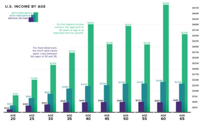
...2) Income is positively correlated with age How do these beliefs stand up to the actual income data? As it turns out, quite well. Today’s data,...
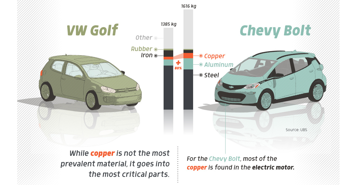
...Electric, the More Copper According to Copper.org, along the scale from gas-powered cars to fully electrical vehicles, copper use increases dramatically. Conventional gas-powered cars contain 18...
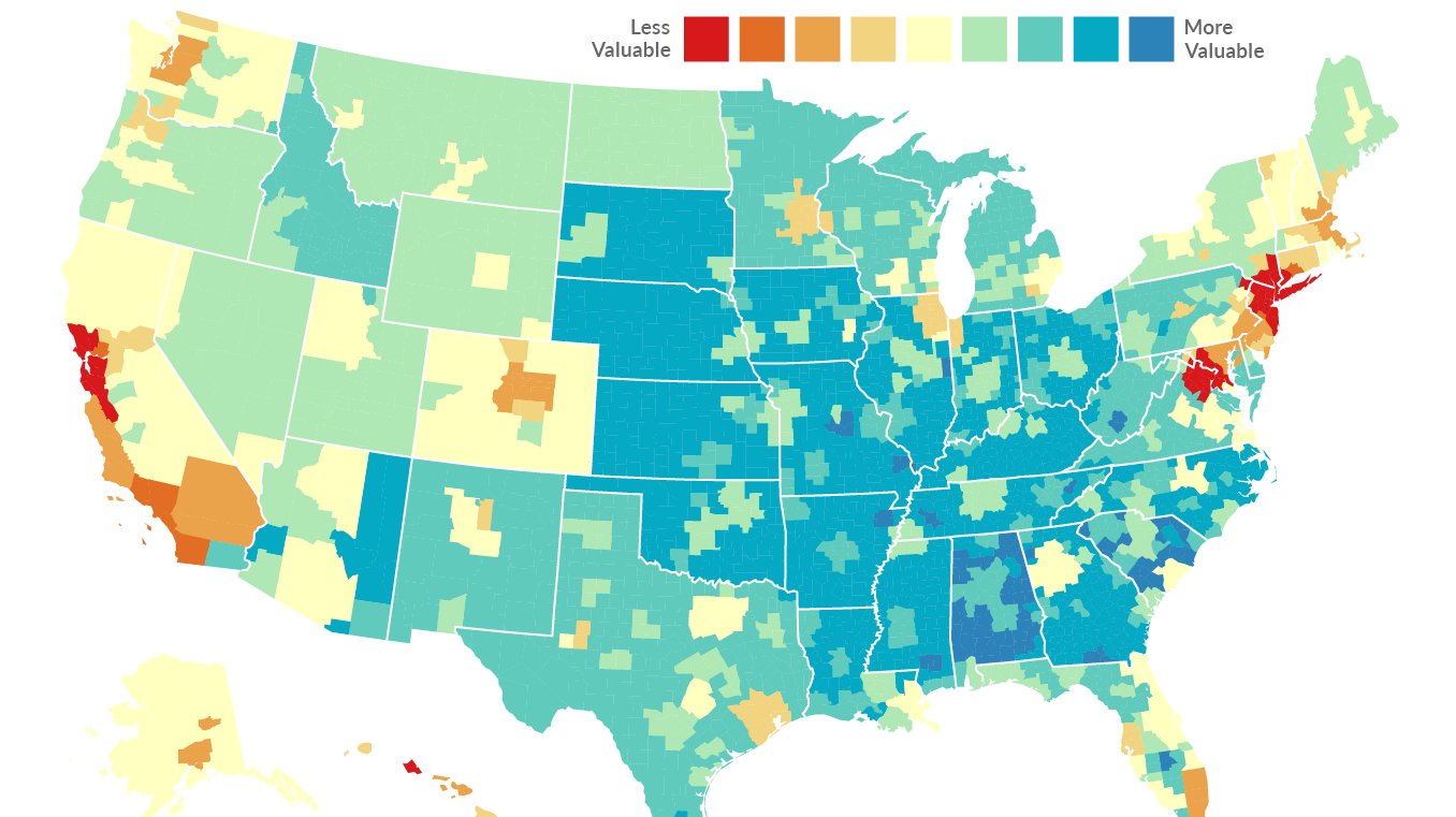
...greatly impacting purchasing power and the cost of living. Sometimes even a short one-hour drive can make a difference in some cases. Today’s two maps come...
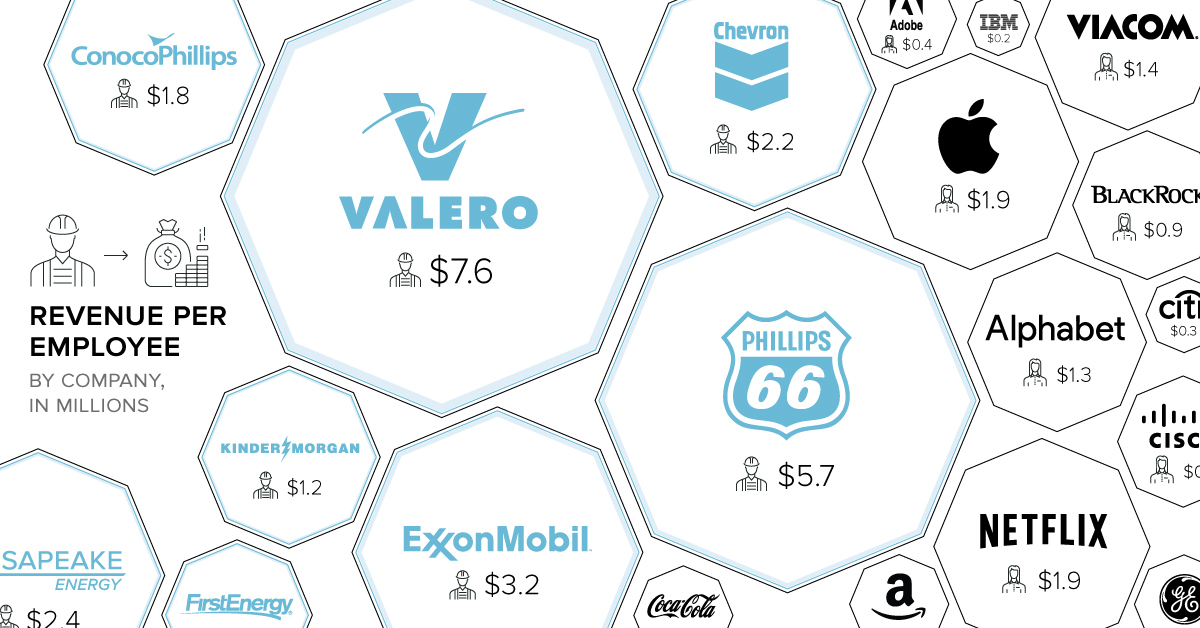
...weekly Visual Capitalist feature on Fridays. The world’s largest companies have many similarities, but the size of their respective org charts is not necessarily one of...
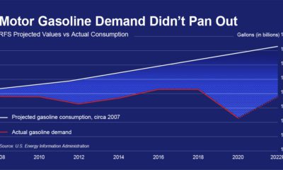
...As a result, the RFS needs to undergo urgent reform in order to be better aligned with the realities of modern gasoline and diesel markets. For...
...Committee (IOC) and Procon.org, the above infographic created by Athul Alexander looks at all the doping scandals at the Winter Olympics from the past 50 years....
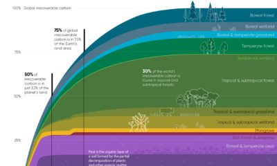
...in Brazil. Where does this data come from? Source: Noon, M.L., Goldstein, A., Ledezma, J.C. et al. Mapping the irrecoverable carbon in Earth’s ecosystems. Nat Sustain...
...collisions, and other remnants of human space exploration are orbiting the Earth at breakneck speeds. In this graphic, Preyash Shah uses tracking data from the Space-Track.org,...
...2005 2.6 -0.5% 2006 2.6 -0.5% 2007 2.6 -0.5% 2008 2.6 -0.5% 2009 2.6 -0.5% 2010 2.5 -0.5% 2011 2.5 -0.5% 2012 2.5 -0.5% 2013 2.5...
Published 10 months ago on June 30, 2023 By Graphics & Design Zack Aboulazm The following content is sponsored by Greenbutts View the full-size version of...


 Creator Program