Visualizing Global Inflation Forecasts (2024-2026)
The World’s Fastest Growing Emerging Markets (2024-2029 Forecast)
The Most Valuable Companies in Major EU Economies
Visualized: Interest Rate Forecasts for Advanced Economies
The Best U.S. Companies to Work for According to LinkedIn
All of the Grants Given by the U.S. CHIPS Act
Visualizing AI Patents by Country
How Tech Logos Have Evolved Over Time
Ranked: Semiconductor Companies by Industry Revenue Share
The Stock Performance of U.S. Chipmakers So Far in 2024
Ranked: The Top 20 Countries in Debt to China
Charted: Which Country Has the Most Billionaires in 2024?
Charted: Which City Has the Most Billionaires in 2024?
Charted: Who Has Savings in This Economy?
How Debt-to-GDP Ratios Have Changed Since 2000
What Causes Preventable Child Deaths?
The Cost of an EpiPen in Major Markets
Charted: Global Tobacco Use by Country and Sex
Visualized: What Lives in Your Gut Microbiome?
Charted: Average Years Left to Live by Age
Who’s Building the Most Solar Energy?
Mapped: The Age of Energy Projects in Interconnection Queues, by State
Ranked: The Top 10 EV Battery Manufacturers in 2023
The World’s Biggest Nuclear Energy Producers
The World’s Biggest Oil Producers in 2023
The Largest Earthquakes in the New York Area (1970-2024)
Mapped: Average Wages Across Europe
Mapped: Asia’s Population Patterns by Density
A Map of Global Happiness By Country in 2024
Mapped: Population Growth by Region (1900-2050F)
Visualizing Global Gold Production in 2023
Gold vs. S&P 500: Which Has Grown More Over Five Years?
Charted: The Value Gap Between the Gold Price and Gold Miners
Charted: Global Uranium Reserves, by Country
The Carbon Footprint of Major Travel Methods
Ranking the Top 15 Countries by Carbon Tax Revenue
Ranked: The Countries With the Most Air Pollution in 2023
Top Countries By Forest Growth Since 2001
Ranked: Top Countries by Total Forest Loss Since 2001
...Teo detail the population density of six countries. 3D spikes denote where people live, with higher spikes equaling more people. #12 VORONOI Visualizing All the World’s...
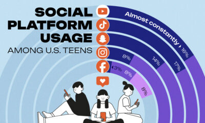
...shows that intensive usage is independent of household income. The majority of teenagers who live in households making less than $30,000 per year and those in...
...On the flip side, many cities are seeing severe labor shortages as many lower-wage workers simply cannot afford to live in the city. Both phenomena affect...
...firms. Many of these companies are well known globally, and several are only known within their region. This graphic shows the richest people that live outside...
...some time in the 2050s. And all those new people will need places to live, to work, and importantly more food to eat and this means...
...approximately 29.4% to 87.0 million by 2070. In this graphic, we use data from Kyodo News, Statista, and Database.earth to illustrate the number of live births...
...will similarly transform the way we live, work, and entertain ourselves. RankBrand% of Respondents 1 🇺🇸 Apple 50% 2 🇰🇷 Samsung 27% 3 🇺🇸 Motorola 6%...
...unites people, places, and things. A Thoughtful AI for the Future? With AI already upending the way we live and work, and former tech evangelists raising...
...measurable dollars. But where do the very wealthiest people live right now? We visualize the countries with the most billionaires in 2024, sourced from the annual...
...than $1 million. But there’s a vast difference between being a millionaire and a billionaire. So where do the richest of them all live? Using data...