Misc
Visualizing the Current State of the Global Gender Gap
Article/Editing:
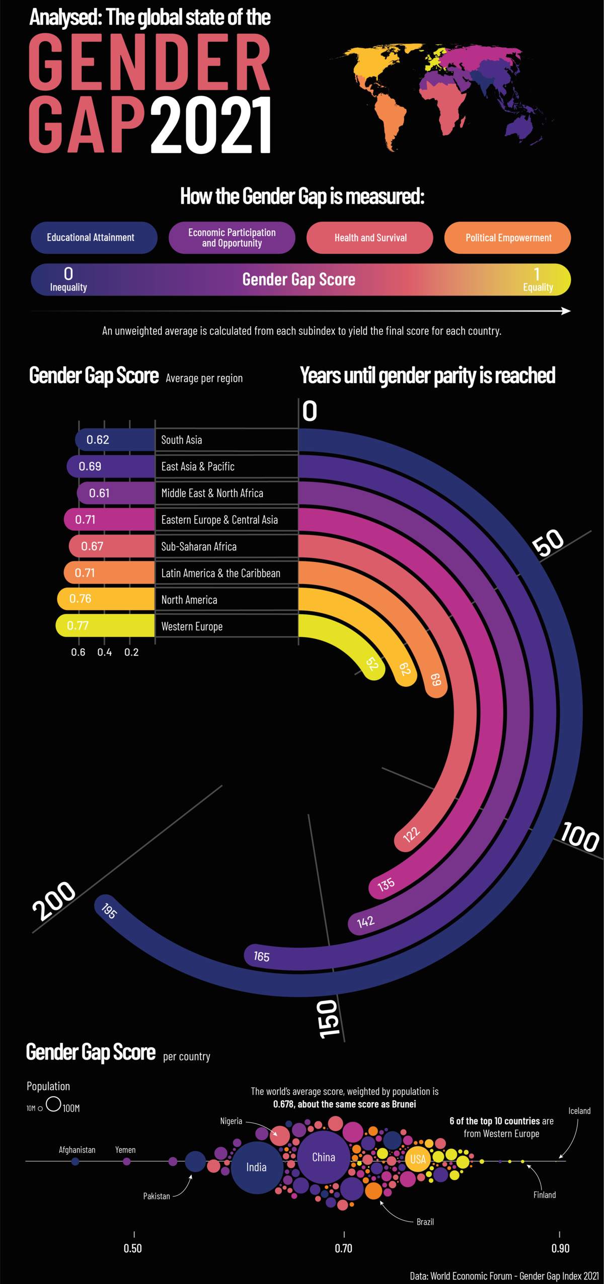
The Current State of the Global Gender Gap
As a global society, we still have a long way to go before we reach gender equality around the world.
According to the World Economic Forum’s (WEF) latest Global Gender Gap Report, it could take up to 135.6 years to close the global gender gap, based on the current rate of change.
This graphic by Sebastian Gräff gives a breakdown of gender equality worldwide, showing how long it will take before each region reaches gender parity.
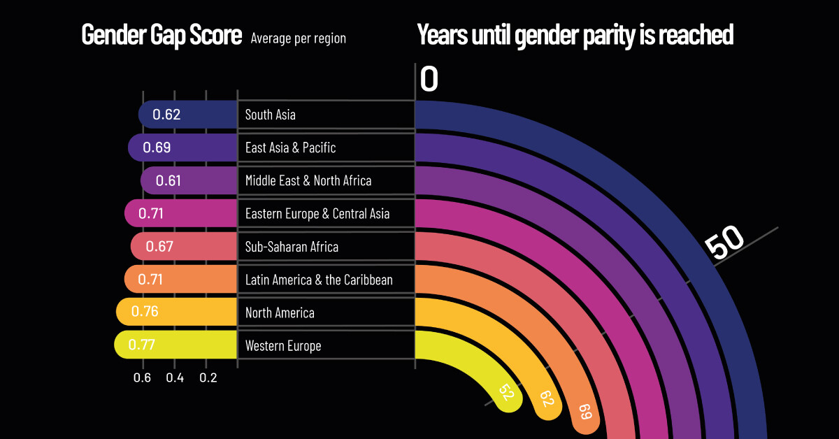
How Gender Gap is Measured
In its 15th edition, the Global Gender Gap Report analyzes gender-based discrepancies across 156 different countries. To gauge each region’s gender gap, the report digs into four key areas:
- Economic Participation and Opportunity
- Educational Attainment
- Health and Survival
- Political Empowerment
Each subindex is given its own score, then an average across the four pillars is calculated to give each country a final score between zero (exceptionally unequal) and one (completely equal).
Regional Breakdown
Out of all the regions, Western Europe has the smallest gender gap, with a score of 0.78. At this rate, the gender gap in Western Europe could be closed in approximately 52.1 years, more than 83 years faster than the global estimate.
| Rank | Region | Overall Gender Gap Index (2021) |
|---|---|---|
| 1 | Western Europe | 0.77 |
| 2 | North America | 0.76 |
| 3 | Latin America and the Caribbean | 0.71 |
| 4 | Eastern Europe and Central Asia | 0.71 |
| 5 | East Asia and the Pacific | 0.69 |
| 6 | Sub-Saharan Africa | 0.67 |
| 7 | South Asia | 0.62 |
| 8 | Middle East and North Africa | 0.61 |
| Global Average | 0.69 |
Western Europe scores particularly high in educational attainment (1.0) and health and survival (0.97). Here’s a look at the category breakdown for each region:
| Region | Economic Participation and Opportunity | Educational Attainment | Health and Survival | Political Empowerment |
|---|---|---|---|---|
| Western Europe | 0.70 | 1.00 | 0.97 | 0.44 |
| North America | 0.75 | 1.00 | 0.97 | 0.33 |
| Latin America and the Caribbean | 0.64 | 1.00 | 0.98 | 0.27 |
| Eastern Europe and Central Asia | 0.74 | 1.00 | 0.98 | 0.14 |
| East Asia and the Pacific | 0.70 | 0.98 | 0.95 | 0.14 |
| Sub-Saharan Africa | 0.66 | 0.85 | 0.97 | 0.21 |
| South Asia | 0.34 | 0.93 | 0.94 | 0.28 |
| Middle East and North Africa | 0.41 | 0.94 | 0.97 | 0.12 |
| Global Average | 0.62 | 0.96 | 0.97 | 0.22 |
But it might be surprising to see that political empowerment in Western Europe received a score of only 0.44. This is higher than the global average for political empowerment of 0.21, but still indicative of a large gender gap in this area.
Globally, political empowerment tended to receive the lowest scores in the report, as women are grossly underrepresented in politics. A study by the Council of Foreign Relations revealed that out of 195 different countries’ national cabinets, only 14 countries had at least 50% of their ministerial positions held by women.
Economic participation and opportunity is the second weakest category, with a global average score of 0.58. A good example of how this gap manifests itself is in entrepreneurship and business, where women still struggle to find investors and gain access to venture capital. Further, on average, women continue to make less money than men. According to the UN, women across the globe make approximately 77 cents for every dollar earned by men.
The Economic Benefit of Gender Equality
Research shows that empowering women in the workforce is in everyone’s best interest. Closing the gender gap in the global workforce could lead to a boost of more than $28 trillion to the global economy.
Yet across the globe, COVID-19 has created new challenges that have hindered our progress towards gender equality. This is partly because some of the sectors that have been impacted the most by COVID-19 restrictions, such as hospitality, food services, and personal care, are largely dominated by female workers.
As we continue to recover from the impact of COVID-19, world leaders will face numerous policy challenges, including how to build back better, creating more opportunities for women to thrive in the global economy.

This article was published as a part of Visual Capitalist's Creator Program, which features data-driven visuals from some of our favorite Creators around the world.


Public Opinion
Charted: How Americans Feel About Federal Government Agencies
Fourteen of 16 federal government agencies garnered more favorable responses than unfavorable ones. But what were the outliers?
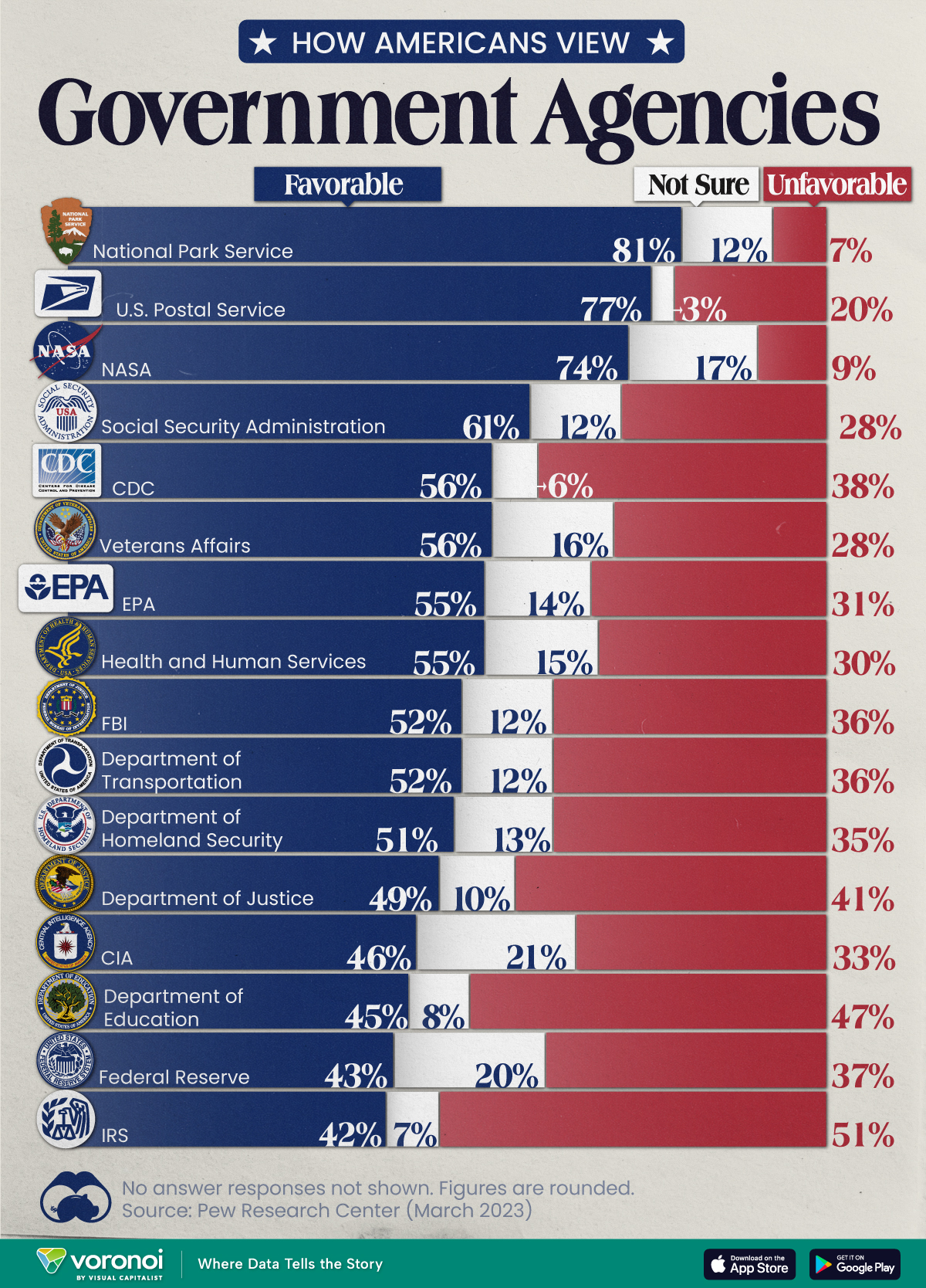
Chart: How Americans Rate 16 Federal Government Agencies
This was originally posted on our Voronoi app. Download the app for free on iOS or Android and discover incredible data-driven charts from a variety of trusted sources.
Come election time, America won’t hesitate to show its approval or disapproval of the country’s elected political representatives. That said, feelings about the federal bureaucracy and its associated agencies are a little harder to gauge.
We chart the results from an opinion poll conducted by Pew Research Center between March 13-19, 2023. In it, 10,701 adults—a representative of the U.S. adult population—were asked whether they felt favorably or unfavorably towards 16 different federal government agencies.
Americans Love the Park Service, Are Divided Over the IRS
Broadly speaking, 14 of the 16 federal government agencies garnered more favorable responses than unfavorable ones.
Of them, the Parks Service, Postal Service, and NASA all had the approval of more than 70% of the respondents.
| Agency | Favorable | Unfavorable | Not sure |
|---|---|---|---|
| 🏞️ National Park Service | 81% | 7% | 12% |
| 📮 U.S. Postal Service | 77% | 20% | 3% |
| 🚀 NASA | 74% | 9% | 17% |
| 💼 Social Security Administration | 61% | 28% | 12% |
| 🔬 CDC | 56% | 38% | 6% |
| 🎖️ Veterans Affairs | 56% | 28% | 16% |
| 🌿 EPA | 55% | 31% | 14% |
| 💉 Health & Human Services | 55% | 30% | 15% |
| 🕵️ FBI | 52% | 36% | 12% |
| 🚗 Department of Transportation | 52% | 36% | 12% |
| 🛡️ Department of Homeland Security | 51% | 35% | 13% |
| ⚖️ Department of Justice | 49% | 41% | 10% |
| 🕵️♂️ CIA | 46% | 33% | 21% |
| 📚 Department of Education | 45% | 47% | 8% |
| 💰 Federal Reserve | 43% | 37% | 20% |
| 💼 IRS | 42% | 51% | 7% |
Note: Figures are rounded. No answer responses are not shown.
Only the Department of Education and the IRS earned more unfavorable responses, and between them, only the IRS had a majority (51%) of unfavorable responses.
There are some caveats to remember with this data. Firstly, tax collection is a less-friendly activity than say, maintaining picturesque parks. Secondly, the survey was conducted a month before taxes were typically due, a peak time for experiencing filing woes.
Nevertheless, the IRS has come under fire in recent years. As per a New York Times article in 2019, eight years of budget cuts have stymied the agency’s ability to scrutinize tax filings from wealthier and more sophisticated filers.
At the same time poorer Americans are facing increasing audits on wage subsidies available to low income workers. According to a Transactional Records Access Clearinghouse report, this subset of filers was audited five-and-a-half more times the average American.

-

 Markets5 days ago
Mapped: The Most Valuable Company in Each Southeast Asian Country
-

 Markets2 weeks ago
The Top Private Equity Firms by Country
-

 Jobs2 weeks ago
The Best U.S. Companies to Work for According to LinkedIn
-

 Economy2 weeks ago
Ranked: The Top 20 Countries in Debt to China
-

 Politics1 week ago
Charted: Trust in Government Institutions by G7 Countries
-

 Energy1 week ago
Mapped: The Age of Energy Projects in Interconnection Queues, by State
-

 Mining1 week ago
Visualizing Global Gold Production in 2023
-

 Markets1 week ago
Visualized: Interest Rate Forecasts for Advanced Economies