Green
The Emissions Impact of Coronavirus Lockdowns, As Shown by Satellites
The Emissions Impact of Coronavirus Lockdowns
There’s a high chance you’re reading this while practicing social distancing, or while your corner of the world is under some type of advised or enforced lockdown.
While these are necessary measures to contain the spread of the COVID-19 pandemic, such economic interruption is unprecedented in many ways—resulting in some surprising side effects.
The Evidence is in NO₂ Emissions
Nitrogen dioxide (NO₂) emissions, a major air pollutant, are closely linked to factory output and vehicles operating on the road.
As both industry and transport come to a halt during this pandemic, NO₂ emissions can be a good indicator of global economic activity—and the changes are visible from space.
These images from the Centre for Research on Energy and Clean Air (CREA), as well as satellite footage from NASA and the European Space Agency (ESA), show a drastic decline in NO₂ emissions over recent months, particularly across Italy and China.
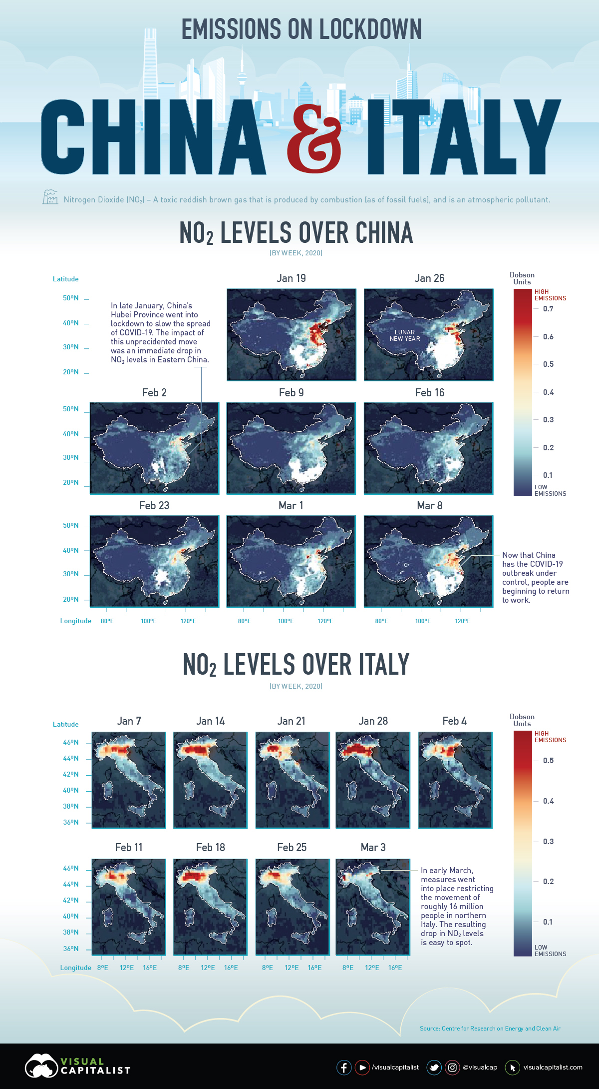
NO₂ Emissions Across Italy
In Italy, the number of active COVID-19 cases has surpassed China (including the death toll). Amid emergency actions to lock down the entire nation, everything from schools and shops, to restaurants and even some churches, are closed.
Italy is also an industrial hub, with the sector accounting for nearly 24% of GDP. With many Italians urged to work from home if possible, visible economic activity has dropped considerably.
This 10-day moving average animation (from January 1st—March 11th, 2020) of nitrogen dioxide emissions across Europe clearly demonstrates how the drop in Italy’s economic activity has impacted the environment.
Source: European Space Agency (ESA)
That’s not all: a drop in boat traffic also means that Venice’s canals are clear for the time being, as small fish have begun inhabiting the waterways again. Experts are cautious to note that this does not necessarily mean the water quality is better.
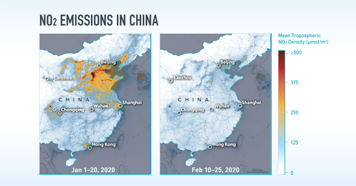
NO₂ Emissions Across China
The emissions changes above China are possibly even more obvious to the eye. China is the world’s most important manufacturing hub and a significant contributor to greenhouse gases globally. But in the month following Lunar New Year (a week-long festival in early February), satellite imagery painted a different picture.
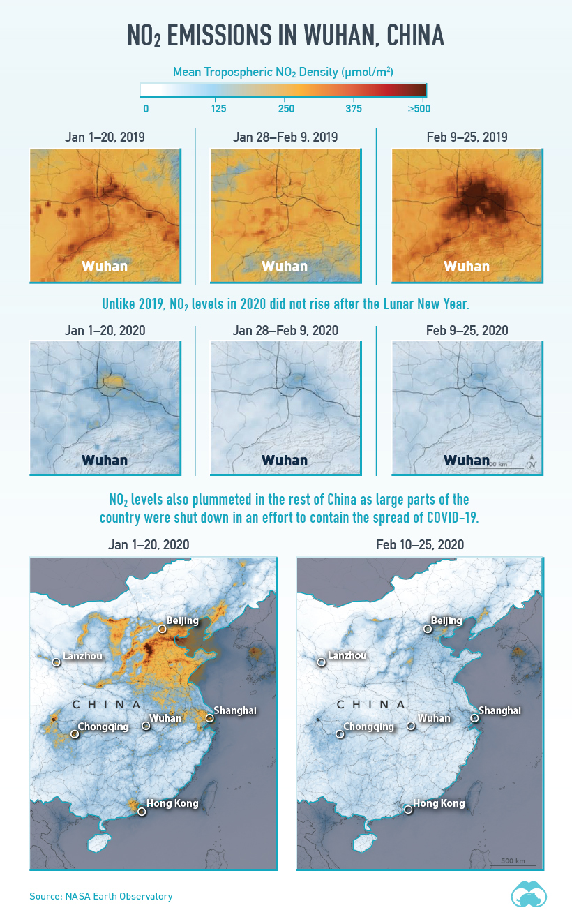
Source: NASA Earth Observatory
NO₂ emissions around the Hubei province, the original epicenter of the virus, steeply dropped as factories were forced to shutter their doors for the time being.
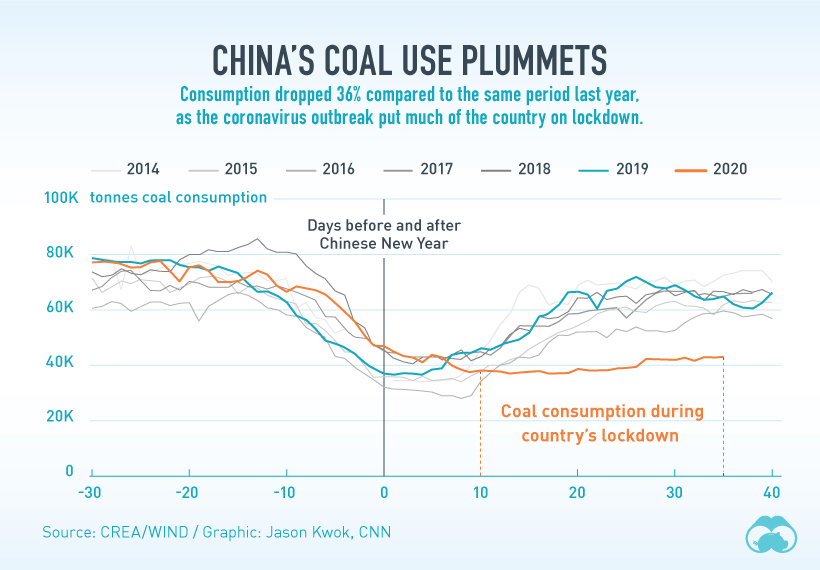
What’s more, there were measurable effects in the decline of other emission types from the drop in coal use during the same time, compared to years prior.
Back to the Status Quo?
In recent weeks, China has been able to flatten the curve of its total COVID-19 cases. As a result, the government is beginning to ease its restrictions—and it’s clear that social and economic activities are starting to pick back up in March.
Source: European Space Agency (ESA)
With the regular chain of events beginning to resume, it remains to be seen whether NO₂ emissions will rebound right back to their pre-pandemic levels.
This bounce-back effect—which can sometimes reverse any overall drop in emissions—is [called] “revenge pollution”. And in China, it has precedent.
—Li Shuo, Senior climate policy advisor, Greenpeace East Asia


Automotive
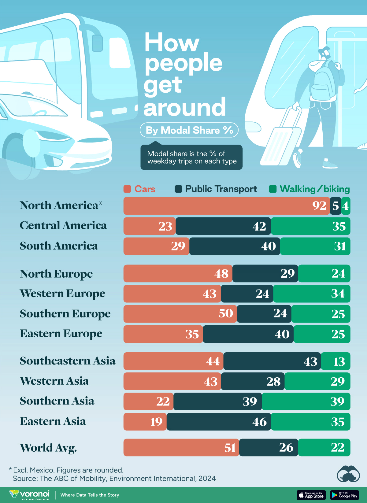
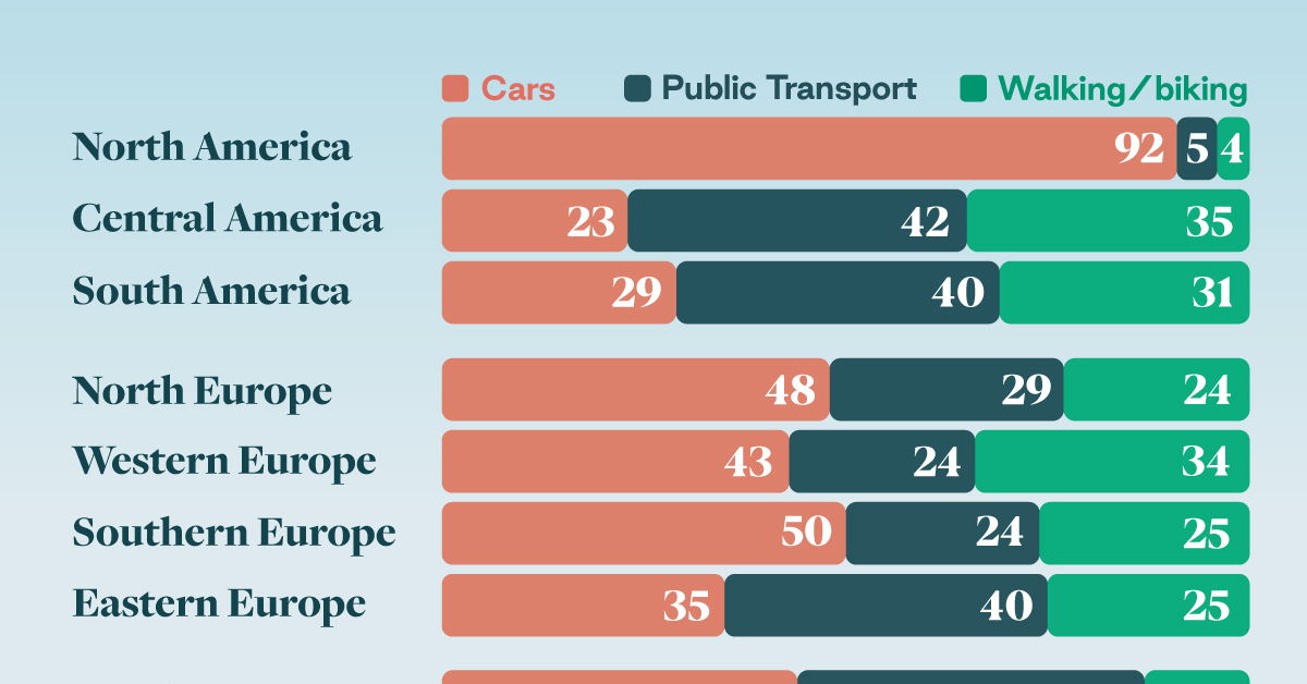
How People Get Around in America, Europe, and Asia
Examining how people get around using cars, public transit, and walking or biking, and the regional differences in usage.
How People Get Around in America, Europe, and Asia
This was originally posted on our Voronoi app. Download the app for free on iOS or Android and discover incredible data-driven charts from a variety of trusted sources.
This chart highlights the popularity of different transportation types in the Americas, Europe, and Asia, calculated by modal share.
Data for this article and visualization is sourced from ‘The ABC of Mobility’, a research paper by Rafael Prieto-Curiel (Complexity Science Hub) and Juan P. Ospina (EAFIT University), accessed through ScienceDirect.
The authors gathered their modal share data through travel surveys, which focused on the primary mode of transportation a person employs for each weekday trip. Information from 800 cities across 61 countries was collected for this study.
North American Car Culture Contrasts with the Rest of the World
In the U.S. and Canada, people heavily rely on cars to get around, no matter the size of the city. There are a few exceptions of course, such as New York, Toronto, and smaller college towns across the United States.
| Region | 🚗 Cars | 🚌 Public Transport | 🚶 Walking/Biking |
|---|---|---|---|
| North America* | 92% | 5% | 4% |
| Central America | 23% | 42% | 35% |
| South America | 29% | 40% | 31% |
| Northern Europe | 48% | 29% | 24% |
| Western Europe | 43% | 24% | 34% |
| Southern Europe | 50% | 24% | 25% |
| Eastern Europe | 35% | 40% | 25% |
| Southeastern Asia | 44% | 43% | 13% |
| Western Asia | 43% | 28% | 29% |
| Southern Asia | 22% | 39% | 39% |
| Eastern Asia | 19% | 46% | 35% |
| World | 51% | 26% | 22% |
Note: *Excluding Mexico. Percentages are rounded.
As a result, North America’s share of public transport and active mobility (walking and biking) is the lowest amongst all surveyed regions by a significant amount.
On the other hand, public transport reigns supreme in South and Central America as well as Southern and Eastern Asia. It ties with cars in Southeastern Asia, and is eclipsed by cars in Western Asia.
As outlined in the paper, Europe sees more city-level differences in transport popularity.
For example, Utrecht, Netherlands prefers walking and biking. People in Paris and London like using their extensive transit systems. And in Manchester and Rome, roughly two out of three journeys are by car.

-
 Markets5 days ago
Visualizing Global Inflation Forecasts (2024-2026)
-

 Green2 weeks ago
The Carbon Footprint of Major Travel Methods
-

 United States2 weeks ago
Visualizing the Most Common Pets in the U.S.
-

 Culture2 weeks ago
The World’s Top Media Franchises by All-Time Revenue
-

 voronoi1 week ago
Best Visualizations of April on the Voronoi App
-

 Wealth1 week ago
Charted: Which Country Has the Most Billionaires in 2024?
-

 Business1 week ago
The Top Private Equity Firms by Country
-

 Markets1 week ago
The Best U.S. Companies to Work for According to LinkedIn