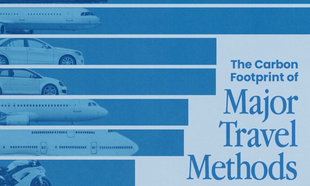

Going on a cruise ship and flying domestically are the most carbon-intensive travel methods.
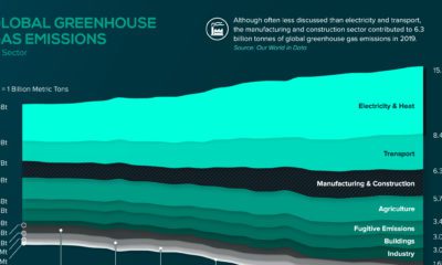

The manufacturing and construction sector contributed to 6.3 billion tonnes of global greenhouse gas emissions in 2019.
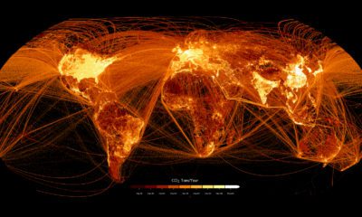

This graphic maps out carbon emissions around the world and where they come from, using data from the European Commission.
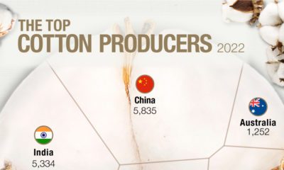

As the most-used natural fiber, cotton has become the most important non-food agricultural product.
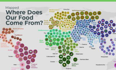

Did you know that over two-thirds of national crops originated from somewhere else? Over time the food that built national diets has evolved.
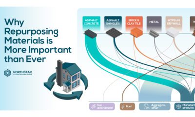

Globally around 2 billion tonnes of waste is generated every year and the construction industry is a large contributor.
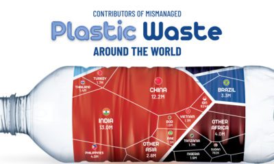

About 22% of the world's annual plastic waste generation is mismanaged. Here's a break down of mismanaged plastic waste by country.
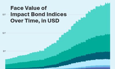

The face value of impact bond indices jumped by nearly 500% from 2018 to 2021. How do various types of sustainability indices help investors?
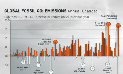

How much do global CO₂ emissions change on a year-to-year basis? Here, we show the annual rate of change in emissions since 1900.
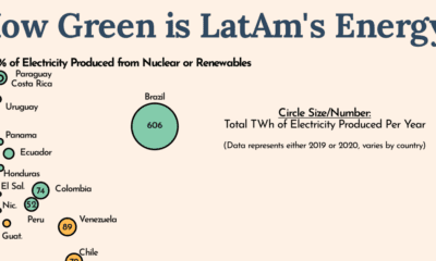

Countries around the world are looking to decarbonize, but Latin America is leading the charge in green energy usage.


Looking for an EV charging station in the states? This interactive map contains every EV charging station in America.


 Creator Program