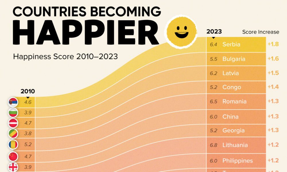
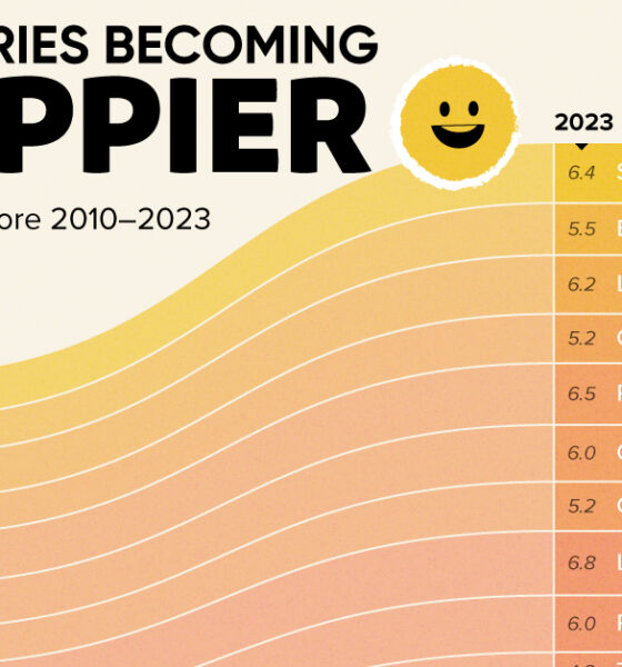
Tracking Gallup survey data for more than a decade reveals insights into the regions seeing happiness gains.


See how the world's 6 largest countries will grow (or shrink) by 2075, based on the latest UN population projections.
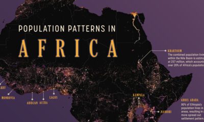

We map out Africa’s population density, spotlighting the continent’s most populous countries and cities.
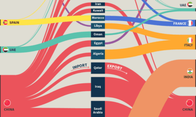

China holds the position of both the top importer and exporter with MENA countries by volume.
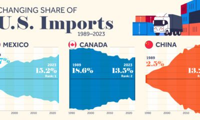

We highlight seven key U.S. trade partners and their changing share in the sources of U.S. imports from 1989–2023.
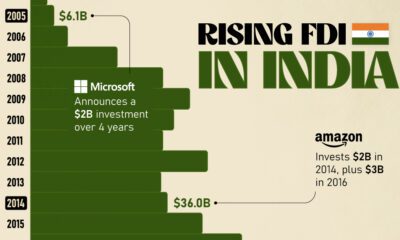

Mirroring the country's rapid economic growth, India's FDI (foreign direct investment) inflows have skyrocketed over the last twenty years.
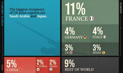

The U.S. is the biggest weapons exporter in the world, but which other countries take up a significant share of global arms exports in 2022? And...
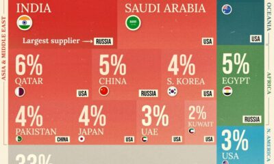

Which countries imported weapons to boost their defenses in 2022? We rank the biggest by their the share of global arms imports.
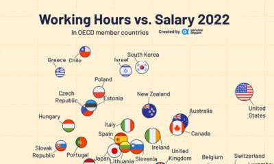

What are the average work hours and salaries in OECD countries? We look at the data for trends across regions.
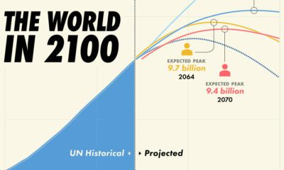

Population projections from the UN suggest that there will be over 10 billion people by 2060, though other organizations disagree.


 Creator Program