Demographics
Mapped: The World Divided Into 4 Regions With Equal Populations
View a high resolution version of this graphic
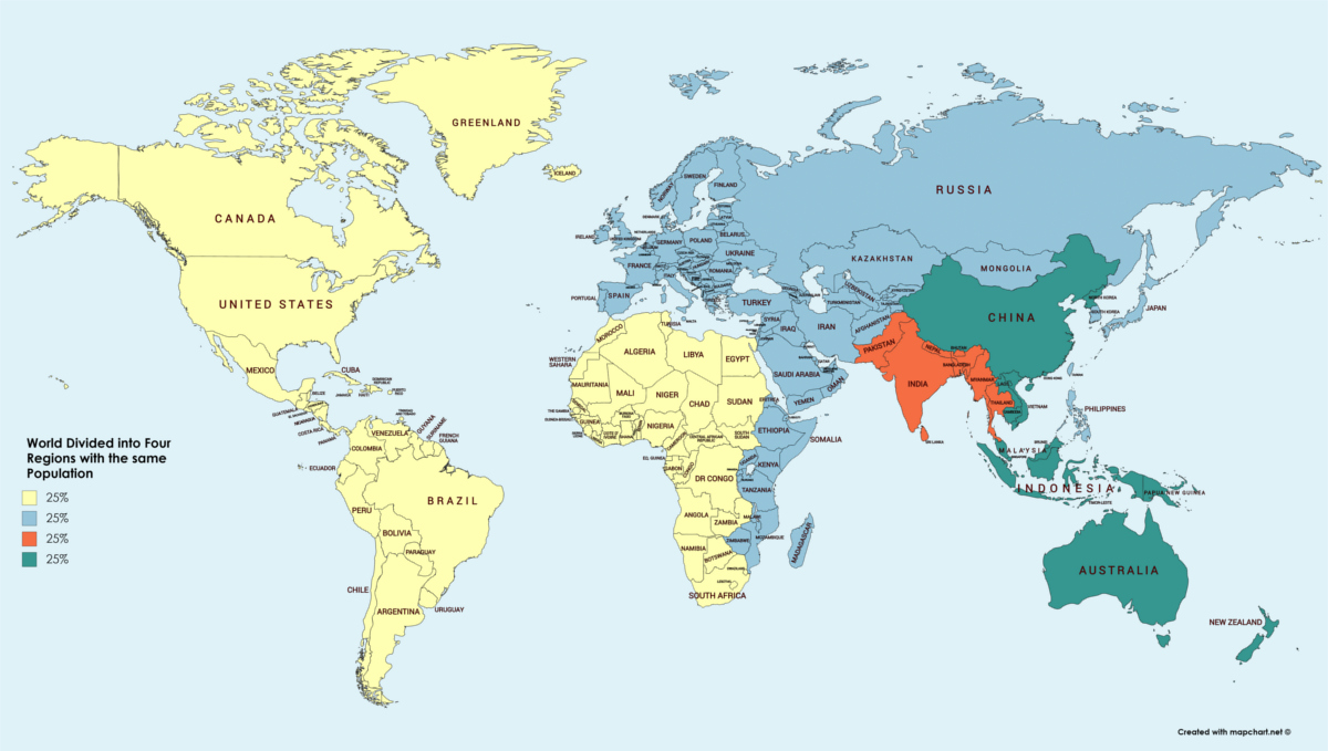
World Map: Divided Into 4 Regions With Equal Populations
View the full-size version of the infographic by clicking here
At the most basic level, a standard world map tells us almost nothing about human population.
While the borders on a map may give us an idea of political boundaries or even aspects of continental geography, in reality they have little to do with showing population density.
That said, it is possible to apply one simple alteration to the world map so that we can make it more interesting from a population perspective – and it turns out that doing so can help us gain insight on where regional population density is the greatest.
Splitting Up the Map
Today’s map comes from Reddit user /u/OrneryThroat and it breaks up the world by grouping countries into four equally populated regions.
While both simple and crude, this mechanism does have some profound results:
| Region | Population |
|---|---|
| North America, South America, and West/Central Africa | 1.9 billion |
| Europe, East Africa, Middle East, and Northern Asia | 1.9 billion |
| South Asia | 1.9 billion |
| Most of Southeast Asia, China, and Oceania | 1.9 billion |
More specifically, there is one area that stands out from a visual standpoint, and it resides clearly in the southern portion of Asia.
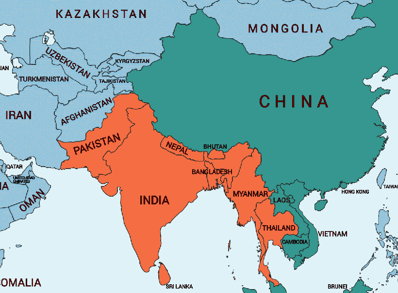
Home to 1.34 billion people, it’s well-known that India already holds roughly 20% of the global population – but add Pakistan (195 million) and Bangladesh (165 million) into the mix, and you’re already closing in on one quarter of the global total.
Meanwhile, to get to a similar number, you’d need to add the entire populations of North America, South America, Europe, and Oceania together to even come close.
Shown Another Way
While splitting it into four equal portions is one way to transform the world map, here is another geometric route to conveying a similar idea about the world’s population density:
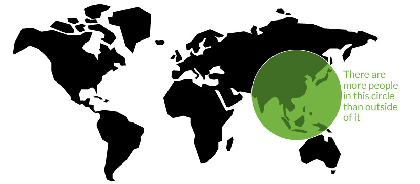
On a previous Chart of the Week, we showed that 22 of the world’s 37 megacities are located in the small circle above, putting into perspective the region’s population density in a similar but different way.
These simple transformations of the world map are not only memorable, but they also give our brain an easy heuristic to better understand the planet we live on.


Demographics
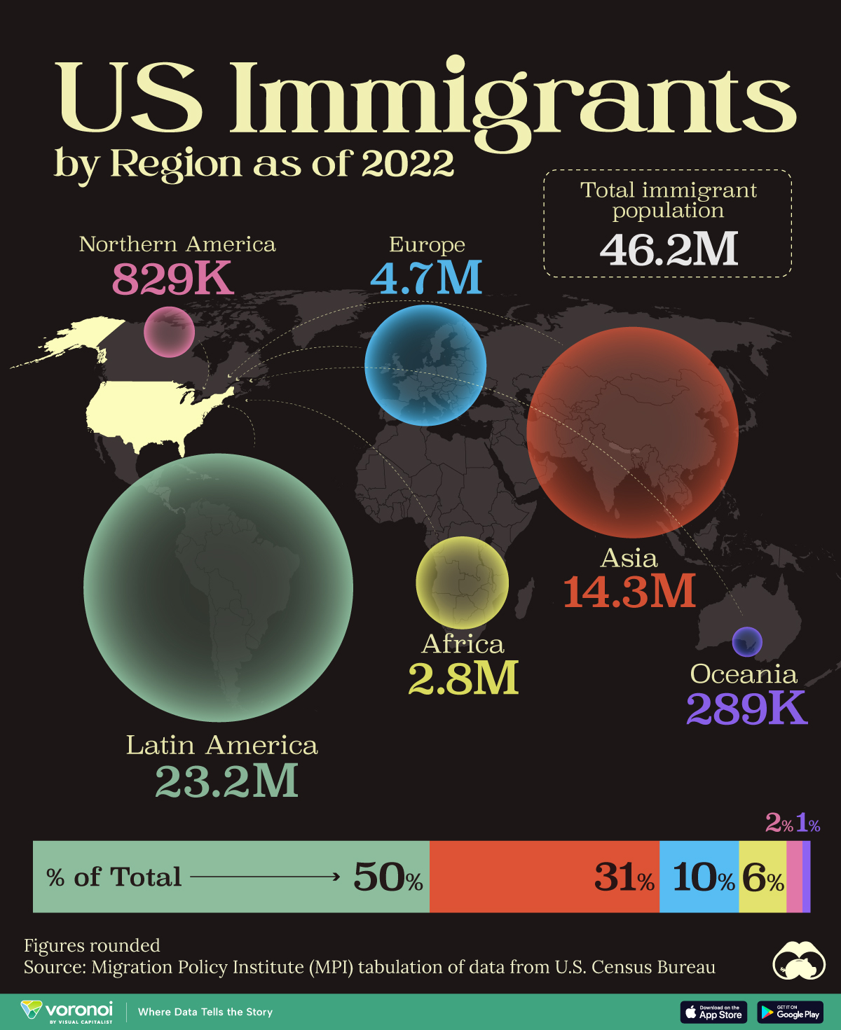
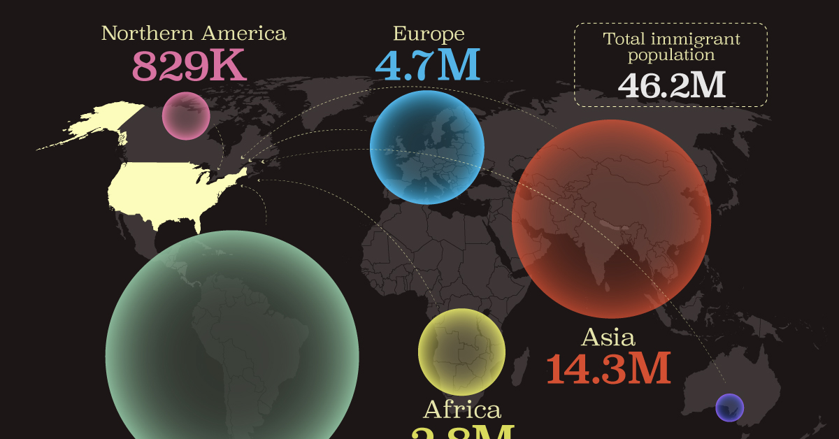
Mapped: U.S. Immigrants by Region
This map shows which regions U.S. immigrants came from, highlighting Asia and Latin America as the biggest sources.
Breaking Down America’s Immigrant Population
This was originally posted on our Voronoi app. Download the app for free on iOS or Android and discover incredible data-driven charts from a variety of trusted sources.
The United States is home to more immigrants than any other nation, surpassing the combined totals of the next four countries: Germany, Saudi Arabia, Russia, and the United Kingdom.
To add context to this impressive fact, we’ve illustrated the regions from which U.S. immigrants originated. “Immigrants” in this context refers to individuals who are residing in the United States but were not U.S. citizens at birth.
These statistics were sourced from the Migration Policy Institute, which analyzed data from the U.S. Census Bureau’s 2022 American Community Survey (ACS).
U.S. Immigrants by Region
From this graphic, we can see that Asia and Latin America emerge as the primary sources of immigration, collectively accounting for 81% of America’s 46.2 million immigrants.
| Region | # of Immigrants | % of Total |
|---|---|---|
| Europe | 4,728,948 | 10 |
| Asia | 14,349,080 | 31 |
| Africa | 2,752,965 | 6 |
| Oceania | 288,560 | 1 |
| Northern America | 828,702 | 2 |
| Latin America | 23,233,834 | 50 |
| Total | 46,182,089 | 100 |
Latin America alone contributes half of the immigrant population. Mexico stands out as the largest contributor to U.S. immigration, with 10.7 million immigrants, attributable to its geographical proximity and historical ties.
Economic factors, including wage disparity and employment opportunities, drive many Mexicans to seek better prospects north of the border.
From Asia, the two largest country sources are China (2.2 million) and India (2.8 million).
Learn More About U.S. Immigration From Visual Capitalist
If you enjoyed this post, be sure to check out Why Do People Immigrate to the U.S.? This visualization shows the different reasons why immigrants chose to come to America in 2021.

-

 Markets5 days ago
Mapped: The Most Valuable Company in Each Southeast Asian Country
-

 Markets2 weeks ago
The Top Private Equity Firms by Country
-

 Jobs2 weeks ago
The Best U.S. Companies to Work for According to LinkedIn
-

 Economy2 weeks ago
Ranked: The Top 20 Countries in Debt to China
-

 Politics1 week ago
Charted: Trust in Government Institutions by G7 Countries
-

 Energy1 week ago
Mapped: The Age of Energy Projects in Interconnection Queues, by State
-

 Mining1 week ago
Visualizing Global Gold Production in 2023
-

 Markets1 week ago
Visualized: Interest Rate Forecasts for Advanced Economies