

Older, better-educated adults are winning the savings game, reveals a January survey by the National Opinion Research Center at the University of Chicago.
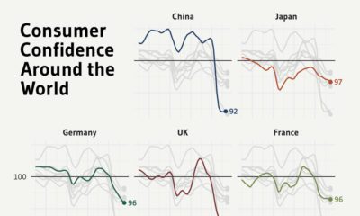

This graphic charts the rise and fall of consumer confidence across the world over the past three years.
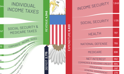

The U.S. deficit hit $2.7 trillion in 2021, the second highest on record. Here's a look at U.S. federal spending compared to revenue last year.
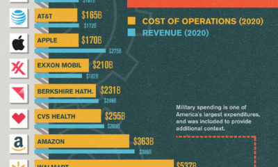

Running a Fortune 500 company is a costly endeavor. In this chart, we compare the operating costs of America's biggest names.


An additional $2.1 trillion of spending will be needed to get America's infrastructure back on track - here's how that creates an opportunity for investors.
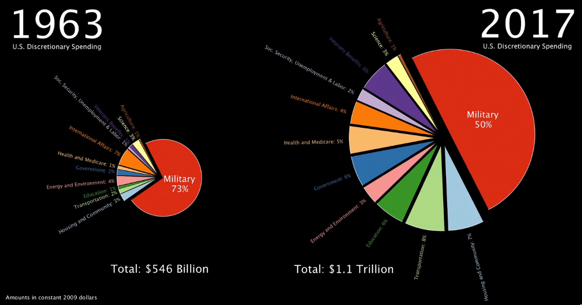
This stunning one minute animation breaks down U.S. government discretionary spending from 1963 all the way until today.
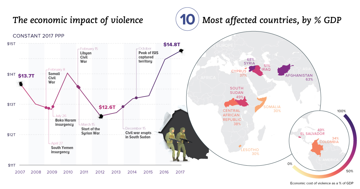
Aside from the obvious human toll, violence also hurts productivity and wealth creation. We visualize the real economic impact of violence in these charts.
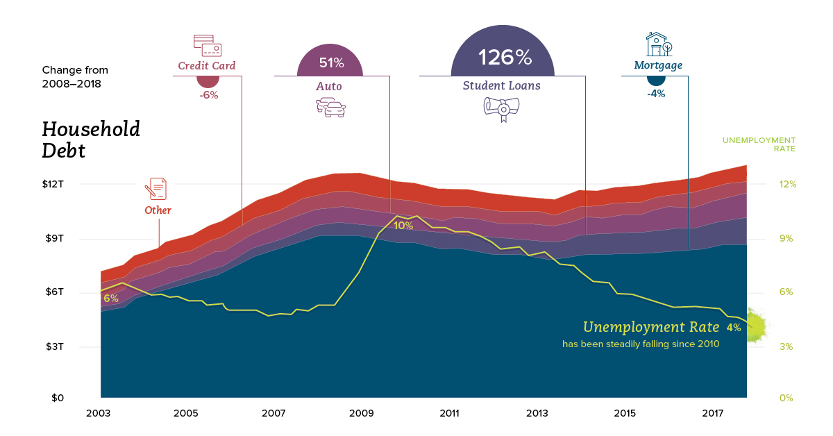
How are American household finances shifting in terms of income, savings, debt, and spending? This series of charts shows the trends you need to know.
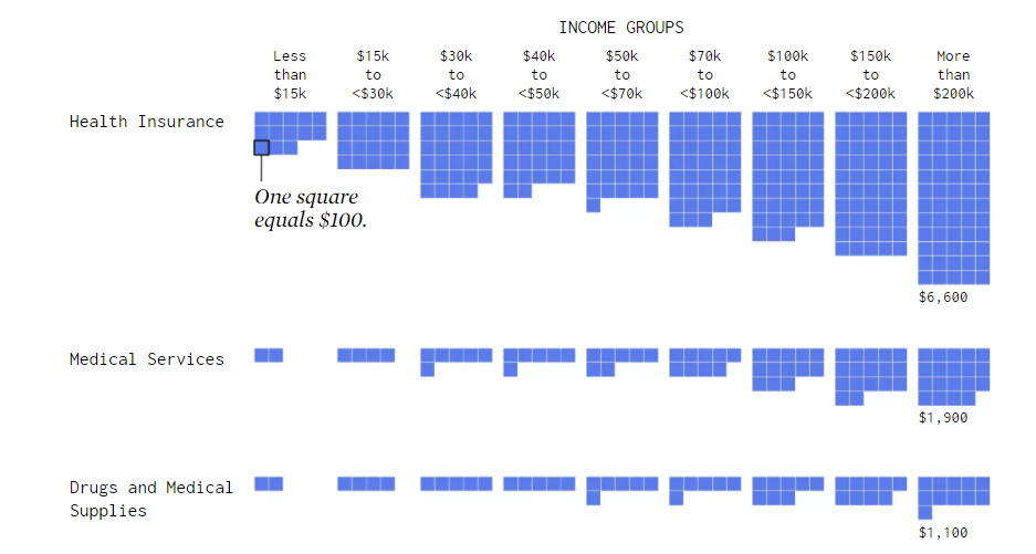
Visualizing how different income groups spend their money on things like housing, food, transportation, health, and travel.
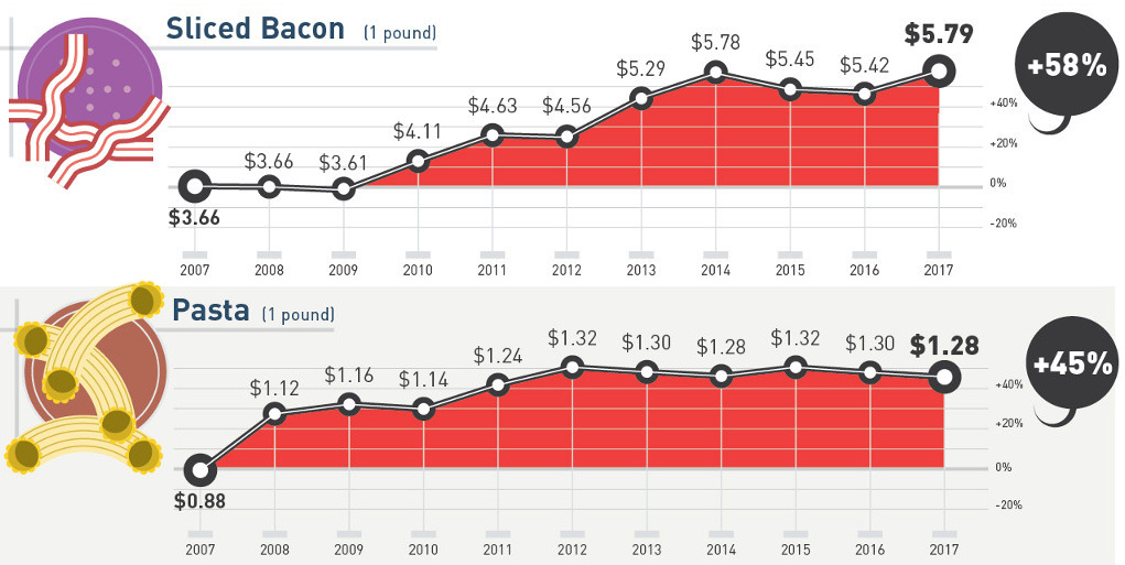
How much more expensive are basic staples than they were 10 years ago? This infographic tracks grocery prices for 30 common items like cheese, fruit, and...


 Creator Program