Markets
In Charts: How American Household Finances are Changing
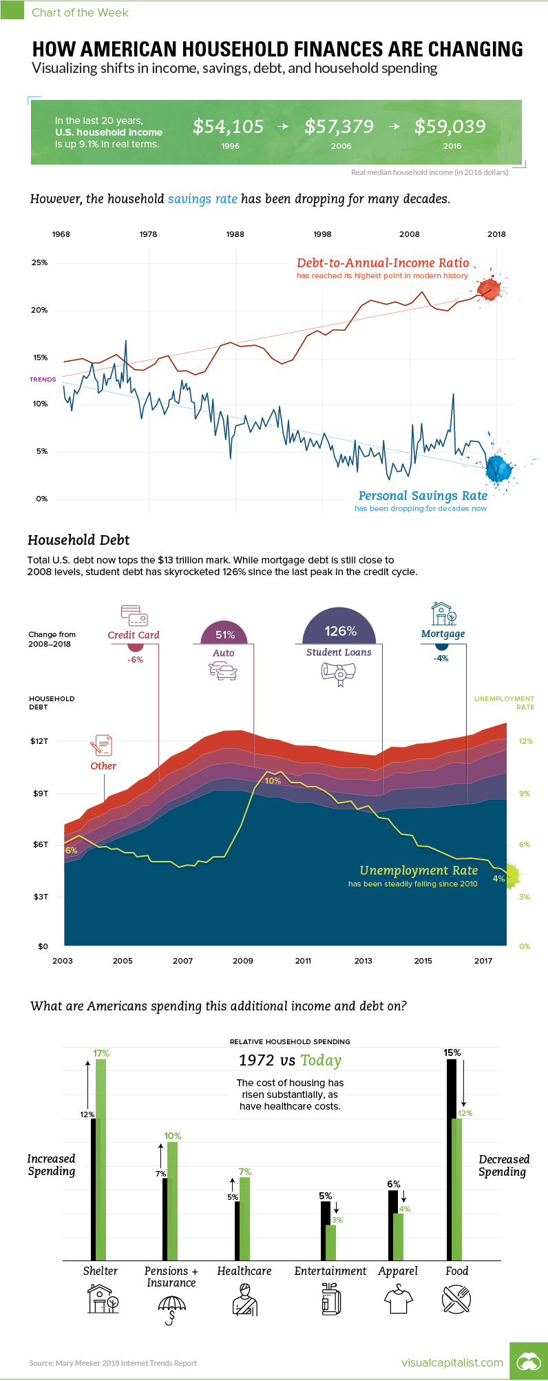
How American Household Finances are Changing
Visualizing shifts in income, savings, debt, and spending
The Chart of the Week is a weekly Visual Capitalist feature on Fridays.
Every year, Silicon Valley patiently waits for Mary Meeker from Kleiner Perkins to share her famous Internet Trends report.
The latest rendition came out two days ago. As usual, the 294-slide deck is a treasure trove of the the latest data on technology and internet trends.
But while the report is well-known as a barometer on the internet, it also features some high-level data on the U.S. economy that we found interesting. As a result, we used some of the most compelling slides to put together this week’s chart on how American household finances are changing – and we greatly thank Mary for doing the heavy lifting.
From Peak to Peak
In 2007, real median household income had a local peak of $58,149, and then fell off a cliff at the same time as the credit cycle, which reached its own peak in 2008 Q3 as the financial crisis set in.
Real median household income bottomed in 2012, and then debt followed in 2013.
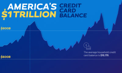
Looking at the most recent year of data available, both categories are now back above pre-crisis highs. Real median household income has now surpassed its all-time record in 1999 – and total household debt has topped $13 trillion in 2018 Q1, more than $500 billion higher than its previous peak in 2008.
A Closer Look
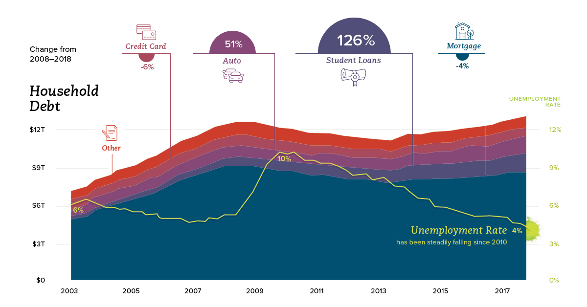
While consumer debt is similar in terms of total size from a decade ago, the composition has changed considerably.
Mortgage debt, which makes up the vast majority of consumer debt, is still actually down from its 2008 peak by 4%. Replacing that is other forms of debt, including student loans:
| Non-Housing Debt | 2008 Q3 ($T) | 2018 Q1 ($T) | Change |
|---|---|---|---|
| Credit Card | $0.86 | $0.81 | -6% |
| Auto Loan | $0.81 | $1.23 | 52% |
| Student Debt | $0.61 | $1.41 | 131% |
| Other Non-Housing Debt | $0.41 | $0.39 | -5% |
Note: it appears the data listed in this table is one quarter more recent than Meeker’s, which was represented in chart
Since 2008, student loan debt has surged by 131% – and auto loans by 52%. Mortgage debt, credit debt, and other non-housing debt have not yet crawled back to pre-crisis peaks.
Saving and Spending
Looking at the longer-term trend, Americans are borrowing more and saving fewer dollars.
In the 1970s, both rates were about the same as a percentage of income, falling in a range between 13-15%. Today, the savings rate is below 5%, and debt-to-annual income ratio has risen to 22%, according to Meeker.
What are American households spending money on?
| Category | 1972 | 1990 | 2017 |
|---|---|---|---|
| Shelter | 12% | 15% | 17% |
| Taxes | 15% | 9% | 15% |
| Transportation | 14% | 16% | 14% |
| Food | 15% | 15% | 12% |
| Household Operations | 11% | 12% | 11% |
| Pensions & Insurance | 7% | 8% | 10% |
| Healthcare | 5% | 5% | 7% |
| Entertainment | 6% | 5% | 4% |
| Apparel | 5% | 5% | 3% |
| Other | 9% | 9% | 8% |
Notably, households are spending more on shelter and healthcare – meanwhile, the cost for food, entertainment, and apparel are decreasing over time.


Markets
U.S. Debt Interest Payments Reach $1 Trillion
U.S. debt interest payments have surged past the $1 trillion dollar mark, amid high interest rates and an ever-expanding debt burden.


U.S. Debt Interest Payments Reach $1 Trillion
This was originally posted on our Voronoi app. Download the app for free on iOS or Android and discover incredible data-driven charts from a variety of trusted sources.
The cost of paying for America’s national debt crossed the $1 trillion dollar mark in 2023, driven by high interest rates and a record $34 trillion mountain of debt.
Over the last decade, U.S. debt interest payments have more than doubled amid vast government spending during the pandemic crisis. As debt payments continue to soar, the Congressional Budget Office (CBO) reported that debt servicing costs surpassed defense spending for the first time ever this year.
This graphic shows the sharp rise in U.S. debt payments, based on data from the Federal Reserve.
A $1 Trillion Interest Bill, and Growing
Below, we show how U.S. debt interest payments have risen at a faster pace than at another time in modern history:
| Date | Interest Payments | U.S. National Debt |
|---|---|---|
| 2023 | $1.0T | $34.0T |
| 2022 | $830B | $31.4T |
| 2021 | $612B | $29.6T |
| 2020 | $518B | $27.7T |
| 2019 | $564B | $23.2T |
| 2018 | $571B | $22.0T |
| 2017 | $493B | $20.5T |
| 2016 | $460B | $20.0T |
| 2015 | $435B | $18.9T |
| 2014 | $442B | $18.1T |
| 2013 | $425B | $17.2T |
| 2012 | $417B | $16.4T |
| 2011 | $433B | $15.2T |
| 2010 | $400B | $14.0T |
| 2009 | $354B | $12.3T |
| 2008 | $380B | $10.7T |
| 2007 | $414B | $9.2T |
| 2006 | $387B | $8.7T |
| 2005 | $355B | $8.2T |
| 2004 | $318B | $7.6T |
| 2003 | $294B | $7.0T |
| 2002 | $298B | $6.4T |
| 2001 | $318B | $5.9T |
| 2000 | $353B | $5.7T |
| 1999 | $353B | $5.8T |
| 1998 | $360B | $5.6T |
| 1997 | $368B | $5.5T |
| 1996 | $362B | $5.3T |
| 1995 | $357B | $5.0T |
| 1994 | $334B | $4.8T |
| 1993 | $311B | $4.5T |
| 1992 | $306B | $4.2T |
| 1991 | $308B | $3.8T |
| 1990 | $298B | $3.4T |
| 1989 | $275B | $3.0T |
| 1988 | $254B | $2.7T |
| 1987 | $240B | $2.4T |
| 1986 | $225B | $2.2T |
| 1985 | $219B | $1.9T |
| 1984 | $205B | $1.7T |
| 1983 | $176B | $1.4T |
| 1982 | $157B | $1.2T |
| 1981 | $142B | $1.0T |
| 1980 | $113B | $930.2B |
| 1979 | $96B | $845.1B |
| 1978 | $84B | $789.2B |
| 1977 | $69B | $718.9B |
| 1976 | $61B | $653.5B |
| 1975 | $55B | $576.6B |
| 1974 | $50B | $492.7B |
| 1973 | $45B | $469.1B |
| 1972 | $39B | $448.5B |
| 1971 | $36B | $424.1B |
| 1970 | $35B | $389.2B |
| 1969 | $30B | $368.2B |
| 1968 | $25B | $358.0B |
| 1967 | $23B | $344.7B |
| 1966 | $21B | $329.3B |
Interest payments represent seasonally adjusted annual rate at the end of Q4.
At current rates, the U.S. national debt is growing by a remarkable $1 trillion about every 100 days, equal to roughly $3.6 trillion per year.
As the national debt has ballooned, debt payments even exceeded Medicaid outlays in 2023—one of the government’s largest expenditures. On average, the U.S. spent more than $2 billion per day on interest costs last year. Going further, the U.S. government is projected to spend a historic $12.4 trillion on interest payments over the next decade, averaging about $37,100 per American.
Exacerbating matters is that the U.S. is running a steep deficit, which stood at $1.1 trillion for the first six months of fiscal 2024. This has accelerated due to the 43% increase in debt servicing costs along with a $31 billion dollar increase in defense spending from a year earlier. Additionally, a $30 billion increase in funding for the Federal Deposit Insurance Corporation in light of the regional banking crisis last year was a major contributor to the deficit increase.
Overall, the CBO forecasts that roughly 75% of the federal deficit’s increase will be due to interest costs by 2034.

-

 Technology2 weeks ago
Ranked: The Most Popular Smartphone Brands in the U.S.
-

 Automotive1 week ago
Almost Every EV Stock is Down After Q1 2024
-

 Money1 week ago
Where Does One U.S. Tax Dollar Go?
-

 Green2 weeks ago
Ranked: Top Countries by Total Forest Loss Since 2001
-

 Real Estate2 weeks ago
Visualizing America’s Shortage of Affordable Homes
-

 Maps2 weeks ago
Mapped: Average Wages Across Europe
-

 Mining2 weeks ago
Charted: The Value Gap Between the Gold Price and Gold Miners
-

 Demographics2 weeks ago
Visualizing the Size of the Global Senior Population