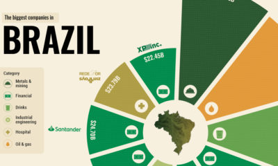

What drives some of the world’s emerging economies? From natural resources to giant banks, here are the top 10 biggest companies in Brazil.
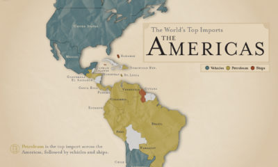

What are the most popular imports across the Americas? Petroleum is number one, followed by vehicles and ships.
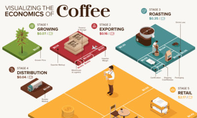

What makes your cup of coffee possible, and how much does it really cost? Here’s how the $200B coffee supply chain breaks down economically.
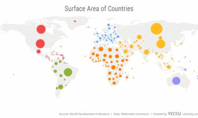

We’ve come a long way since Pangea. This short video examines the area, population, and GDP of our continents as a share of the world's total.
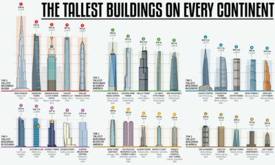

How much higher and further into the skies can we reach? This infographic looks at the most impressive skyscrapers gracing every continent.
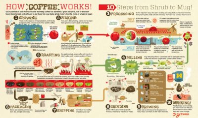

How does coffee get from a faraway plant to your morning cup? See the great journey of beans through the coffee supply chain.
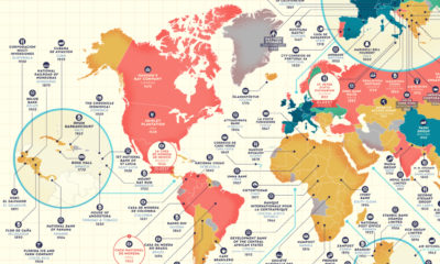

Which companies have stood the test of time? This detailed map highlights the oldest company in every country that is still in business.