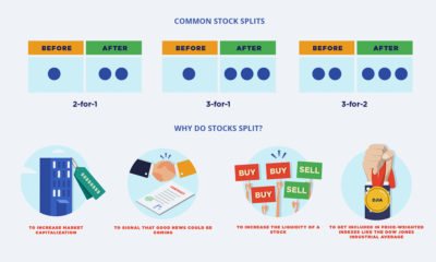

If companies want their stock price to rise, why would they want to split it, effectively lowering the price? This infographic explains why.


It’s been a long year since the WHO declared the novel coronavirus a global pandemic. This visual looks at key events in the COVID-19 timeline.
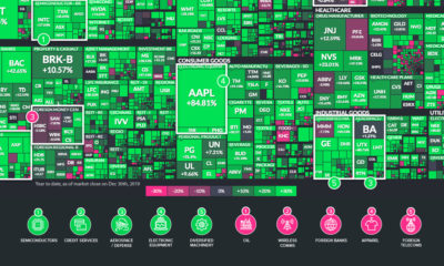

The U.S. stock market had a banner year, but some sectors were notable outliers. Here are the ones that outperformed (and underperformed) in 2019.
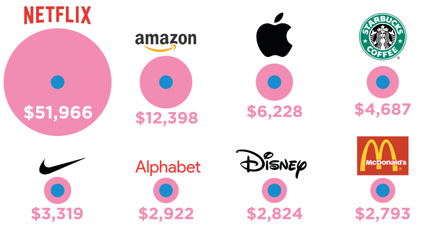
What would happen if you had invested $1,000 in Apple, Starbucks, Walmart, Coca-Cola, or other household names right before the market crash?
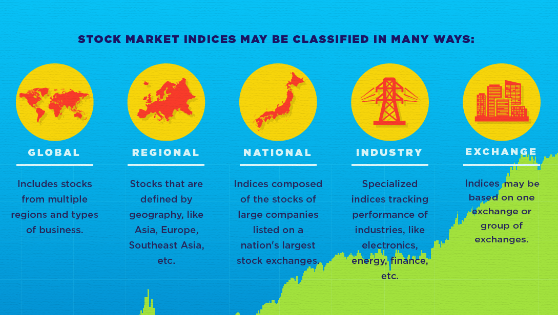
This infographic helps to explain the basics around what a stock market index is, and what it does.
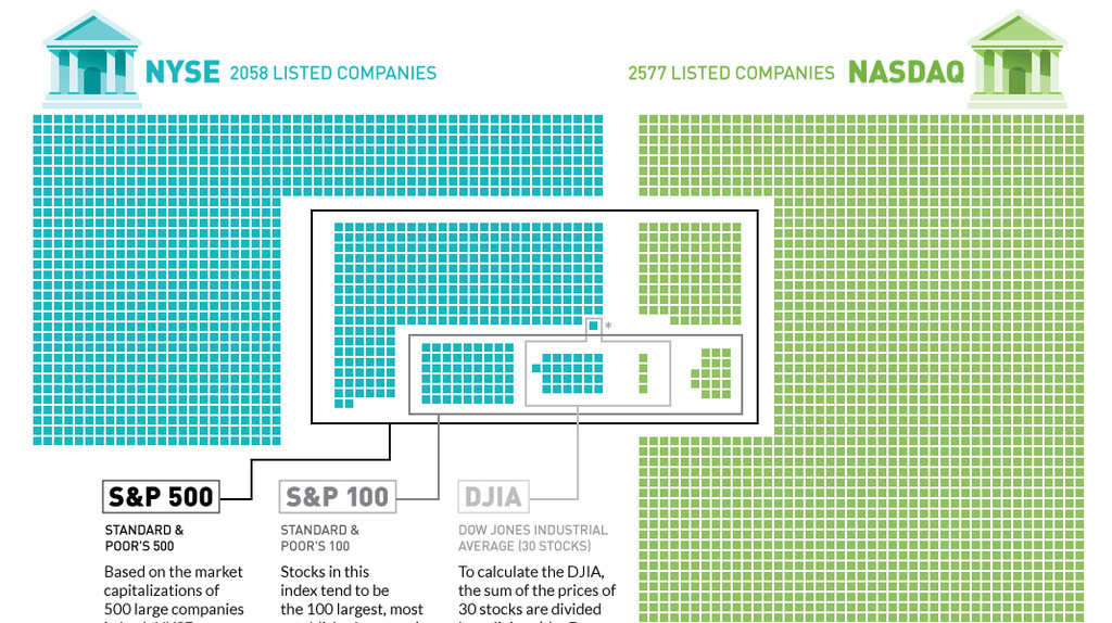
Plotting the 4,500+ companies on the NYSE and NASDAQ to show how the S&P 500, S&P 100, and Dow are derived.
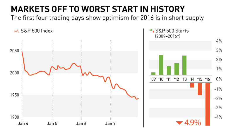
In this chart and post, we show why markets are off to their worst start in history. We also look at recent S&P 500 starts to...
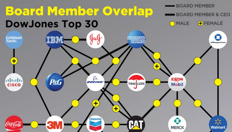
The most powerful corporations in America are intimately connected. Their boards and executives are intertwined in what looks like a spider web.


