Markets
The Best and Worst Performing Sectors in 2019
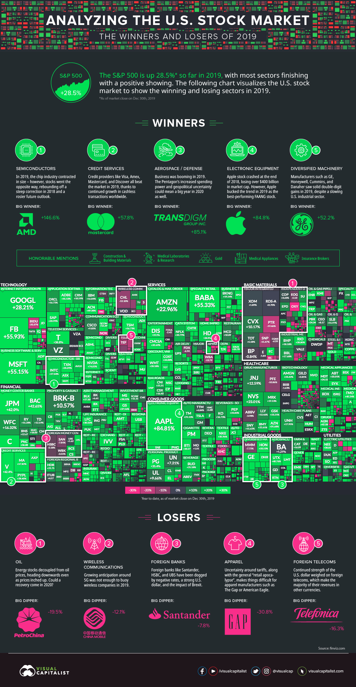
The Best and Worst Performing Sectors in 2019
If you think back almost 12 months, you’ll remember that the markets opened the year with extreme levels of volatility.
Stocks had just finished the worst year in a decade. Then in early January, Apple cut its earnings guidance after the company had already lost over $400 billion in market capitalization. The S&P 500 and DJIA seesawed, suggesting that the lengthy bull run could come to an end.
Yet, here we are a year later — we’re wrapping up the decade with a banner year for the S&P 500. As of the market close on December 30, 2019, stocks were up 28.5% to give the index what is expected to be its second-best performance since 1998.
Winners and Losers
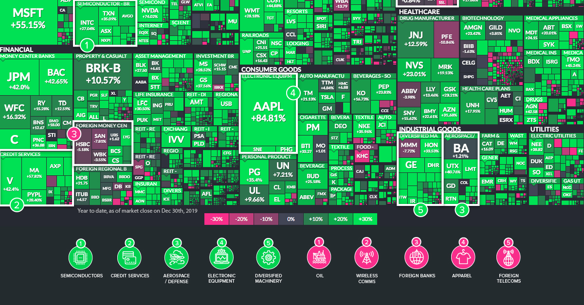
Today’s infographic pulls data from Finviz.com. We’ve taken their great treemap visualization of U.S. markets and augmented it to show the sectors that beat the frothy market in 2019, as well as the ones that lagged behind.
Below, we’ll highlight instances where sectors stood out as having companies that, with few exceptions, saw ubiquitously positive or negative returns.
Top Performing Sectors
1. Semiconductors
Semiconductor stocks soared in 2019, despite sales expected to shrink 12% globally. Although this seems counterintuitive at first glance, the context helps here: in 2018, there was hefty correction in the market – and the future outlook for the industry has also been revised to be rosier.
2. Credit Services
In case you didn’t get the memo, the world is increasingly going cashless — and payments companies have been licking their lips. Mastercard, Visa, American Express, Capital One, and Discover were just some of the names that outperformed the S&P 500 in 2019.
3. Aerospace / Defense
The vast majority of companies in this market, including Lockheed Martin, Raytheon, and United Technologies, all beat the market in 2019. One notable and obvious exception to this is Boeing, a company that saw its stock get hammered after the Boeing 737 Max model was grounded in the wake of several high-profile crashes.
4. Electronic Equipment
Apple shareholders had a bit of a wild ride in 2018. The company had risen in value to $1.1 trillion, but then it subsequently lost over $400 billion in market capitalization by the end of the year. Interestingly, in 2019, the stock had a strong bounce back year: the stock increased 84.8% in value, making it the best-performing FAANG stock by far.
5. Diversified Machinery
Manufacturers such as Honeywell, General Electric, Cummins, and Danaher saw solid double-digit gains in 2019, despite a slowing U.S. industrial sector. For GE in particular, this was a bit of a comeback year after its stock was decimated in 2018.
Honorable mentions:
Construction Materials, Medical Labs & Research, Gold, Medical Appliances, Insurance Brokers
Worst Performing Sectors
1. Oil
Big oil, independent oil, and many oil services companies all had a year to forget. While this is not unusual in a highly cyclical industry, what is strange is that this happened in a year where oil prices (WTI) increased 36% for the best year since 2016.
2. Wireless Communications
Growing anticipation around 5G was not enough to buoy wireless companies in 2019.
3. Foreign Banks
It’s a tough environment for European banks right now. Not only is it late in the cycle, but banks are trying to make money in an environment with negative rates and large amounts of Brexit uncertainty. The strong U.S. dollar doesn’t help much, either.
4. Apparel
The CEO of The Gap has described U.S. tariffs as “attacks on the American consumer”, providing just another nail in the coffin to the bottom line of the retail industry. Given these additional headwinds, it’s not surprising that companies like The Gap, American Eagle, Nordstrom, Urban Outfitters, and Abercrombie & Fitch all finished the year in the red.
5. Foreign Telecoms
Continued strength of the U.S. dollar weighed on foreign telecoms, which make the majority of their revenues in other currencies.


Markets
U.S. Debt Interest Payments Reach $1 Trillion
U.S. debt interest payments have surged past the $1 trillion dollar mark, amid high interest rates and an ever-expanding debt burden.


U.S. Debt Interest Payments Reach $1 Trillion
This was originally posted on our Voronoi app. Download the app for free on iOS or Android and discover incredible data-driven charts from a variety of trusted sources.
The cost of paying for America’s national debt crossed the $1 trillion dollar mark in 2023, driven by high interest rates and a record $34 trillion mountain of debt.
Over the last decade, U.S. debt interest payments have more than doubled amid vast government spending during the pandemic crisis. As debt payments continue to soar, the Congressional Budget Office (CBO) reported that debt servicing costs surpassed defense spending for the first time ever this year.
This graphic shows the sharp rise in U.S. debt payments, based on data from the Federal Reserve.
A $1 Trillion Interest Bill, and Growing
Below, we show how U.S. debt interest payments have risen at a faster pace than at another time in modern history:
| Date | Interest Payments | U.S. National Debt |
|---|---|---|
| 2023 | $1.0T | $34.0T |
| 2022 | $830B | $31.4T |
| 2021 | $612B | $29.6T |
| 2020 | $518B | $27.7T |
| 2019 | $564B | $23.2T |
| 2018 | $571B | $22.0T |
| 2017 | $493B | $20.5T |
| 2016 | $460B | $20.0T |
| 2015 | $435B | $18.9T |
| 2014 | $442B | $18.1T |
| 2013 | $425B | $17.2T |
| 2012 | $417B | $16.4T |
| 2011 | $433B | $15.2T |
| 2010 | $400B | $14.0T |
| 2009 | $354B | $12.3T |
| 2008 | $380B | $10.7T |
| 2007 | $414B | $9.2T |
| 2006 | $387B | $8.7T |
| 2005 | $355B | $8.2T |
| 2004 | $318B | $7.6T |
| 2003 | $294B | $7.0T |
| 2002 | $298B | $6.4T |
| 2001 | $318B | $5.9T |
| 2000 | $353B | $5.7T |
| 1999 | $353B | $5.8T |
| 1998 | $360B | $5.6T |
| 1997 | $368B | $5.5T |
| 1996 | $362B | $5.3T |
| 1995 | $357B | $5.0T |
| 1994 | $334B | $4.8T |
| 1993 | $311B | $4.5T |
| 1992 | $306B | $4.2T |
| 1991 | $308B | $3.8T |
| 1990 | $298B | $3.4T |
| 1989 | $275B | $3.0T |
| 1988 | $254B | $2.7T |
| 1987 | $240B | $2.4T |
| 1986 | $225B | $2.2T |
| 1985 | $219B | $1.9T |
| 1984 | $205B | $1.7T |
| 1983 | $176B | $1.4T |
| 1982 | $157B | $1.2T |
| 1981 | $142B | $1.0T |
| 1980 | $113B | $930.2B |
| 1979 | $96B | $845.1B |
| 1978 | $84B | $789.2B |
| 1977 | $69B | $718.9B |
| 1976 | $61B | $653.5B |
| 1975 | $55B | $576.6B |
| 1974 | $50B | $492.7B |
| 1973 | $45B | $469.1B |
| 1972 | $39B | $448.5B |
| 1971 | $36B | $424.1B |
| 1970 | $35B | $389.2B |
| 1969 | $30B | $368.2B |
| 1968 | $25B | $358.0B |
| 1967 | $23B | $344.7B |
| 1966 | $21B | $329.3B |
Interest payments represent seasonally adjusted annual rate at the end of Q4.
At current rates, the U.S. national debt is growing by a remarkable $1 trillion about every 100 days, equal to roughly $3.6 trillion per year.
As the national debt has ballooned, debt payments even exceeded Medicaid outlays in 2023—one of the government’s largest expenditures. On average, the U.S. spent more than $2 billion per day on interest costs last year. Going further, the U.S. government is projected to spend a historic $12.4 trillion on interest payments over the next decade, averaging about $37,100 per American.
Exacerbating matters is that the U.S. is running a steep deficit, which stood at $1.1 trillion for the first six months of fiscal 2024. This has accelerated due to the 43% increase in debt servicing costs along with a $31 billion dollar increase in defense spending from a year earlier. Additionally, a $30 billion increase in funding for the Federal Deposit Insurance Corporation in light of the regional banking crisis last year was a major contributor to the deficit increase.
Overall, the CBO forecasts that roughly 75% of the federal deficit’s increase will be due to interest costs by 2034.

-

 Maps2 weeks ago
Mapped: Average Wages Across Europe
-

 Money1 week ago
Which States Have the Highest Minimum Wage in America?
-

 Real Estate1 week ago
Ranked: The Most Valuable Housing Markets in America
-

 Business1 week ago
Charted: Big Four Market Share by S&P 500 Audits
-

 AI1 week ago
The Stock Performance of U.S. Chipmakers So Far in 2024
-

 Automotive2 weeks ago
Almost Every EV Stock is Down After Q1 2024
-

 Money2 weeks ago
Where Does One U.S. Tax Dollar Go?
-

 Green2 weeks ago
Ranked: Top Countries by Total Forest Loss Since 2001