Mapped: Europe’s GDP Per Capita, by Country
The Growth of a $1,000 Equity Investment, by Stock Market
Mapped: The Most Valuable Company in Each Southeast Asian Country
Visualizing Global Inflation Forecasts (2024-2026)
The World’s Fastest Growing Emerging Markets (2024-2029 Forecast)
Countries With the Highest Rates of Crypto Ownership
Mapped: The Number of AI Startups By Country
All of the Grants Given by the U.S. CHIPS Act
Visualizing AI Patents by Country
How Tech Logos Have Evolved Over Time
Visualizing the Tax Burden of Every U.S. State
Charted: What Frustrates Americans About the Tax System
Ranked: The Top 20 Countries in Debt to China
Charted: Which Country Has the Most Billionaires in 2024?
Charted: Which City Has the Most Billionaires in 2024?
Life Expectancy by Region (1950-2050F)
What Causes Preventable Child Deaths?
The Cost of an EpiPen in Major Markets
Charted: Global Tobacco Use by Country and Sex
Visualized: What Lives in Your Gut Microbiome?
Who’s Building the Most Solar Energy?
Mapped: The Age of Energy Projects in Interconnection Queues, by State
Ranked: The Top 10 EV Battery Manufacturers in 2023
The World’s Biggest Nuclear Energy Producers
The World’s Biggest Oil Producers in 2023
Mapped: U.S. Immigrants by Region
Mapped: Southeast Asia’s GDP Per Capita, by Country
The Largest Earthquakes in the New York Area (1970-2024)
Mapped: Average Wages Across Europe
Mapped: Asia’s Population Patterns by Density
Where the World’s Aluminum is Smelted, by Country
Visualizing Global Gold Production in 2023
Gold vs. S&P 500: Which Has Grown More Over Five Years?
Charted: The Value Gap Between the Gold Price and Gold Miners
How People Get Around in America, Europe, and Asia
The Carbon Footprint of Major Travel Methods
Ranking the Top 15 Countries by Carbon Tax Revenue
Ranked: The Countries With the Most Air Pollution in 2023
Top Countries By Forest Growth Since 2001
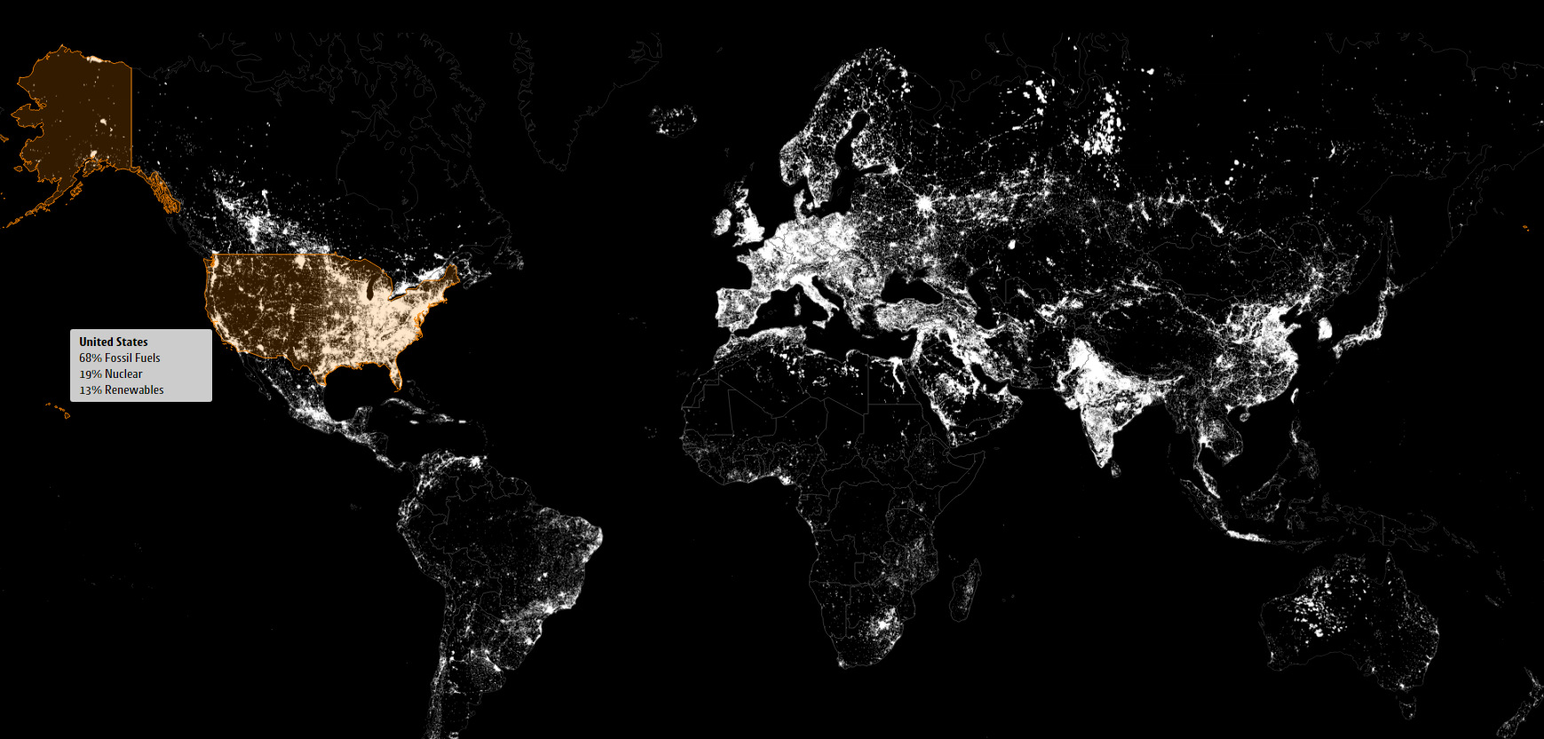
These satellite maps visualize where different energy sources, like fossil fuels, nuclear, or renewables, are used to generate electricity.
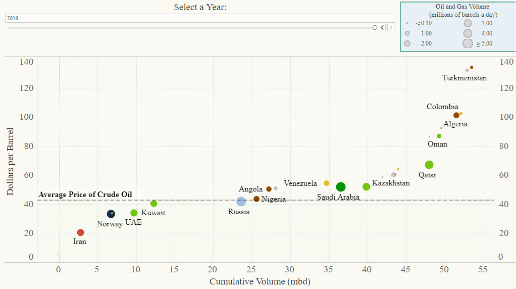
This interactive chart shows the breakeven prices that oil-rich countries need to pay for imports. We also dive into Venezuela's specific crisis as well.
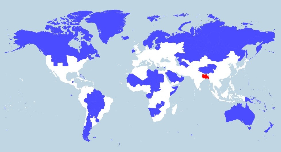
More people live in the tiny red region than all of the blue areas combined. This map really shows the disparity in population density throughout the...
Election day is finally here. Here's 10 charts and maps that will be central to the story as America makes its historical decision.
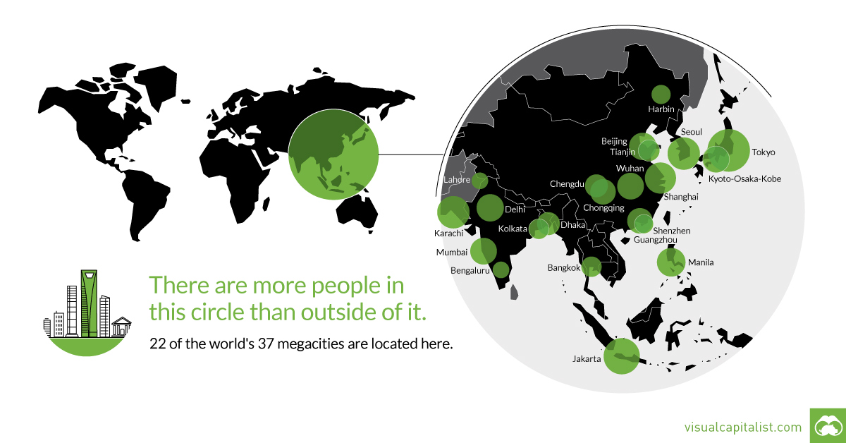
That's right - nearly 4 billion people live inside the circle on this world map, including 22 of the world's 37 megacities.
The 'garage-to-riches' story shows the true power that an idea can have. See the multi-billion dollar firms that were started in garages in this infographic.
The story of how Vancouver lost its affordability...and its mind.
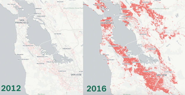
This animation shows the growth in million dollar homes in the Bay Area over the last four years. Today, the majority of homes in SF are...
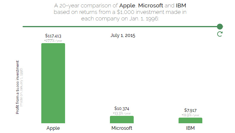
Going back 20 years, which stock would you buy? It turns out to be not even close between Apple and Microsoft.
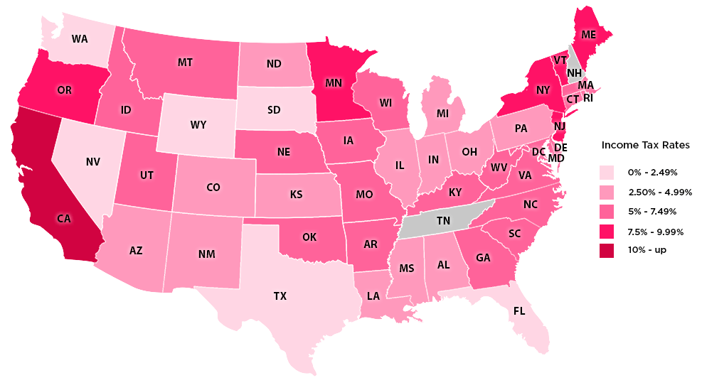
How green is the grass on the other side of the state border? See the U.S. states with the lowest income taxes in this series of...