


Economic inequality, Arms flows, Democracy
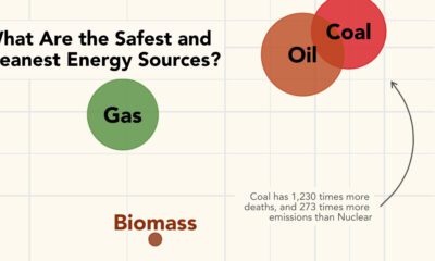

What are the safest energy sources? This graphic shows both GHG emissions and accidental deaths caused by different energy sources.
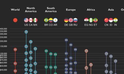

This graphic shows income distributions in 16 different countries around the world, using data from the World Inequality Database.
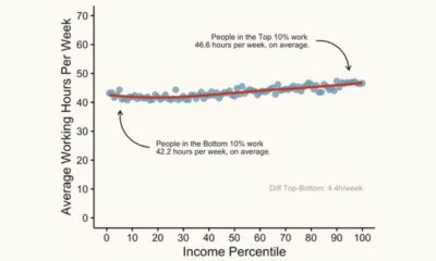

This graphic shows the average working hours between higher and lower-income groups in America, based on income percentile.
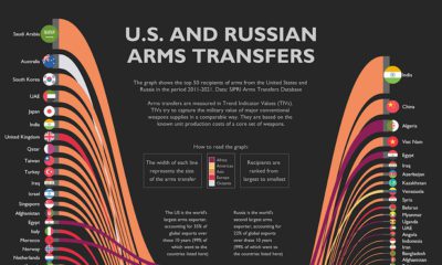

The U.S. and Russia combined for 57% of all global arms transfers in the last decade. This graphic highlights their 50 biggest trade partners.
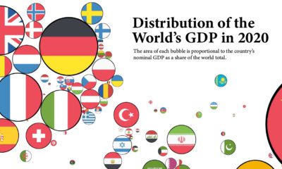

How have the world's largest economies changed over time? These graphics show countries sized by their GDP, as a share of the global total.