Visual Capitalist
You Asked For a Visual Capitalist Book… We’re Making It Happen!
For years, Visual Capitalist has created the best infographics on markets, technology, energy, and the global economy. And over that time, we’ve been asked many times when our work would be available in print form…
So today, we are excited to announce our new book called “Visualizing Change”.
The book, which explores how our world is shifting, will be made from our best infographics by adapting them to print. We’ll also be adding tons of new visualizations, too.
But we need your help to get it off the ground…
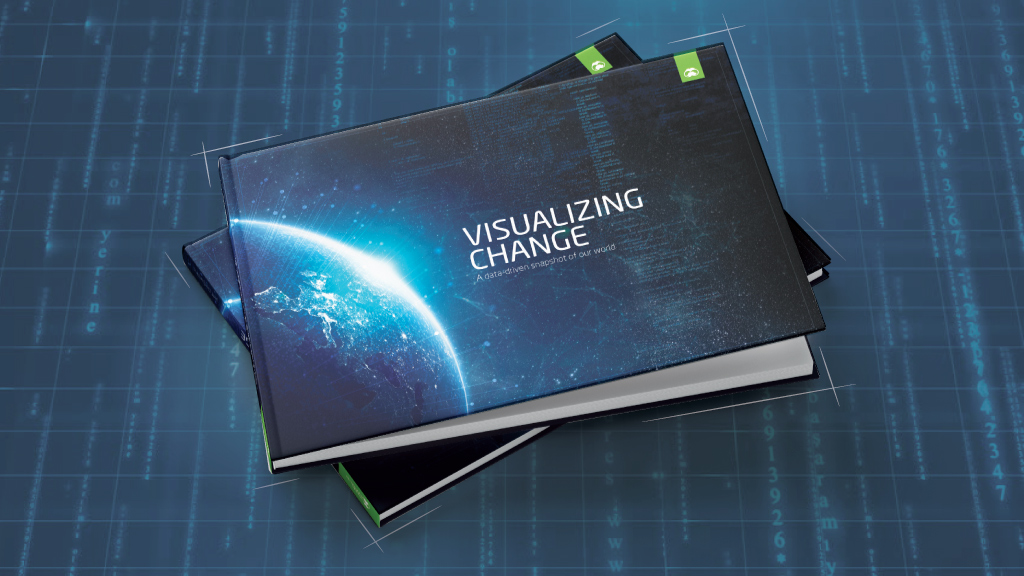
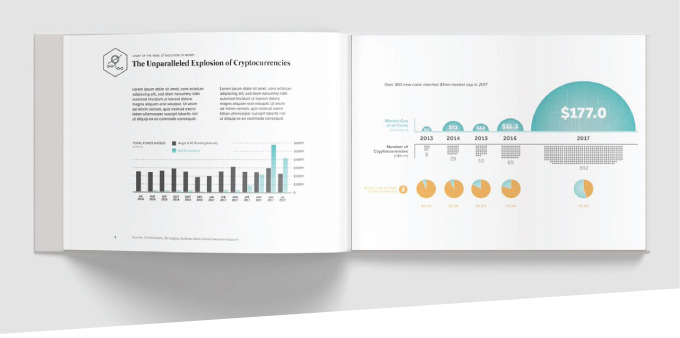
Mockup cover of “Visualizing Change: A Data-Driven Snapshot of Our World.”
Our Vision
We’ve always dreamed of making a book – but if we did it, we wanted to do it right!
A proper Visual Capitalist book would need to be loaded with world-class infographics, and to be designed with a hard-cover that would look stunning on your desk or coffee table.
And so two months ago, the idea of “Visualizing Change” was born…
The aim? To take a big picture look at our increasingly complex world, and to examine the many ways we are being impacted by new technology, shifting human geography, and the evolution of money, markets, and the economy.
How You Can Help
Creating and printing a hard-cover book can be expensive and time-consuming at the very best of times – but it’s even harder when we are dealing with hundreds of pages of complex data visualizations and infographics.
We’re still a small team, so the time-intensive design and printing processes are significant costs to handle upfront!
That’s where you come in: by pre-ordering the book on Kickstarter, you can help us reach our funding goal to get this ambitious book created, published, and printed.
Funding is all or nothing – so if we make our funding goal, the book gets made.

An Exclusive Opportunity
Not only will you get a copy of this visually groundbreaking book – but, to sweeten the deal, we’ve added all kinds of other awesome posters, prints, signed books, swag, and personalized options to our Kickstarter campaign page.
By pre-ordering before 12PM on October 31st, 2017, you’re not only helping our book become a reality – but you’re also able to get exclusive items that have been custom-made by the Visual Capitalist team especially for this campaign.
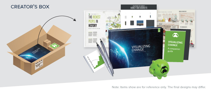
For example, below is our “Creator’s Box”, which comes with the book as well as goodies like mini-books (looking behind the scenes, and explaining the secrets behind how we make infographics) and other one-of-a-kind things.
Don’t Miss Out!
By going to the Kickstarter page right now, you can:
- Learn more about the upcoming book “Visualizing Change”
- Watch a video where our team outlines our vision for the book
- See the proposed themes, chapters, and book specs
- See mockups of the cover, layout, and posters
And of course, you can also pre-order the book or any of the other items, like posters, that are custom-made for this campaign.

If you back the campaign early with a pledge, it also helps the book generate early momentum to ensure that it gets fully funded.
Thank you so much for your support, and for being a supporter of Visual Capitalist!
– Jeff Desjardins
Founder & Editor-in-Chief of Visual Capitalist


Best of
Best Visualizations of April on the Voronoi App
We round up the most popular, most discussed, and most liked visualizations of the month on Voronoi, our new data storytelling platform.
At the end of 2023, we publicly launched Voronoi, our free new data discovery app!
The initial response from both users and creators has been incredible. We now have millions of in-app views, and there are already more than 1,000 interesting visualizations to discover, many of which will never be published on Visual Capitalist.
For that reason, we’ve chosen to highlight some of the most popular visualizations and creators from April in this roundup. To see them and many others, make sure to download the app!
Let’s take a look at a popular creator worth highlighting, as well as the most viewed, most discussed, and most liked posts of the month.
POPULAR CREATOR
Our World in Data
Visual Capitalist isn’t the only creator on the Voronoi app.
Instead, it features incredible data-driven charts and stories from many of the world’s best data sources, like Our World in Data.
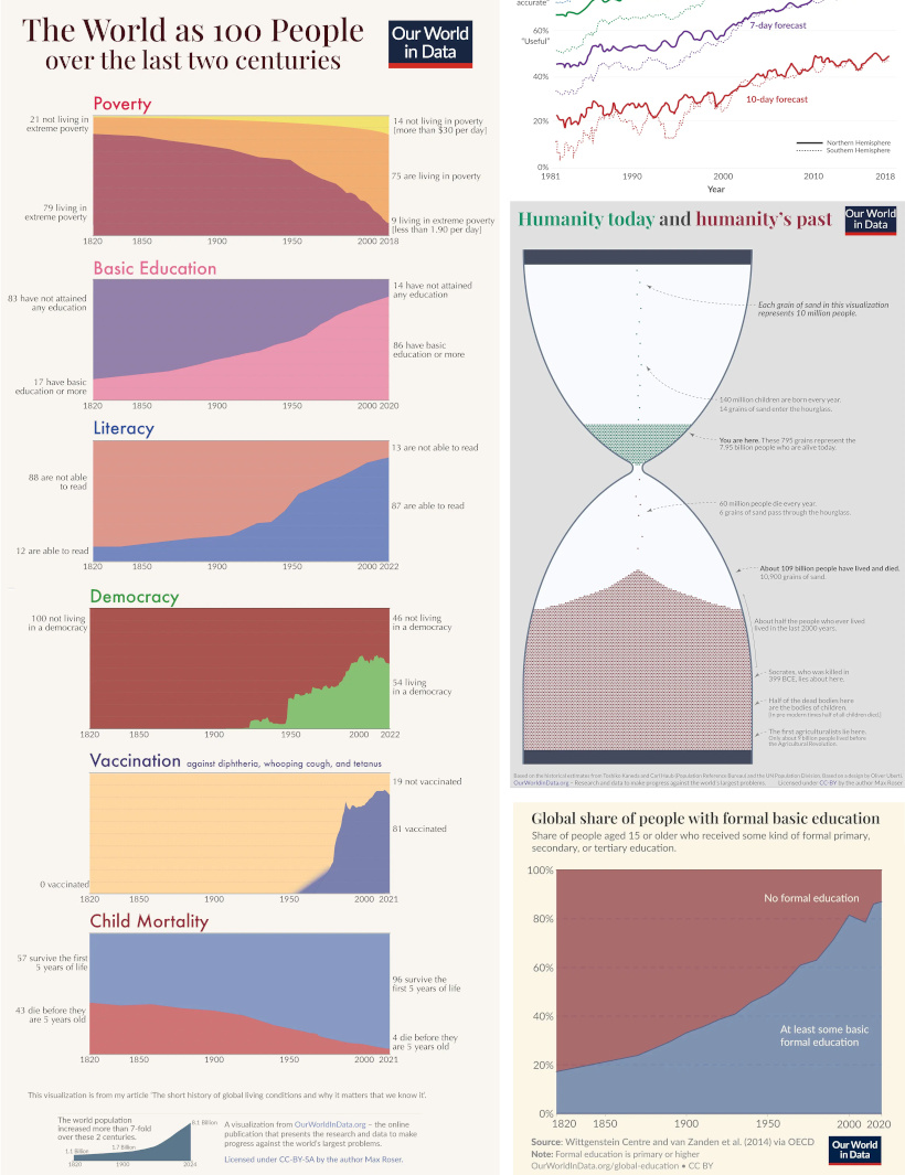
Our World in Data is one of the world’s most important public repositories of data online, covering a wide range of subjects on economics, demographics, history, health, and more.
On Voronoi, you can find a growing collection of visuals from Our World in Data, showing:
- Why weather forecasts are getting better over time
- Expected growth of the global population until the year 2100
- All of the humans that have ever lived, quantified
- Global poverty charted from 1977 until today
We highly recommend following Our World in Data on the app!
![]() View all of Our World in Data’s visuals on Voronoi today.
View all of Our World in Data’s visuals on Voronoi today.
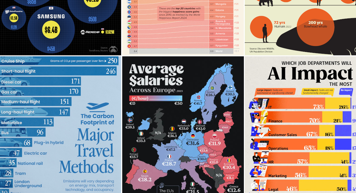
MOST VIEWED
Mapped: Average Salares in Europe
Europe is economically diverse.
Yes, the cost of living can be cheaper or more expensive depending where you go, but so are average wages:
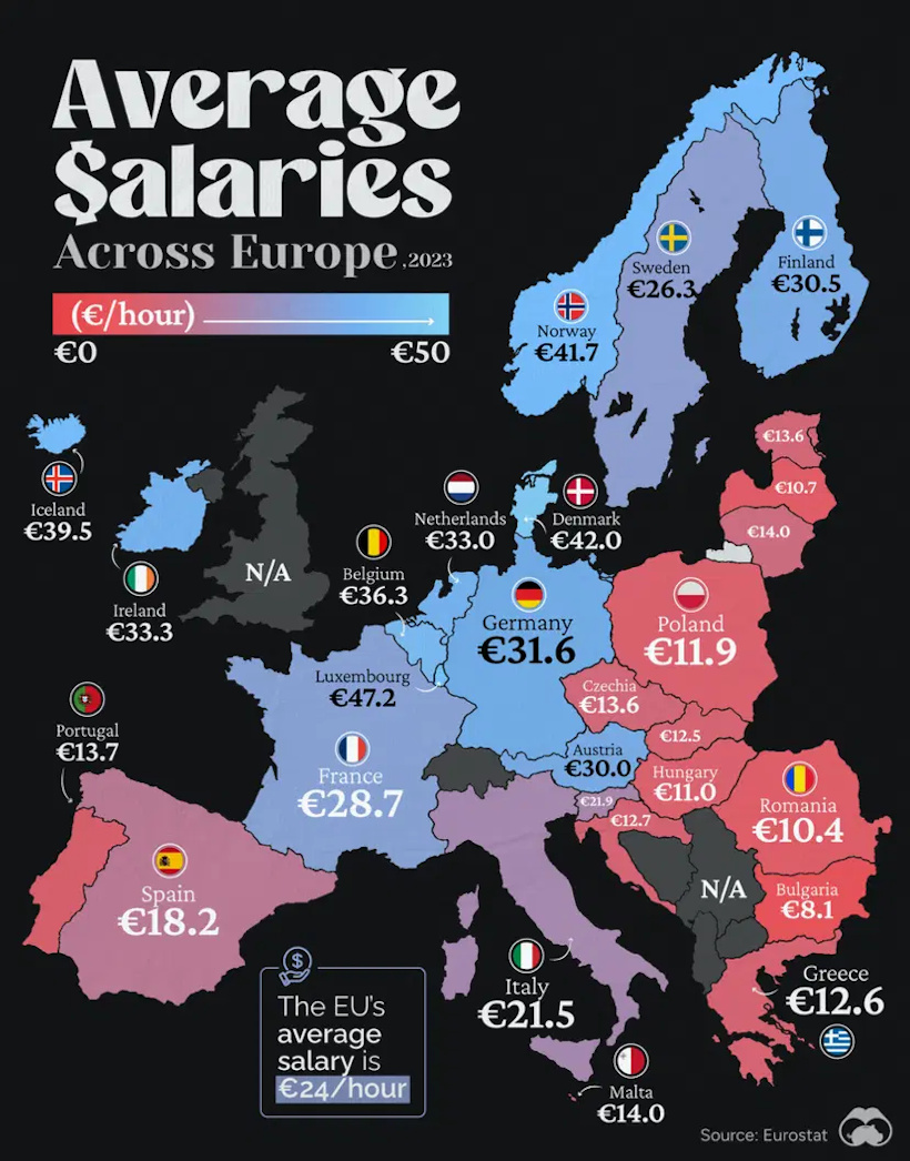
This visualization from Visual Capitalist resonated with our viewership this past month, garnering more views than any other visual published in April.
![]() Get the data behind this visual on Voronoi today.
Get the data behind this visual on Voronoi today.
MOST DISCUSSED
The Carbon Footprint of Travel
The most commented on visualization from Visual Capitalist showed the carbon footprints of many different common travel options.
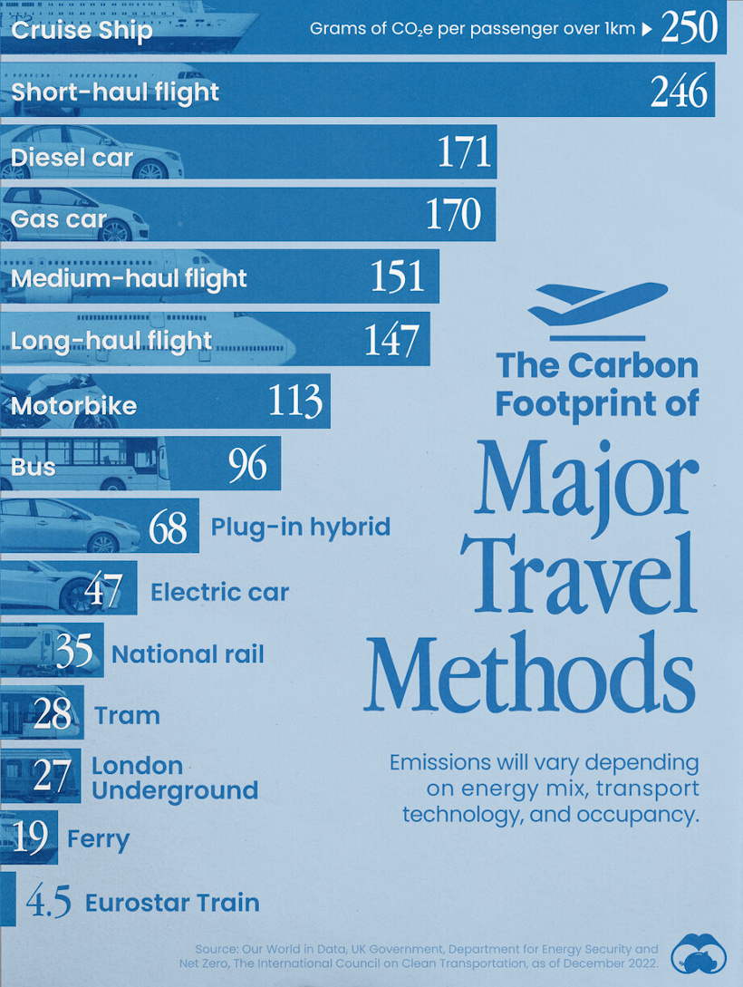
Interestingly, the most carbon-intensive form of transportation is cruise ships, and after that falls short-haul flights, gas-powered cars, and other options.
Commenting users wondered about ethanol-powered vehicles, which were not in the data set. They also asked how adding (or subtracting) passengers would affect the data.
![]() To join the conversation, download Voronoi today.
To join the conversation, download Voronoi today.
MOST LIKED
The Jobs Most Impacted by Artificial Intelligence
The most liked visual on Voronoi in April came from Visual Capitalist, showing the job departments that are most likely to be impacted by AI.
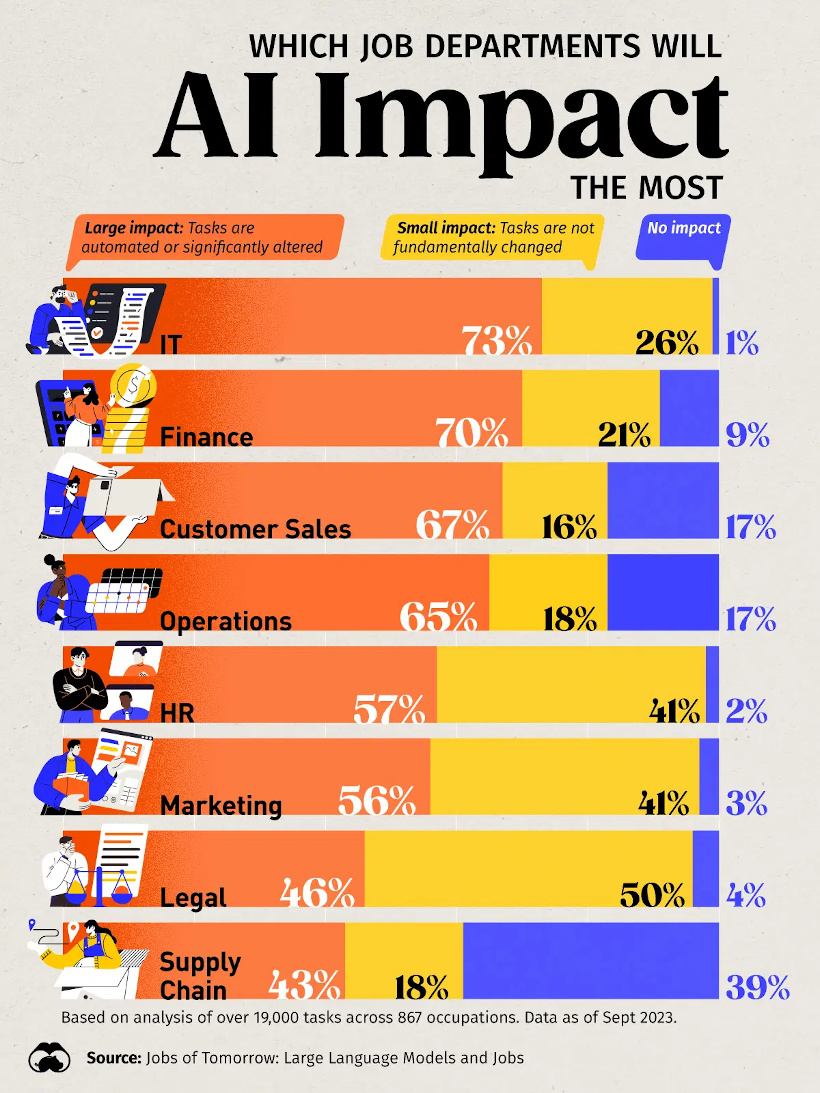
The data comes from an analysis of over 19,000 tasks across 867 occupations, and has IT and finance as the occupation areas most likely to be affected.
![]() Get the data behind this visual on Voronoi today.
Get the data behind this visual on Voronoi today.

-

 Lithium6 days ago
Ranked: The Top 10 EV Battery Manufacturers in 2023
-

 Green2 weeks ago
Top Countries By Forest Growth Since 2001
-

 United States2 weeks ago
Ranked: The Largest U.S. Corporations by Number of Employees
-

 Maps2 weeks ago
The Largest Earthquakes in the New York Area (1970-2024)
-

 Green2 weeks ago
Ranked: The Countries With the Most Air Pollution in 2023
-

 Green2 weeks ago
Ranking the Top 15 Countries by Carbon Tax Revenue
-

 Markets2 weeks ago
U.S. Debt Interest Payments Reach $1 Trillion
-

 Mining2 weeks ago
Gold vs. S&P 500: Which Has Grown More Over Five Years?