Energy
The Periodic Table of Commodity Returns
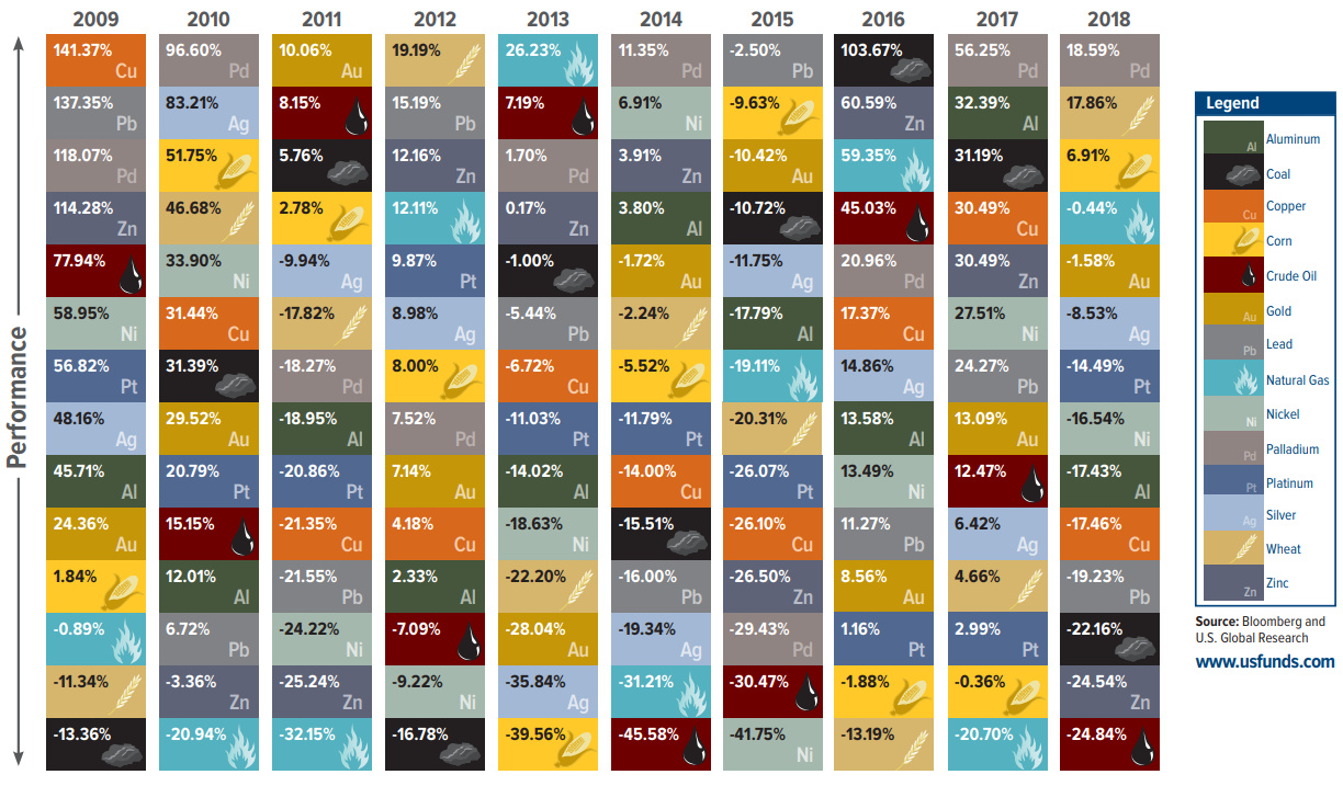
Periodic Table of Commodity Returns (2019 Edition)
Commodities are an interesting asset class to watch.
In certain years, all commodities will move in price together in an obvious and correlated fashion. This is a representation of the cyclical characteristics of commodity markets, in which macroeconomic factors align to create a tide that lifts or sinks all boats.
At the same time, however, each individual commodity is incredibly unique with its own specific set of supply and demand circumstances. In the years when these supply or demand crunches materialize, a certain commodity can surge or crash in price, separating itself from the rest of the pack.
A Decade of Commodity Returns
Today’s visualization comes to us from our friends at U.S. Global Investors, and it tracks commodity returns over the last decade.
More specifically, it takes a closer look at individual commodities (i.e. corn, gold, oil, zinc) to show how performance can vary over time. With a quick examination of the graphic, you can see years where commodities moved together – and some years where individual commodities stole the show unexpectedly.
Palladium: A Perennial Winner
The best performing commodity in 2018 was palladium, which found itself up 18.6% – just enough to edge out corn, which jumped up 17.9% in price last year.
Interestingly, palladium has also been the best performing commodity over the 10-year period as well:
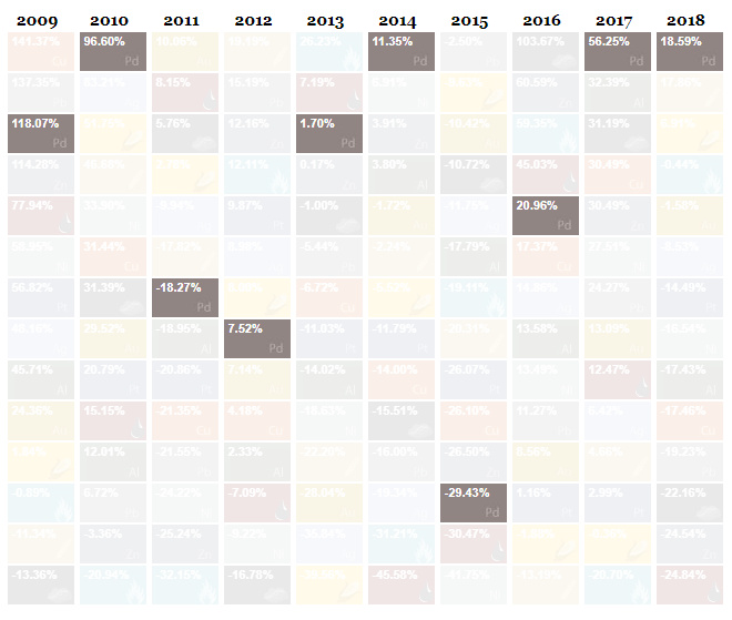
Palladium has finished in first place in four of the last 10 years, including in 2017 and 2018 – it’s also impressive to note that palladium has only had negative returns twice in the last decade (2011, 2015).
A Crude Awakening
The worst performing commodity in 2018 was crude oil, which fell -24.8% in price.
Like palladium, this wasn’t a unique occurrence: crude has actually been the worst performing commodity investment over the last decade:
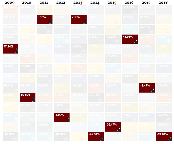
As you can see, crude oil has been the worst (or second worst) commodity in three of the last five years.
Further, as our chart on how all assets performed in 2018 shows, crude oil was outperformed by every other asset class, and the energy sector had the poorest performance out of all S&P 500 sectors last year.


Energy
Mapped: The Age of Energy Projects in Interconnection Queues, by State
This map shows how many energy projects are in interconnection queues by state and how long these projects have been queued up, on average.
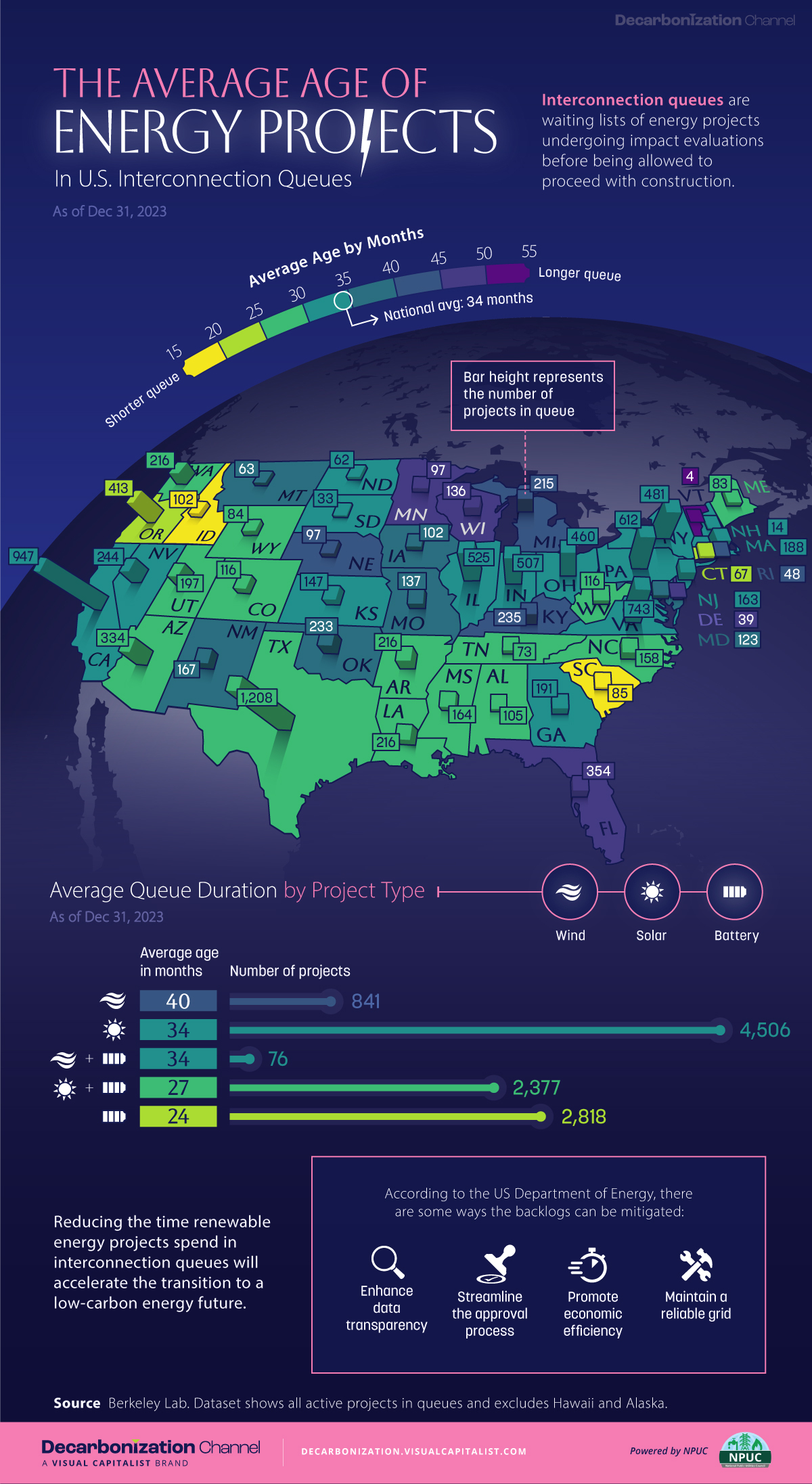

Age of Energy Projects in Interconnection Queues, by State
This was originally posted on our Voronoi app. Download the app for free on iOS or Android and discover incredible data-driven charts from a variety of trusted sources.
By the end of 2023, more than 11,000 energy projects were in interconnection queues in the United States, waiting for a green-light from regional grid operators to proceed with construction.
This map, created in partnership with the National Public Utilities Council, maps out the average age of active energy projects in interconnection queues by state, using data from Berkeley Lab.
Interconnection Queues, Explained
Interconnection queues are lists of energy projects that have made interconnection requests to their regional grid operators. Once submitted, these requests formally initiate the impact study process that each project goes through before grid connection, forming waiting lists for approval known as interconnection queues.
In recent years, both the number and generation capacity of queued projects have surged in the United States, along with the length of time spent in queue.
According to Berkeley Lab, the amount of generation capacity entering queues each year has risen by more than 550% from 2015 to 2023, with average queue duration rising from 3 years to 5 years the same period.
As a result of the growing backlog, a large proportion of projects ultimately withdraw from queues, leading to only 19% of applications reaching commercial operations.
The Backlog: Number of Projects and Average Wait Times
Of the 11,000 active projects in U.S. queues at the end of 2023, Texas, California, and Virginia had the most in queue; 1,208, 947, and 743, respectively.
When looking at the average ages of these projects, all three states hovered around the national average of 34 months (2.83 years), with Texas sporting 28 months, California 33, and Virginia 34.
Vermont, Minnesota, Wisconsin, and Florida, on the other hand, had the highest average queue durations; 54, 49, 47, and 46 months, respectively.
Average Queue Duration by Project Type
At the end of 2023, more than 95% of the generation capacity in active interconnection queues was for emission-free resources. The table below provides a breakdown.
| Project Type | Average Queue Duration (As of 12/31/2023) | Number of Projects in Queue |
|---|---|---|
| Wind | 40 months | 841 |
| Solar | 34 months | 4,506 |
| Wind+Battery | 34 months | 76 |
| Solar+Battery | 27 months | 2,377 |
| Battery | 24 months | 2,818 |
Wind projects had the highest wait times at the end of 2023 with an average age of 40 months (3.33 years). Solar projects, on the other hand, made up more than 40% of projects in queue.
Overall, reducing the time that these renewable energy projects spend in queues can accelerate the transition to a low-carbon energy future.
According to the U.S. Department of Energy, enhancing data transparency, streamlining approval processes, promoting economic efficiency, and maintaining a reliable grid are some of the ways this growing backlog can be mitigated.

-

 Technology6 days ago
All of the Grants Given by the U.S. CHIPS Act
-

 Uranium2 weeks ago
The World’s Biggest Nuclear Energy Producers
-

 Education2 weeks ago
How Hard Is It to Get Into an Ivy League School?
-

 Debt2 weeks ago
How Debt-to-GDP Ratios Have Changed Since 2000
-

 Sports2 weeks ago
The Highest Earning Athletes in Seven Professional Sports
-

 Science2 weeks ago
Visualizing the Average Lifespans of Mammals
-

 Brands1 week ago
How Tech Logos Have Evolved Over Time
-

 Energy1 week ago
Ranked: The Top 10 EV Battery Manufacturers in 2023