Business
Infographic: 8 Types of Clients to Avoid at All Costs
Everyone needs to work for somebody.
Whether you have a direct relationship with the clients that buy your services, or you get passed client feedback through other team members, getting frustrated with a bad client is an almost universal struggle.
Today’s infographic comes to us from GetCRM and it helps to make light of some of these tragic client experiences.
Clients to Avoid
Regardless of your industry or job title, there’s a good chance you can relate to these eight hilarious (but true) archetypes of clients to avoid:
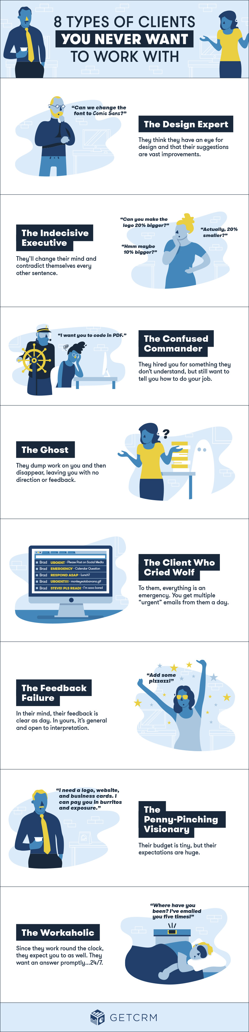
What’s more dreadful?
The client that permanently disappears and never gives an ounce of feedback, or the client that is all over you 24/7 and claims to know your field better than you?
Whether you’re a tech entrepreneur or an investment advisor, it’s likely you’ve had run-ins with at least one of these larger-than-life archetypes.
The Eight Archetypes
According to the infographic, here are the eight archetypes of clients to avoid:
The Design Expert
They think that they have an eye for design, and think that their suggestions are vast improvements on whatever you’ve put together.
The Indecisive Executive
Their feedback could be useful if it didn’t always contradict itself. This client tells you to go one direction, and then to reverse in the exact opposite.
The Confused Commander
Reminiscent of Dilbert’s boss in the famous comic strip, the Confused Commander hires you for something they don’t understand and then provides advice on how to do it.
The Ghost
After dumping a load of work on you, they disappear – never to be seen or heard again. Hopefully they paid upfront.
The Client Who Cried Wolf
Everything is an emergency to this person. Heaven help you if there actually is an urgent problem, because it will likely be sandwiched between 10 other “issues”.
The Feedback Failure
This person has very specific feedback ideas and needs, but utterly fails in communicating them to you. Statements are general, subjective, and open to interpretation – and that doesn’t help move things along, at all.
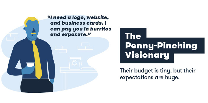
The Penny Pinching Visionary
The Penny Pinching Visionary has a tiny budget, but massive expectations for your work.
The Workaholic
This person is seemingly awake and connected 24/7, and is wondering why you haven’t responded to their last email.
Technology
How Tech Logos Have Evolved Over Time
From complete overhauls to more subtle tweaks, these tech logos have had quite a journey. Featuring: Google, Apple, and more.


How Tech Logos Have Evolved Over Time
This was originally posted on our Voronoi app. Download the app for free on iOS or Android and discover incredible data-driven charts from a variety of trusted sources.
One would be hard-pressed to find a company that has never changed its logo. Granted, some brands—like Rolex, IBM, and Coca-Cola—tend to just have more minimalistic updates. But other companies undergo an entire identity change, thus necessitating a full overhaul.
In this graphic, we visualized the evolution of prominent tech companies’ logos over time. All of these brands ranked highly in a Q1 2024 YouGov study of America’s most famous tech brands. The logo changes are sourced from 1000logos.net.
How Many Times Has Google Changed Its Logo?
Google and Facebook share a 98% fame rating according to YouGov. But while Facebook’s rise was captured in The Social Network (2010), Google’s history tends to be a little less lionized in popular culture.
For example, Google was initially called “Backrub” because it analyzed “back links” to understand how important a website was. Since its founding, Google has undergone eight logo changes, finally settling on its current one in 2015.
| Company | Number of Logo Changes |
|---|---|
| 8 | |
| HP | 8 |
| Amazon | 6 |
| Microsoft | 6 |
| Samsung | 6 |
| Apple | 5* |
Note: *Includes color changes. Source: 1000Logos.net
Another fun origin story is Microsoft, which started off as Traf-O-Data, a traffic counter reading company that generated reports for traffic engineers. By 1975, the company was renamed. But it wasn’t until 2012 that Microsoft put the iconic Windows logo—still the most popular desktop operating system—alongside its name.
And then there’s Samsung, which started as a grocery trading store in 1938. Its pivot to electronics started in the 1970s with black and white television sets. For 55 years, the company kept some form of stars from its first logo, until 1993, when the iconic encircled blue Samsung logo debuted.
Finally, Apple’s first logo in 1976 featured Isaac Newton reading under a tree—moments before an apple fell on his head. Two years later, the iconic bitten apple logo would be designed at Steve Jobs’ behest, and it would take another two decades for it to go monochrome.

-

 Mining1 week ago
Gold vs. S&P 500: Which Has Grown More Over Five Years?
-

 Markets2 weeks ago
Ranked: The Most Valuable Housing Markets in America
-

 Money2 weeks ago
Which States Have the Highest Minimum Wage in America?
-

 AI2 weeks ago
Ranked: Semiconductor Companies by Industry Revenue Share
-

 Markets2 weeks ago
Ranked: The World’s Top Flight Routes, by Revenue
-

 Countries2 weeks ago
Population Projections: The World’s 6 Largest Countries in 2075
-

 Markets2 weeks ago
The Top 10 States by Real GDP Growth in 2023
-

 Demographics2 weeks ago
The Smallest Gender Wage Gaps in OECD Countries