Today's chart from Macquarie shows all asset classes YTD, and gives perspective on the 2015 collapse of commodities.
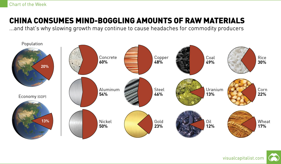
The 1.4 billion people living in China account for 13% of global GDP, but this chart shows that for commodity producers, the country means so much...
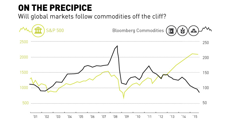
Commodities have fell off the cliff with oil and base metals getting crushed over the last year. Is the general market about to follow the same...
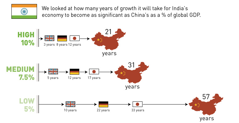
With Chinese economic growth reaching its slowest point in six years, the world is looking for a new engine. Is India the next China?
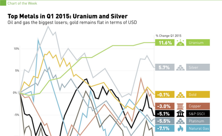
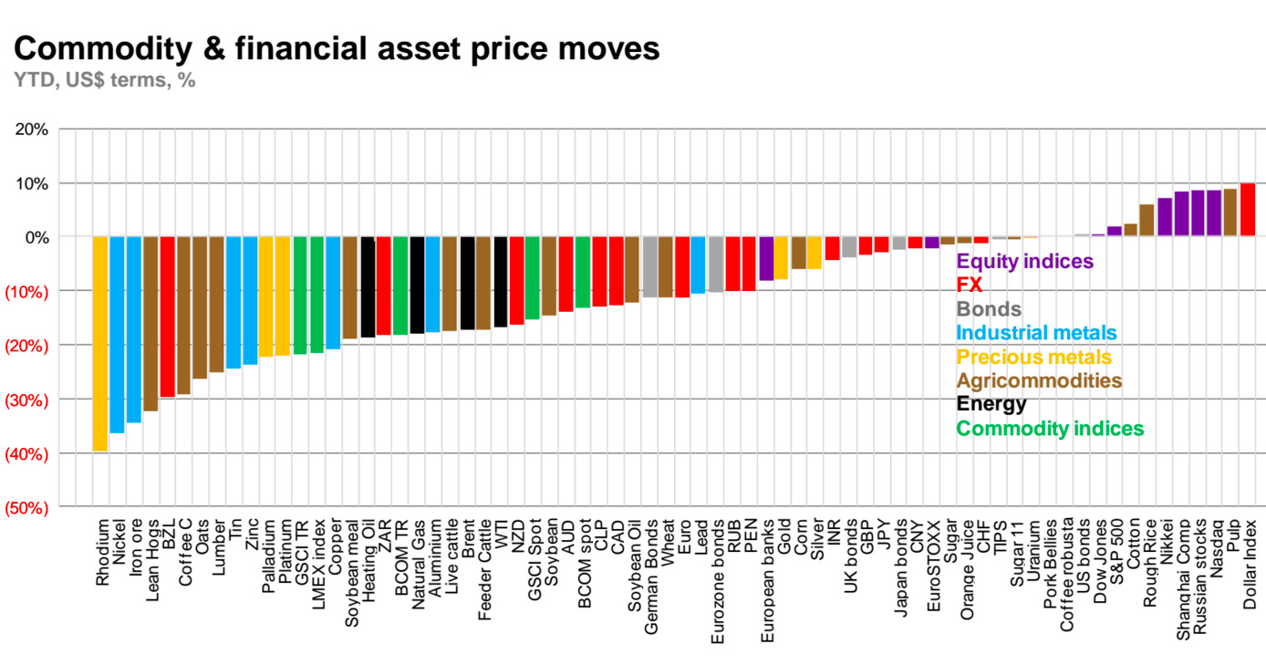
In 2015 Q1, silver and uranium led the way, while oil and natural gas struggled. See all returns in today's Chart of the Week.
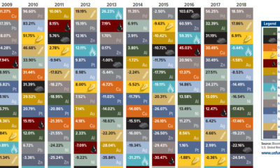

This visualization compares the annual returns of major commodities over the last 10 years including gold, silver, oil, and more.
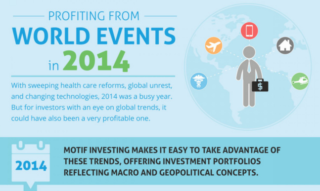
This infographic shows how investors could have profited off of certain world events in 2014.
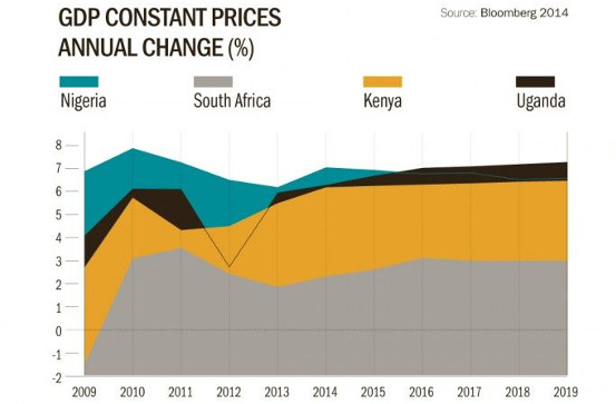
Despite declining commodity prices and the outbreak of Ebola, investors are still betting on Africa.
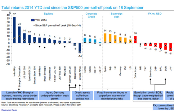
This Deutsche Bank chart shows the performance of every major asset class YTD so far in 2014.
In a market with surging big boards, high volatility, $85 oil, low commodity prices, and slowing China growth, there is no telling where things will go....


