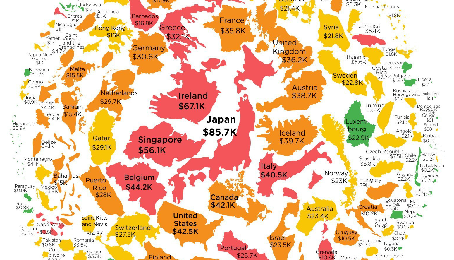
Mapped: Europe’s GDP Per Capita, by Country
The Growth of a $1,000 Equity Investment, by Stock Market
Mapped: The Most Valuable Company in Each Southeast Asian Country
Visualizing Global Inflation Forecasts (2024-2026)
The World’s Fastest Growing Emerging Markets (2024-2029 Forecast)
Countries With the Highest Rates of Crypto Ownership
Mapped: The Number of AI Startups By Country
All of the Grants Given by the U.S. CHIPS Act
Visualizing AI Patents by Country
How Tech Logos Have Evolved Over Time
Visualizing the Tax Burden of Every U.S. State
Charted: What Frustrates Americans About the Tax System
Ranked: The Top 20 Countries in Debt to China
Charted: Which Country Has the Most Billionaires in 2024?
Charted: Which City Has the Most Billionaires in 2024?
Mapped: Countries Where Recreational Cannabis is Legal
Which Countries Have the Highest Infant Mortality Rates?
Life Expectancy by Region (1950-2050F)
What Causes Preventable Child Deaths?
The Cost of an EpiPen in Major Markets
Who’s Building the Most Solar Energy?
Mapped: The Age of Energy Projects in Interconnection Queues, by State
Ranked: The Top 10 EV Battery Manufacturers in 2023
The World’s Biggest Nuclear Energy Producers
The World’s Biggest Oil Producers in 2023
Mapped: U.S. Immigrants by Region
Mapped: Southeast Asia’s GDP Per Capita, by Country
The Largest Earthquakes in the New York Area (1970-2024)
Mapped: Average Wages Across Europe
Visualizing Copper Production by Country in 2023
Where the World’s Aluminum is Smelted, by Country
Visualizing Global Gold Production in 2023
Gold vs. S&P 500: Which Has Grown More Over Five Years?
How People Get Around in America, Europe, and Asia
The Carbon Footprint of Major Travel Methods
Ranking the Top 15 Countries by Carbon Tax Revenue
Ranked: The Countries With the Most Air Pollution in 2023
Top Countries By Forest Growth Since 2001
Want to know how much money the government has borrowed on your behalf? This infographic shows government debt per capita for every country in the world.
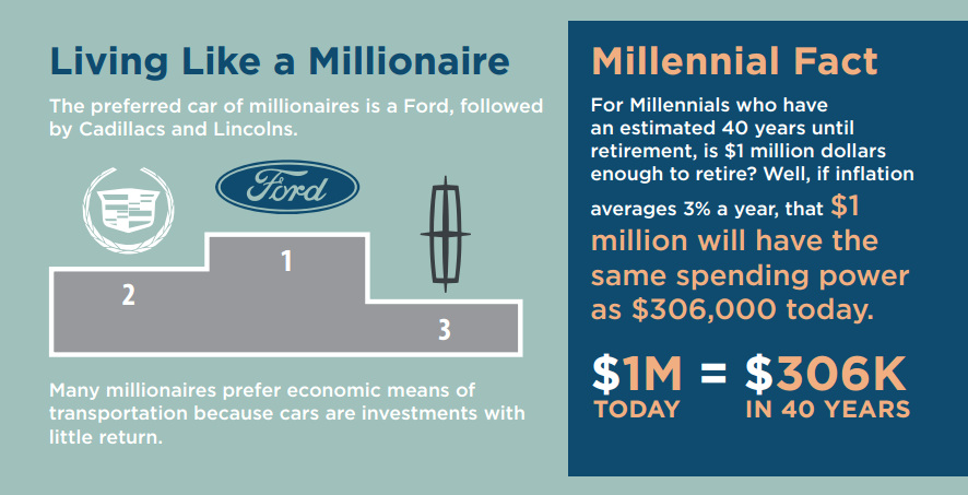
The preferred car for millionaires is a Ford, and most millionaires expect to continue working all the way until retirement.
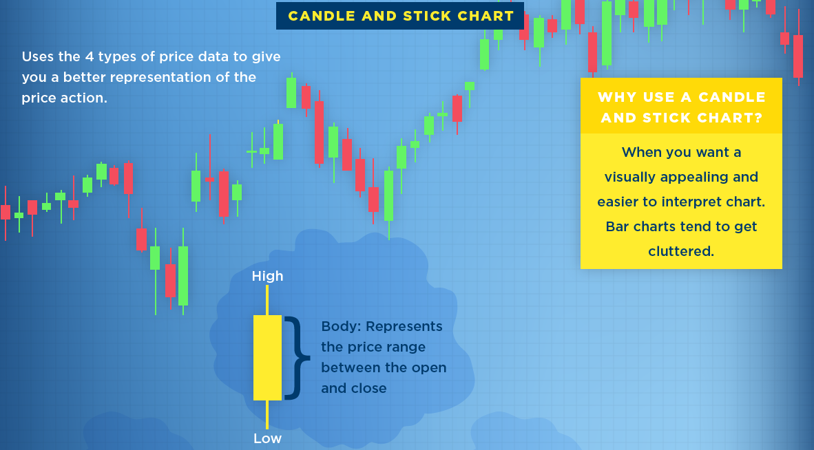
What is a stock chart? Here's three of the most common types of stock charts, along with a description of the data they typically provide investors.
This infographic serves as a cheat sheet to the third party candidates in the U.S. Election, covering what Gary Johnson and Jill Stein are all about.
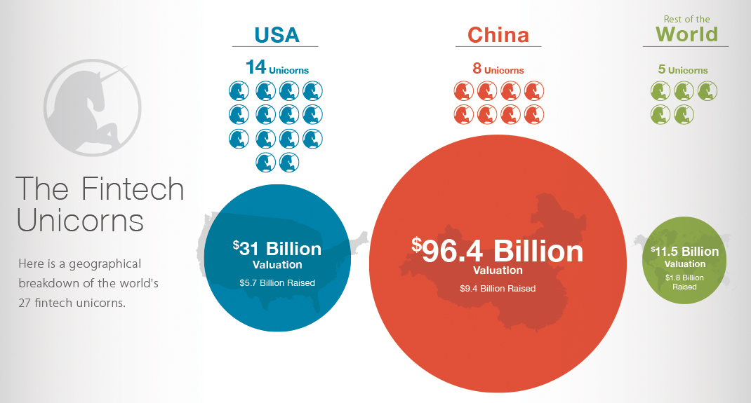
Does the U.S. or China have more valuable fintech startups? This data visualization breaks down fintech unicorns by valuations, money raised, and location.
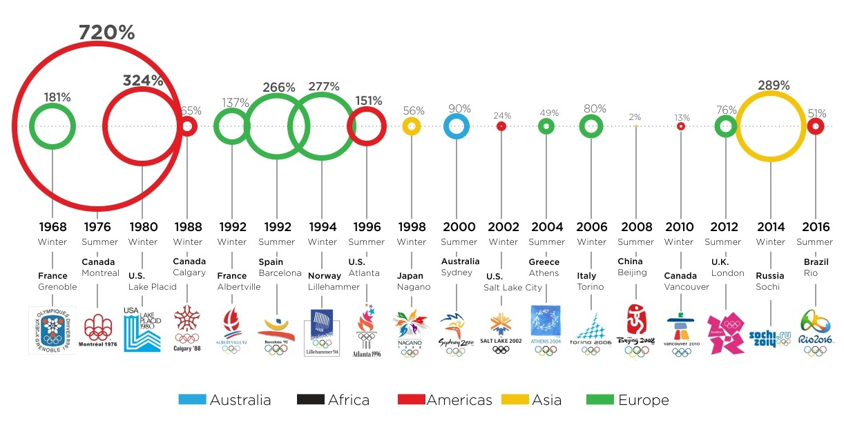
Rarely can a 51% cost overrun be called a success. It turns out, in the bizarro world of the Olympics, going that far overbudget actually isn't...
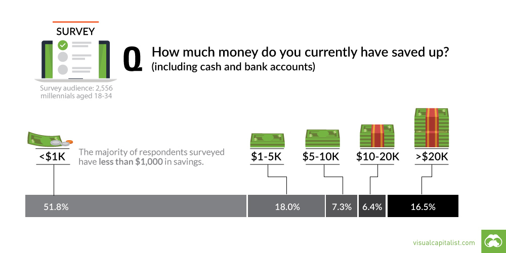
A recent survey shows that most millennials are living paycheck to paycheck. This chart looks at their savings, as well as differences between subgroups.
There is no shortage of sights to see in this world. See which countries rake in the most tourist dollars with this infographic map.
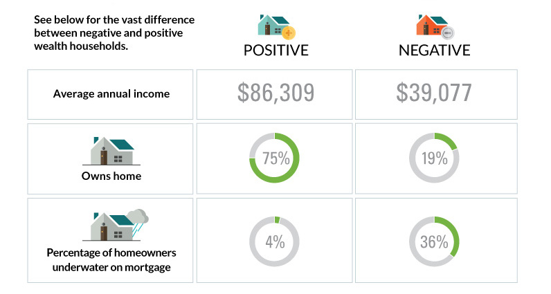
The differences between America's poorest homes - those with negative wealth - and their positive counterparts are stark and numerous.
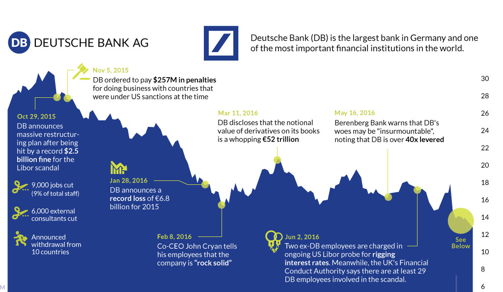
The fate of Germany's largest bank appears to be sealed. This timeline shows the fall of Deutsche Bank, one of Europe's most crucial financial institutions.