Demographics
Population Projections: The World’s 6 Largest Countries in 2075
![]() See this visualization first on the Voronoi app.
See this visualization first on the Voronoi app.
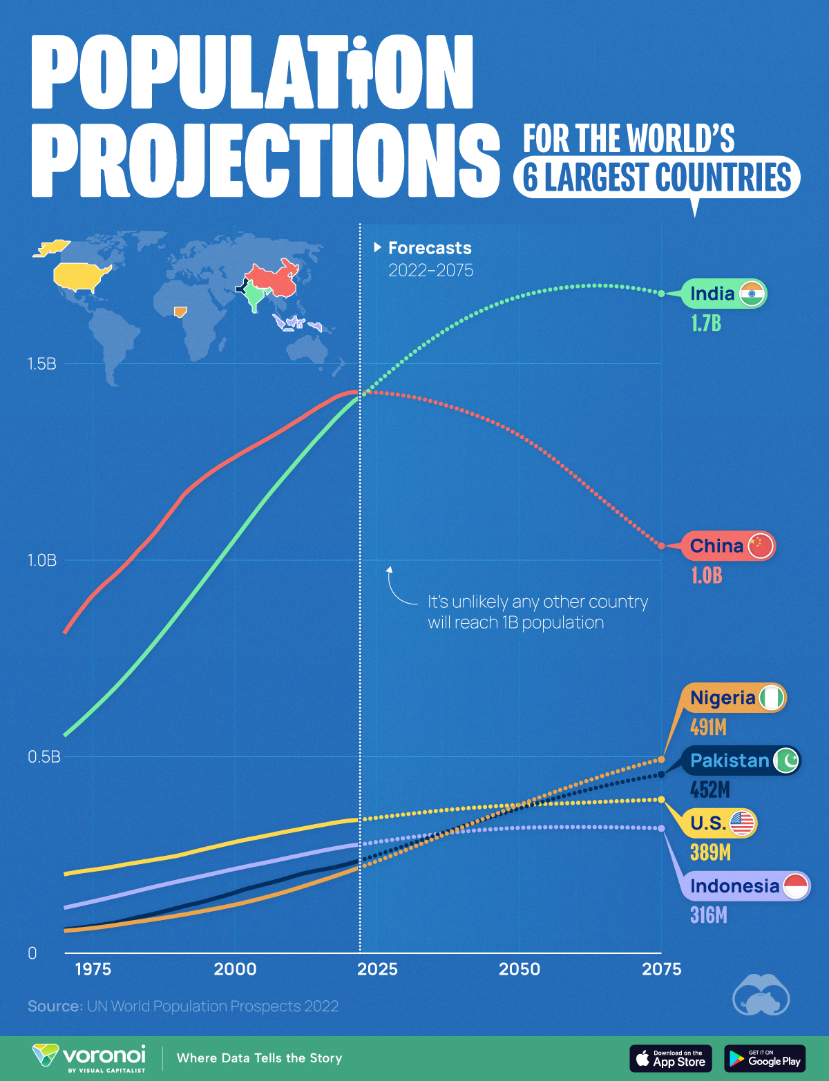
Population Projections for the World’s 6 Largest Countries
This was originally posted on our Voronoi app. Download the app for free on Apple or Android and discover incredible data-driven charts from a variety of trusted sources.
The end of the 21st century will see the first plateauing (and eventually shrinking) of world population since the Industrial Revolution. As birth rates fall across the globe, what does this mean for the world’s most populous countries?
To find out, we visualized forecasts for the world’s six largest countries using data from the latest revised version of the UN World Population Prospects 2022.
Projections are based on a “medium fertility scenario”, which assumes countries will converge at a birth rate of 1.85 children per woman, by 2045-2050.
China’s Projected Population Decline
China’s population boom has officially come to an end, with the country reporting two consecutive years of decreases (down 850,000 in 2022, and 2.1 million in 2023).
| Year | 🇨🇳 China | 🇺🇸 U.S. | 🇮🇩 Indonesia |
|---|---|---|---|
| 1970 | 812M | 199M | 114M |
| 1980 | 975M | 222M | 146M |
| 1990 | 1,144M | 246M | 181M |
| 2000 | 1,260M | 281M | 213M |
| 2010 | 1,344M | 310M | 242M |
| 2020 | 1,424M | 335M | 271M |
| 2030E | 1,417M | 351M | 291M |
| 2040E | 1,380M | 366M | 308M |
| 2050E | 1,317M | 375M | 317M |
| 2060E | 1,211M | 381M | 319M |
| 2070E | 1,091M | 387M | 318M |
| 2075E | 1,035M | 389M | 316M |
Note: Figures are rounded.
The country’s population in 2050 is forecasted to be 1.32 billion, which is roughly the same as it was in 2007. The UN believes this demographic downtrend will accelerate as we enter the second half of the century.
What does this mean for the Chinese economy? Many worry that a smaller workforce, coupled with an aging population, will increase healthcare expenditures and hamper economic growth.
India’s Population Boom Continues
Meanwhile, the UN believes that India’s population will peak somewhere in the mid 2060s, just shy of the 1.7 billion mark.
India’s population will not age as quickly as its neighbor. Those over the age of 65 will represent less than one-fifth of the population until 2060, and their share of India’s total number of people and will not approach 30% until 2100.
| Year | 🇮🇳 India | 🇵🇰 Pakistan | 🇳🇬 Nigeria |
|---|---|---|---|
| 1970 | 551M | 58M | 55M |
| 1980 | 689M | 79M | 72M |
| 1990 | 861M | 114M | 94M |
| 2000 | 1,050M | 152M | 121M |
| 2010 | 1,232M | 192M | 159M |
| 2020 | 1,390M | 225M | 206M |
| 2030E | 1,509M | 272M | 260M |
| 2040E | 1,608M | 320M | 318M |
| 2050E | 1,668M | 366M | 375M |
| 2060E | 1,695M | 406M | 427M |
| 2070E | 1,691M | 439M | 472M |
| 2075E | 1,678M | 452M | 491M |
Note: Figures are rounded.
Finally, whether these predictions come true or not will depend on how quickly birth rates fall as the country develops. For example, India’s fertility rate fell from 6.2 in 1950, to 2.0 in 2021 (births per woman).


Demographics
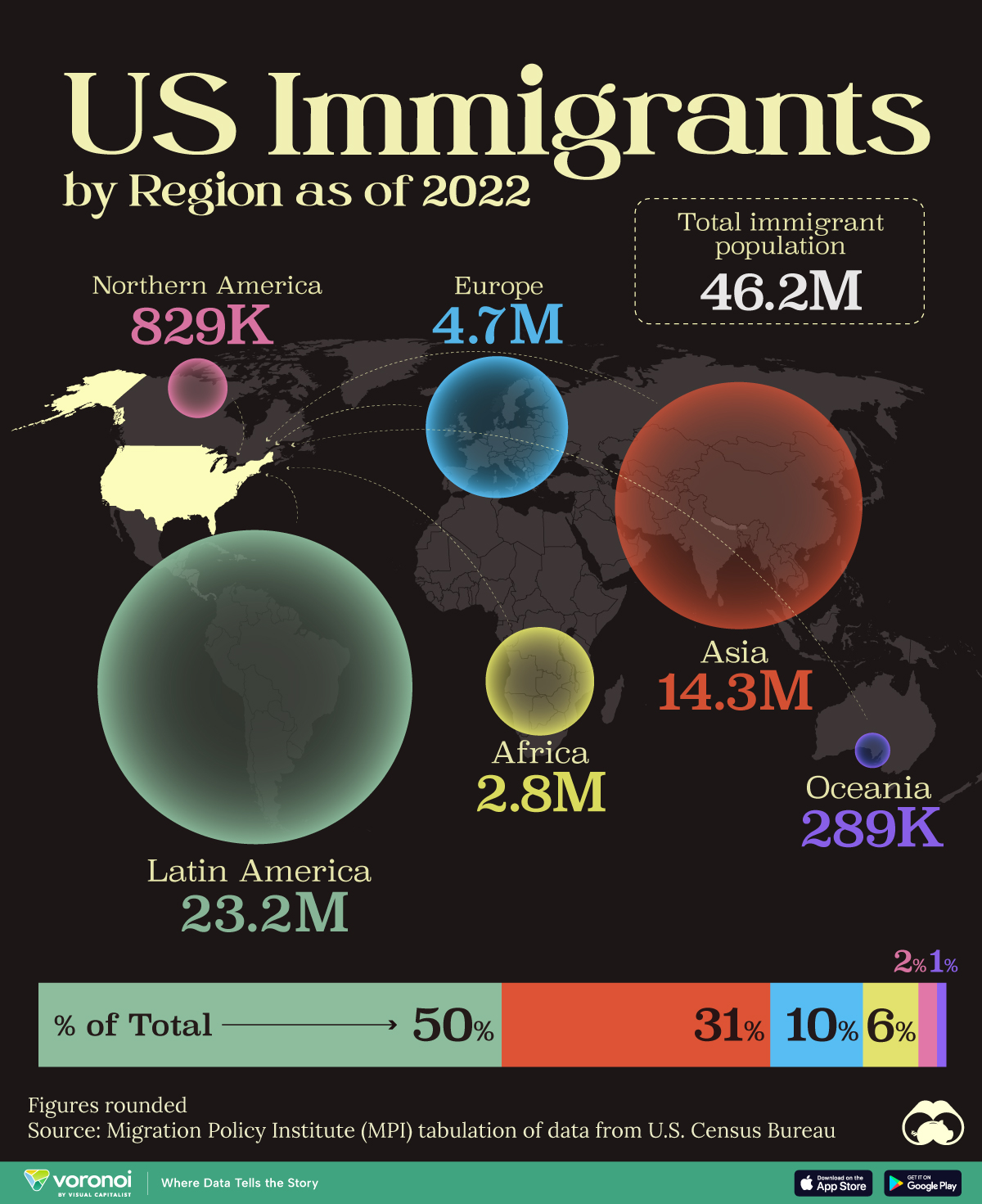
Mapped: U.S. Immigrants by Region
This map shows which regions U.S. immigrants came from, highlighting Asia and Latin America as the biggest sources.
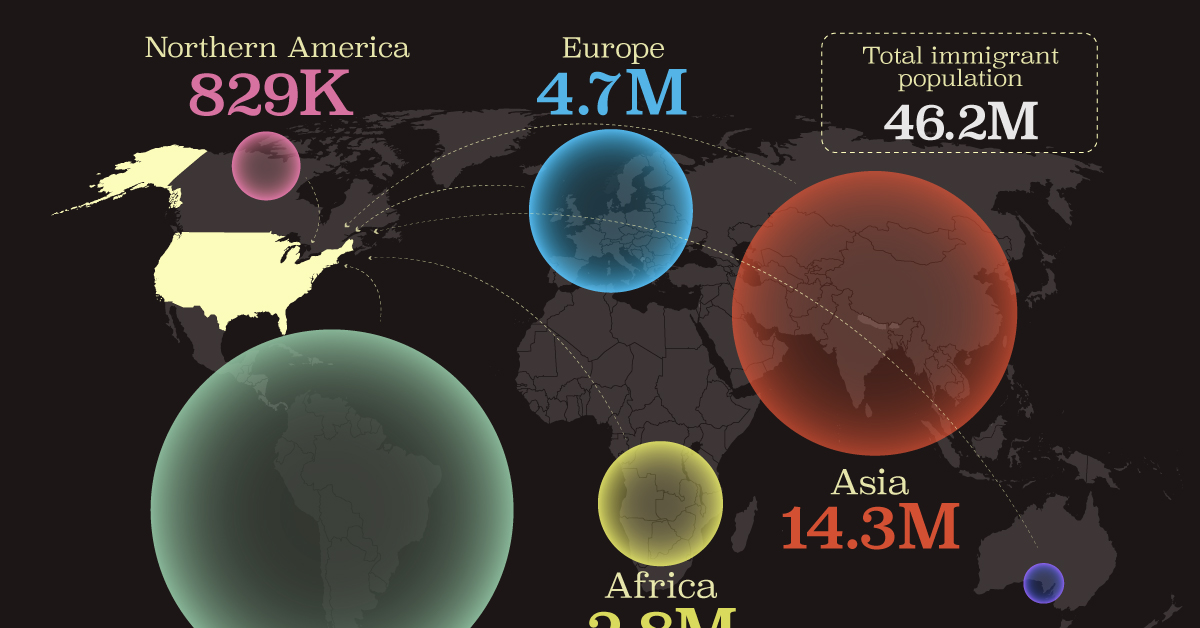
Breaking Down America’s Immigrant Population
This was originally posted on our Voronoi app. Download the app for free on iOS or Android and discover incredible data-driven charts from a variety of trusted sources.
The United States is home to more immigrants than any other nation, surpassing the combined totals of the next four countries: Germany, Saudi Arabia, Russia, and the United Kingdom.
To add context to this impressive fact, we’ve illustrated the regions from which U.S. immigrants originated. “Immigrants” in this context refers to individuals who are residing in the United States but were not U.S. citizens at birth.
These statistics were sourced from the Migration Policy Institute, which analyzed data from the U.S. Census Bureau’s 2022 American Community Survey (ACS).
U.S. Immigrants by Region
From this graphic, we can see that Asia and Latin America emerge as the primary sources of immigration, collectively accounting for 81% of America’s 46.2 million immigrants.
| Region | # of Immigrants | % of Total |
|---|---|---|
| Europe | 4,728,948 | 10 |
| Asia | 14,349,080 | 31 |
| Africa | 2,752,965 | 6 |
| Oceania | 288,560 | 1 |
| Northern America | 828,702 | 2 |
| Latin America | 23,233,834 | 50 |
| Total | 46,182,089 | 100 |
Latin America alone contributes half of the immigrant population. Mexico stands out as the largest contributor to U.S. immigration, with 10.7 million immigrants, attributable to its geographical proximity and historical ties.
Economic factors, including wage disparity and employment opportunities, drive many Mexicans to seek better prospects north of the border.
From Asia, the two largest country sources are China (2.2 million) and India (2.8 million).
Learn More About U.S. Immigration From Visual Capitalist
If you enjoyed this post, be sure to check out Why Do People Immigrate to the U.S.? This visualization shows the different reasons why immigrants chose to come to America in 2021.

-

 Markets5 days ago
Mapped: The Most Valuable Company in Each Southeast Asian Country
-

 Markets2 weeks ago
The Top Private Equity Firms by Country
-

 Jobs2 weeks ago
The Best U.S. Companies to Work for According to LinkedIn
-

 Economy2 weeks ago
Ranked: The Top 20 Countries in Debt to China
-

 Politics1 week ago
Charted: Trust in Government Institutions by G7 Countries
-

 Energy1 week ago
Mapped: The Age of Energy Projects in Interconnection Queues, by State
-

 Mining1 week ago
Visualizing Global Gold Production in 2023
-

 Markets1 week ago
Visualized: Interest Rate Forecasts for Advanced Economies