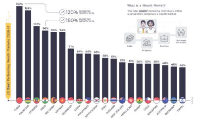

This telling chart shows how national wealth markets have changed over the past decade, highlighting the biggest winners and losers.
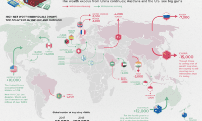

Which countries are magnets for the world's rich, and which countries are seeing a wealth exodus? Mapping the migration of the world's millionaires.
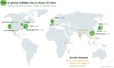

A data-driven snapshot of global wealth distribution. The average person around the world is doing better, but big-picture inequality is still staggering.


