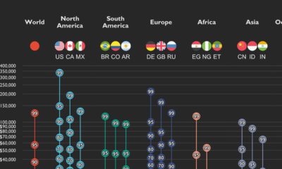

This graphic shows income distributions in 16 different countries around the world, using data from the World Inequality Database.
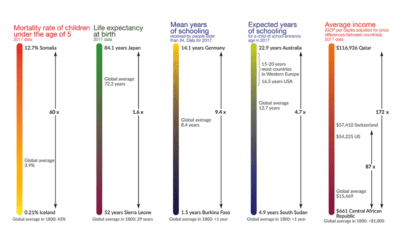

This visualization shows the global inequality gap — a difference in the standards of living around the world, as well as how it's changed over 200...


 Creator Program