Mapped: Europe’s GDP Per Capita, by Country
The Growth of a $1,000 Equity Investment, by Stock Market
Mapped: The Most Valuable Company in Each Southeast Asian Country
Visualizing Global Inflation Forecasts (2024-2026)
The World’s Fastest Growing Emerging Markets (2024-2029 Forecast)
Countries With the Highest Rates of Crypto Ownership
Mapped: The Number of AI Startups By Country
All of the Grants Given by the U.S. CHIPS Act
Visualizing AI Patents by Country
How Tech Logos Have Evolved Over Time
Visualizing the Tax Burden of Every U.S. State
Charted: What Frustrates Americans About the Tax System
Ranked: The Top 20 Countries in Debt to China
Charted: Which Country Has the Most Billionaires in 2024?
Charted: Which City Has the Most Billionaires in 2024?
Life Expectancy by Region (1950-2050F)
What Causes Preventable Child Deaths?
The Cost of an EpiPen in Major Markets
Charted: Global Tobacco Use by Country and Sex
Visualized: What Lives in Your Gut Microbiome?
Who’s Building the Most Solar Energy?
Mapped: The Age of Energy Projects in Interconnection Queues, by State
Ranked: The Top 10 EV Battery Manufacturers in 2023
The World’s Biggest Nuclear Energy Producers
The World’s Biggest Oil Producers in 2023
The Largest Earthquakes in the New York Area (1970-2024)
Mapped: Average Wages Across Europe
Mapped: Asia’s Population Patterns by Density
A Map of Global Happiness By Country in 2024
Mapped: Population Growth by Region (1900-2050F)
Where the World’s Aluminum is Smelted, by Country
Visualizing Global Gold Production in 2023
Gold vs. S&P 500: Which Has Grown More Over Five Years?
Charted: The Value Gap Between the Gold Price and Gold Miners
How People Get Around in America, Europe, and Asia
The Carbon Footprint of Major Travel Methods
Ranking the Top 15 Countries by Carbon Tax Revenue
Ranked: The Countries With the Most Air Pollution in 2023
Top Countries By Forest Growth Since 2001
We count down our favorite infographics and charts from the year, including many you may not have seen before. Catch some of our best work in...
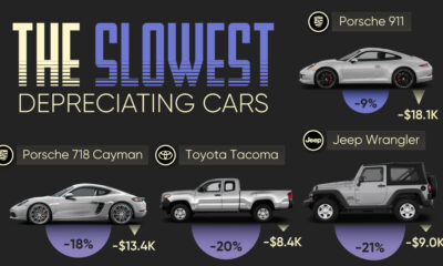
We visualize which cars have the best resale value based on the rate their value drops over five years. Spoiler: Porsche is King.
Reimagining all 200 million of the American workforce as 100 people: where do they all work, what positions they hold, and what jobs they do?
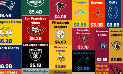
The average NFL team is worth $4.47 billion, more than any other sports team has ever sold for. What are the most valuable NFL teams?
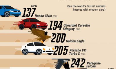
Ever wondered if an animal could outrun a modern car? This infographic puts the top speed of the world's fastest animals into context.
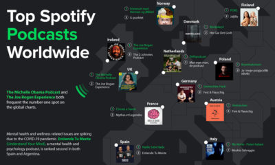
Podcasting is now a billion dollar industry, attracting big names and audiences to match. Here's a global look at the top podcasts on Spotify.
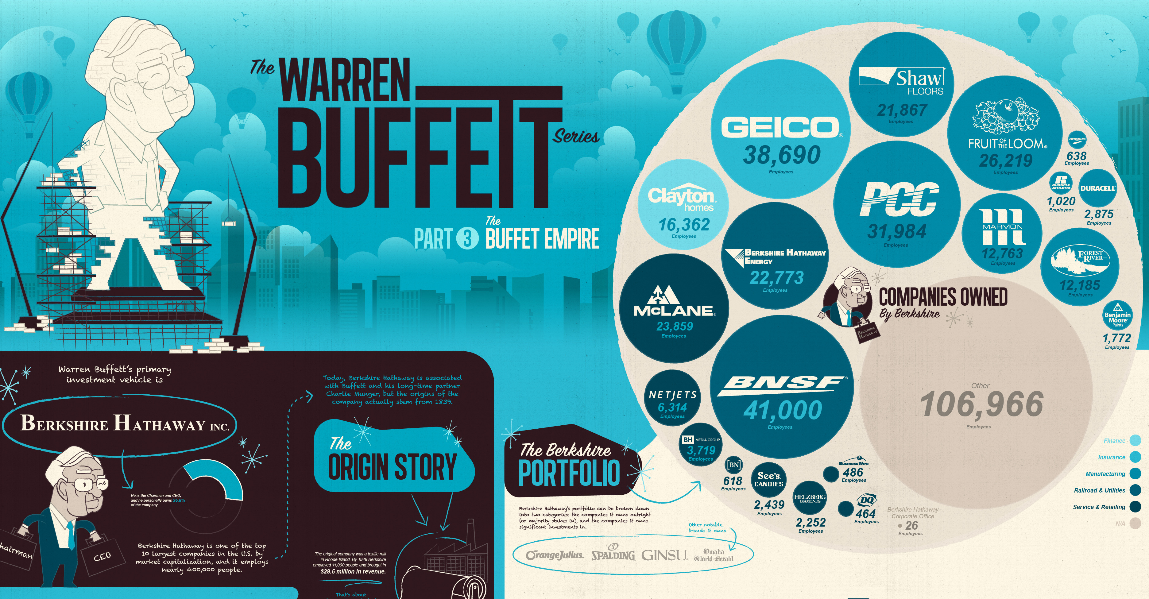
View the extent of the Warren Buffett Empire in this massive infographic, which shows the many, many household companies Berkshire Hathaway owns and controls.
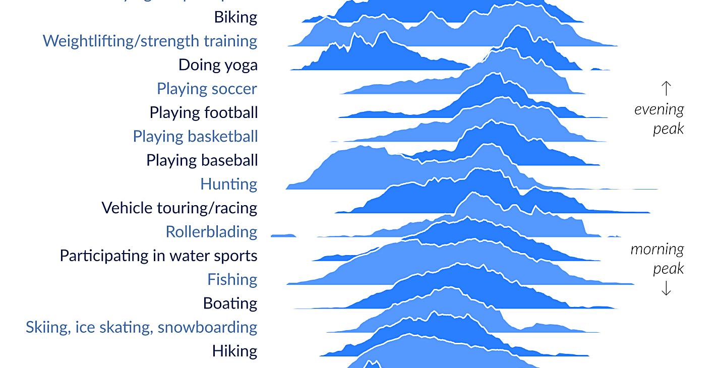
When are people doing activities like playing baseball or working out? This visualization shows how Americans spend free time, and when each activity peaks.
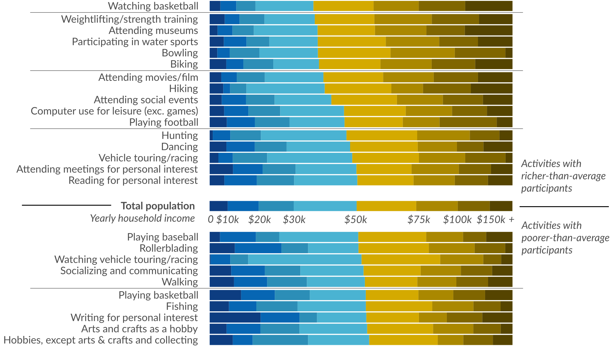
Ever wonder how people spend time? This data visualization shows favorite American past-times like playing baseball or watching TV by using income brackets.
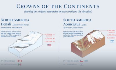
What are the highest mountains in different parts of the world? This visual maps the three tallest mountains by elevation in each continent.


 Creator Program