Mapped: Europe’s GDP Per Capita, by Country
The Growth of a $1,000 Equity Investment, by Stock Market
Mapped: The Most Valuable Company in Each Southeast Asian Country
Visualizing Global Inflation Forecasts (2024-2026)
The World’s Fastest Growing Emerging Markets (2024-2029 Forecast)
Countries With the Highest Rates of Crypto Ownership
Mapped: The Number of AI Startups By Country
All of the Grants Given by the U.S. CHIPS Act
Visualizing AI Patents by Country
How Tech Logos Have Evolved Over Time
Visualizing the Tax Burden of Every U.S. State
Charted: What Frustrates Americans About the Tax System
Ranked: The Top 20 Countries in Debt to China
Charted: Which Country Has the Most Billionaires in 2024?
Charted: Which City Has the Most Billionaires in 2024?
Mapped: Countries Where Recreational Cannabis is Legal
Which Countries Have the Highest Infant Mortality Rates?
Life Expectancy by Region (1950-2050F)
What Causes Preventable Child Deaths?
The Cost of an EpiPen in Major Markets
Who’s Building the Most Solar Energy?
Mapped: The Age of Energy Projects in Interconnection Queues, by State
Ranked: The Top 10 EV Battery Manufacturers in 2023
The World’s Biggest Nuclear Energy Producers
The World’s Biggest Oil Producers in 2023
Mapped: U.S. Immigrants by Region
Mapped: Southeast Asia’s GDP Per Capita, by Country
The Largest Earthquakes in the New York Area (1970-2024)
Mapped: Average Wages Across Europe
Visualizing Copper Production by Country in 2023
Where the World’s Aluminum is Smelted, by Country
Visualizing Global Gold Production in 2023
Gold vs. S&P 500: Which Has Grown More Over Five Years?
How People Get Around in America, Europe, and Asia
The Carbon Footprint of Major Travel Methods
Ranking the Top 15 Countries by Carbon Tax Revenue
Ranked: The Countries With the Most Air Pollution in 2023
Top Countries By Forest Growth Since 2001
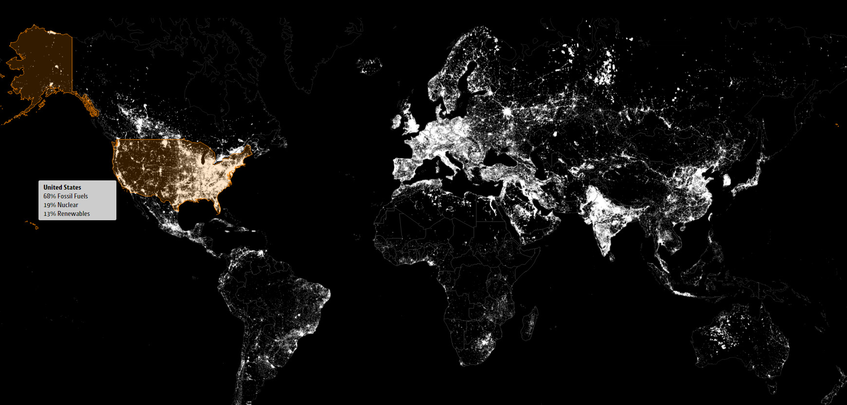
These satellite maps visualize where different energy sources, like fossil fuels, nuclear, or renewables, are used to generate electricity.
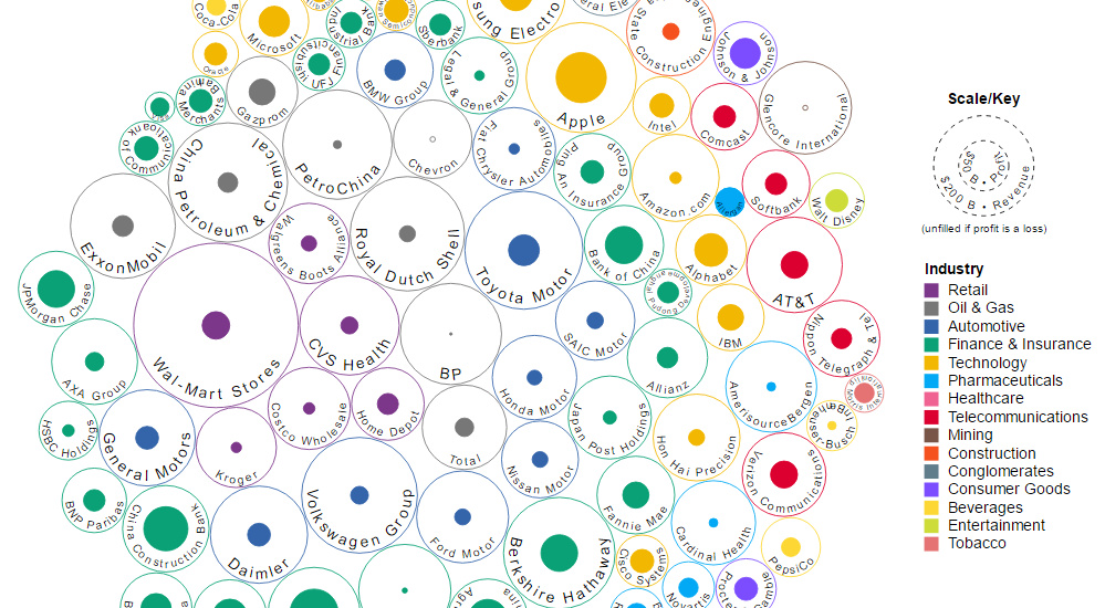
This data visualization compares the revenue and profit numbers for the top 100 companies by market valuation in the world.
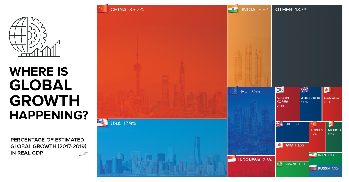
By 2019, the global economy is projected to expand another $6.5 trillion. Today's chart shows which countries will help to fuel this global growth.
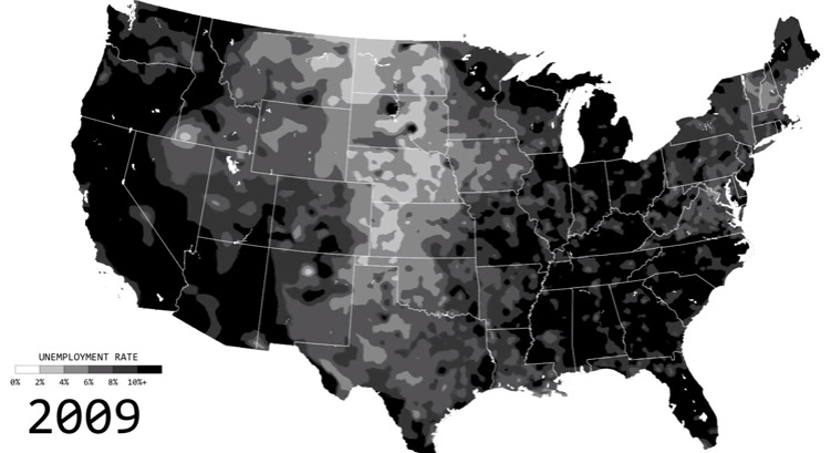
See the ebbs and flows of regional unemployment in the United States in this animated map from 1990 until 2016.
The creative economy is a vital contributor to economic health, but it's a hard thing to measure. Here are some of the most creative cities in...
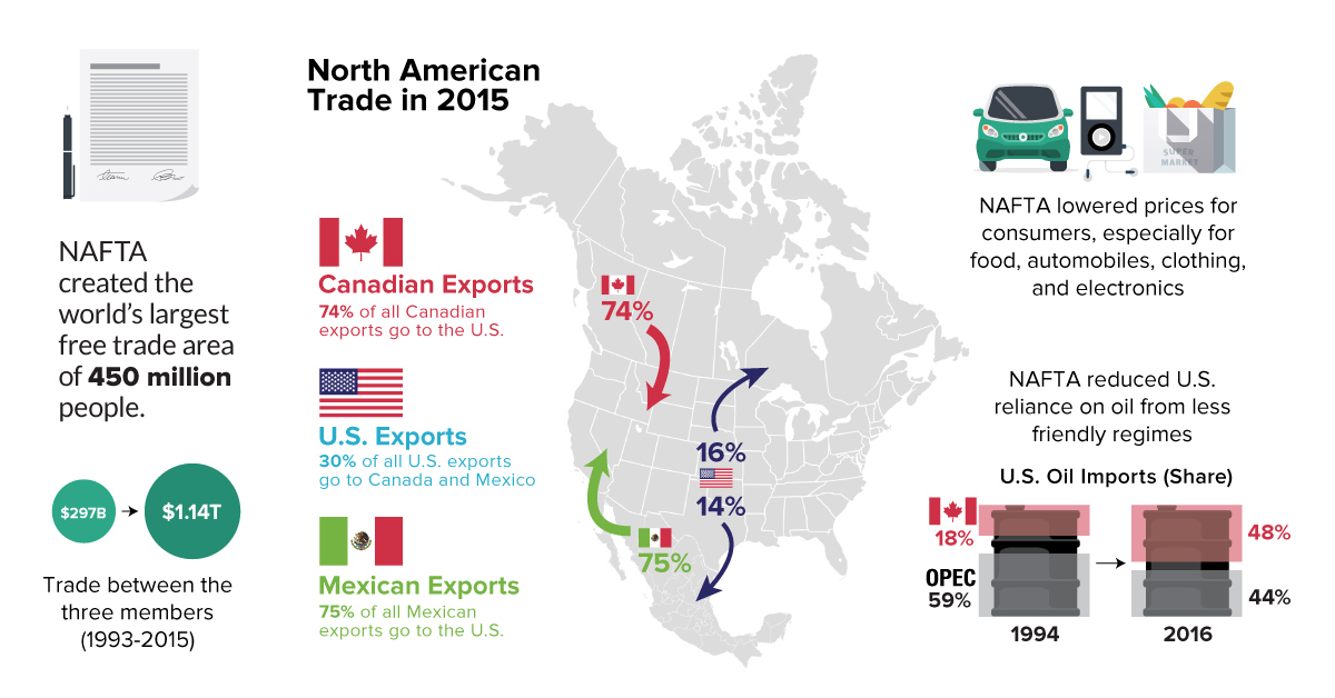
Everything you need to know about NAFTA, including a comparison of economic numbers before and since the agreement was signed in 1994.
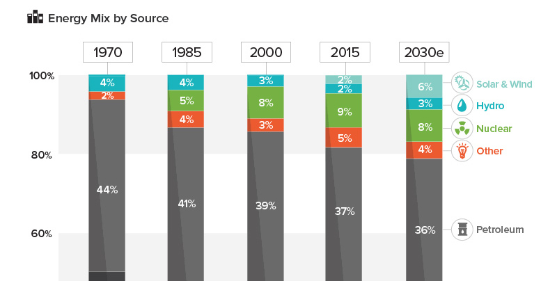
See how America's energy mix has evolved from 1970 until today, as well as a projection for the energy sources to be used in the year...
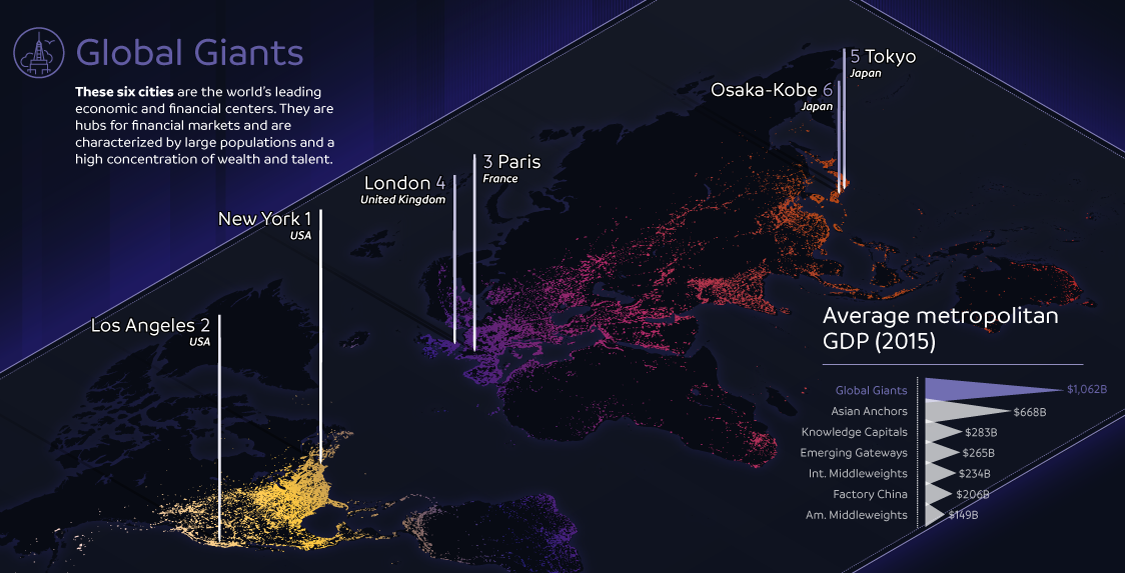
The world's largest 123 cities generate an astonishing $36 trillion in GDP per year. This infographic breaks these global cities down into seven typologies.
Election day is finally here. Here's 10 charts and maps that will be central to the story as America makes its historical decision.
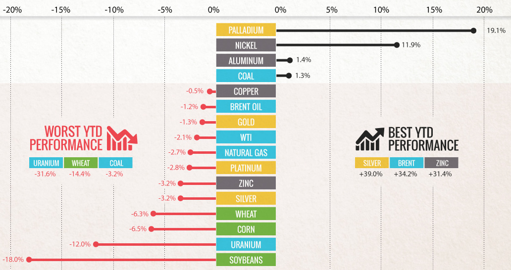
Commodities slumped in Q3 as buyers 'sold in May and went away'. Can commodities shake the summer slump with a U.S. election and OPEC deal in...