

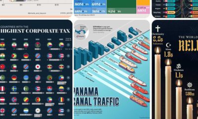
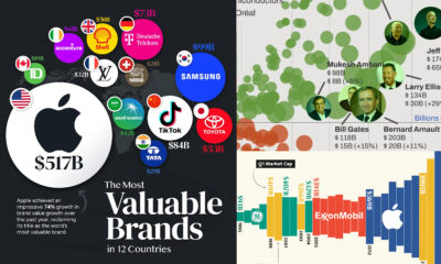
We round up the most popular, most discussed, and most liked visualizations of the month on Voronoi, our new data storytelling platform.

We round up the most popular, most discussed, and most liked visualizations of the month on Voronoi, our new data storytelling platform.

We round up the most popular, most discussed, and most liked visualizations of the month on Voronoi, our new and free data storytelling platform.

See the most popular, most discussed, and most liked visualizations on our new data storytelling app Voronoi in December.


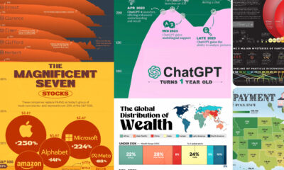
What were the top data visualizations on Visual Capitalist in 2023? We highlight the best charts, maps, and infographics from the year.

Global wheat production is concentrated in just a handful of countries. Here’s a look at the top wheat-producing countries worldwide.
Ever wonder how your state compares in terms of economic output? This simple visualization compares the economies of every U.S. state.


 Creator Program