Demographics
Visualizing the U.S. Population by Race
How to Use: The below maps will animate automatically. To pause, move your cursor on the image. Arrows on left/right navigate.


Visualizing the U.S. Population by Race
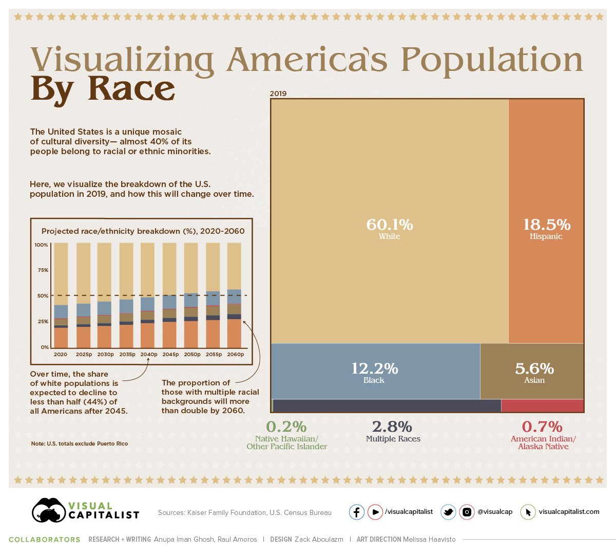
The American population is a unique mosaic of cultures—and almost 40% of people identify as racial or ethnic minorities today.
In this treemap, we use data for 2019 from the Kaiser Family Foundation, which bases its analysis on the latest American Community Survey (ACS) data from the U.S. Census Bureau. Then we break down the same data on a state-by-state basis.
Growing Diversity in America
As of 2019, here is the current distribution of the U.S. population by race and ethnicity:
- White: 60.1% (Non-Hispanic)
- Hispanic: 18.5%
- Black: 12.2%
- Asian: 5.6%
- Multiple Races: 2.8%
- American Indian/Alaska Native: 0.7%
- Native Hawaiian/Other Pacific Islander: 0.2%
Note that the U.S. totals do not include Puerto Rico.
However, these race and ethnicity projections are expected to change over the coming years. By the year 2060, it’s expected that the distribution of Non-Hispanic Whites as a percentage of total population will fall from 60.1% to 44.3% of Americans.
| Year | White* | Black | Hispanic | Asian | Multiple Races | Other** |
|---|---|---|---|---|---|---|
| 2020 | 59.7% | 12.5% | 18.7% | 5.8% | 2.3% | 0.9% |
| 2025 | 57.7% | 12.7% | 19.9% | 6.3% | 2.6% | 0.9% |
| 2030 | 55.8% | 12.8% | 21.1% | 6.7% | 2.8% | 0.9% |
| 2035 | 53.8% | 12.9% | 22.3% | 7.1% | 3.1% | 0.9% |
| 2040 | 51.7% | 13.0% | 23.5% | 7.5% | 3.4% | 0.9% |
| 2045 | 49.7% | 13.1% | 24.6% | 7.9% | 3.8% | 0.9% |
| 2050 | 47.8% | 13.3% | 25.7% | 8.2% | 4.1% | 0.9% |
| 2055 | 46.0% | 13.4% | 26.6% | 8.5% | 4.5% | 0.9% |
| 2060 | 44.3% | 13.6% | 27.5% | 8.9% | 4.9% | 0.9% |
Source: U.S. Census Bureau. *Excludes Hispanics **Other includes American Indian/Alaska Native (0.7%) and Native Hawaiian/Pacific Islander (0.2%). Both proportions remain unchanged in these projections.
Interestingly, the proportion of those from multiple racial and ethnic backgrounds will more than double, from 2.3% to 4.9% alongside rising patterns of interracial marriage.
Over time, the U.S. Census has been vastly expanded to reflect the true diversity that the country holds. In fact, it was only from 1960 onwards that people could select their own race—and only from 2020 can those who chose White or Black provide further information on their roots.
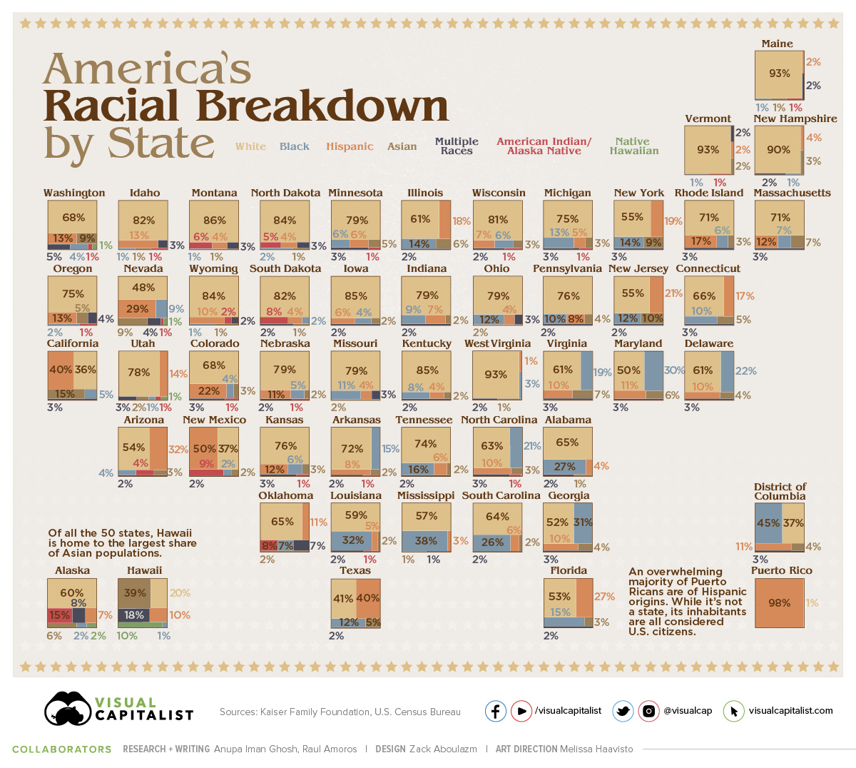
A State-by-State Breakdown
Of course, racial diversity in the United States differs widely from region to region.
In the Northeast—particularly the states Maine, Vermont, and New Hampshire—the Non-Hispanic White population accounts for 90% or more of the total. In contrast, Black populations are highest in the District of Columbia (45%) and several Southern states.
| Location | White | Black | Hispanic | Asian | Multiple Races | American Indian /Alaska Native | Native Hawaiian /Other Pacific Islander |
|---|---|---|---|---|---|---|---|
| Alabama | 65% | 27% | 4% | 1% | 2% | 0% | - |
| Alaska | 60% | 2% | 7% | 6% | 8% | 15% | 2% |
| Arizona | 54% | 4% | 32% | 3% | 2% | 4% | 0% |
| Arkansas | 72% | 15% | 8% | 2% | 2% | 1% | 0% |
| California | 36% | 5% | 40% | 15% | 3% | 0% | 0% |
| Colorado | 68% | 4% | 22% | 3% | 3% | 1% | 0% |
| Connecticut | 66% | 10% | 17% | 5% | 3% | 0% | - |
| Delaware | 61% | 22% | 10% | 4% | 3% | 0% | - |
| District of Columbia | 37% | 45% | 11% | 4% | 3% | 0% | - |
| Florida | 53% | 15% | 27% | 3% | 2% | 0% | 0% |
| Georgia | 52% | 31% | 10% | 4% | 3% | 0% | 0% |
| Hawaii | 20% | 1% | 10% | 39% | 18% | 0% | 10% |
| Idaho | 82% | 1% | 13% | 1% | 3% | 1% | - |
| Illinois | 61% | 14% | 18% | 6% | 2% | 0% | <.01 |
| Indiana | 79% | 9% | 7% | 2% | 2% | 0% | - |
| Iowa | 85% | 4% | 6% | 2% | 2% | 0% | <.01 |
| Kansas | 76% | 6% | 12% | 3% | 3% | 1% | - |
| Kentucky | 85% | 8% | 4% | 2% | 2% | 0% | - |
| Louisiana | 59% | 32% | 5% | 2% | 2% | 1% | - |
| Maine | 93% | 1% | 2% | 1% | 2% | 1% | - |
| Maryland | 50% | 30% | 11% | 6% | 3% | 0% | - |
| Massachusetts | 71% | 7% | 12% | 7% | 3% | 0% | <.01 |
| Michigan | 75% | 13% | 5% | 3% | 3% | 1% | - |
| Minnesota | 79% | 6% | 6% | 5% | 3% | 1% | - |
| Mississippi | 57% | 38% | 3% | 1% | 1% | 0% | - |
| Missouri | 79% | 11% | 4% | 2% | 3% | 0% | 0% |
| Montana | 86% | 1% | 4% | 1% | 3% | 6% | - |
| Nebraska | 79% | 5% | 11% | 2% | 2% | 1% | - |
| Nevada | 48% | 9% | 29% | 9% | 4% | 1% | 1% |
| New Hampshire | 90% | 1% | 4% | 3% | 2% | - | - |
| New Jersey | 55% | 12% | 21% | 10% | 2% | 0% | - |
| New Mexico | 37% | 2% | 50% | 2% | 2% | 9% | - |
| New York | 55% | 14% | 19% | 9% | 3% | 0% | - |
| North Carolina | 63% | 21% | 10% | 3% | 3% | 1% | <.01 |
| North Dakota | 84% | 2% | 4% | 1% | 3% | 5% | - |
| Ohio | 79% | 12% | 4% | 2% | 3% | 0% | - |
| Oklahoma | 65% | 7% | 11% | 2% | 7% | 8% | 0% |
| Oregon | 75% | 2% | 13% | 5% | 4% | 1% | 0% |
| Pennsylvania | 76% | 10% | 8% | 4% | 2% | 0% | <.01 |
| Puerto Rico | 1% | 0% | 98% | - | 0% | - | - |
| Rhode Island | 71% | 6% | 17% | 3% | 3% | 0% | - |
| South Carolina | 64% | 26% | 6% | 2% | 2% | 0% | - |
| South Dakota | 82% | 2% | 4% | 1% | 2% | 8% | - |
| Tennessee | 74% | 16% | 6% | 2% | 2% | 0% | - |
| Texas | 41% | 12% | 40% | 5% | 2% | 0% | 0% |
| Utah | 78% | 1% | 14% | 2% | 3% | 1% | 1% |
| Vermont | 93% | 1% | 2% | 2% | 2% | 1% | - |
| Virginia | 61% | 19% | 10% | 7% | 3% | 0% | <.01 |
| Washington | 68% | 4% | 13% | 9% | 5% | 1% | 1% |
| West Virginia | 93% | 3% | 1% | 1% | 2% | 0% | - |
| Wisconsin | 81% | 6% | 7% | 3% | 2% | 1% | - |
| Wyoming | 84% | 1% | 10% | 1% | 2% | 2% | - |
| U.S. | 60.1% | 12.2% | 18.5% | 5.6% | 2.8% | 0.7% | 0.2% |
Note: A dash (-) indicates estimates with relative standard errors greater than 30%, which were not included in the data
Of all the 50 states, Hawaii is home to the largest share of Asian populations at 39%. It also has one of the most diverse racial breakdowns in the nation overall, including the highest proportion of mixed race individuals.
Looking to another island, an overwhelming majority (98%) of Puerto Ricans are of Hispanic origins. While it’s not a state, its inhabitants are all considered U.S. citizens.
Charting the U.S. population by race is crucial for a number of reasons. This information can be used to better understand existing income and wealth gaps, track public health outcomes, and to aid in policy decision-making at higher levels.
We become not a melting pot but a beautiful mosaic. Different people, different beliefs, different yearnings, different hopes, different dreams.
—Jimmy Carter, 39th President of the U.S.
Editor’s note: This article has been updated to better reflect U.S. Census Bureau categories.


Demographics
Ranked: Countries Where Youth are the Most Unhappy, Relative to Older Generations
Conventional wisdom says that young adults (those below 30) tend to be the happiest demographic—but this is not true for these countries.
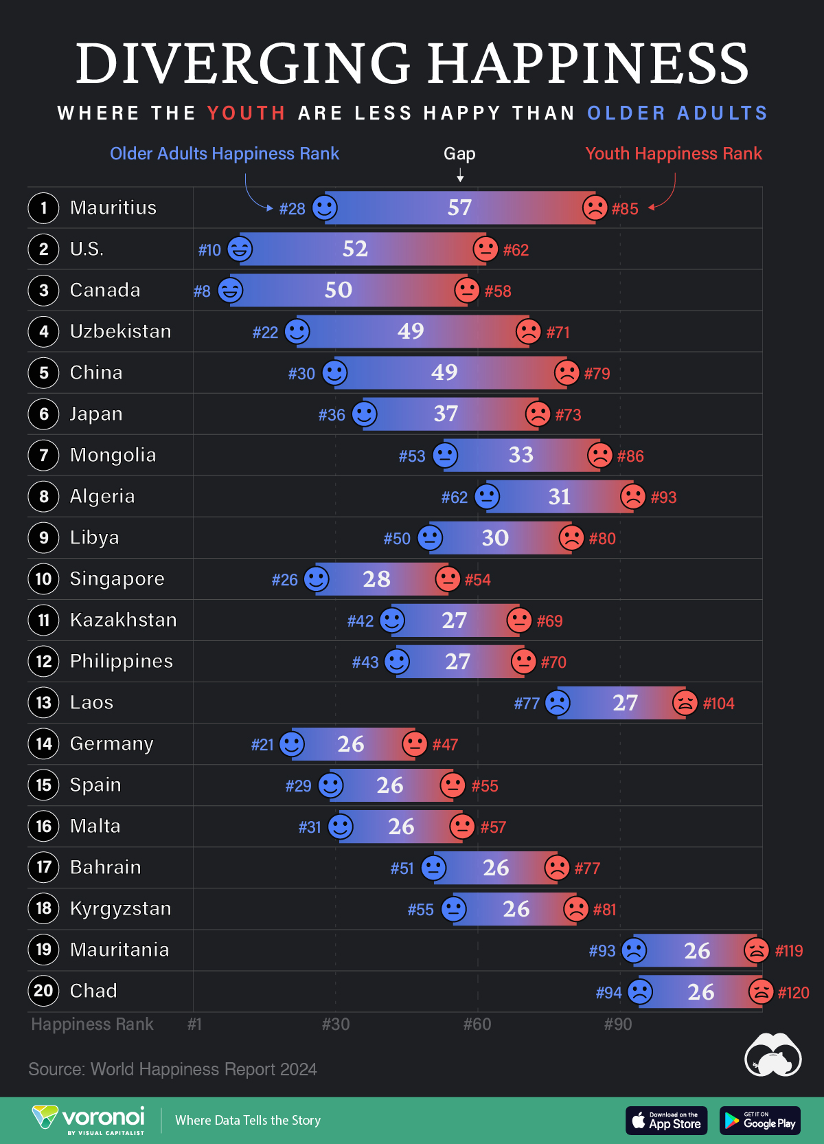
Countries with the Biggest Happiness Gaps Between Generations
This was originally posted on our Voronoi app. Download the app for free on iOS or Android and discover incredible data-driven charts from a variety of trusted sources.
“They say a person needs just three things to be truly happy in this world: someone to love, something to do, and something to hope for.” — Tom Bodett
Measuring happiness is tricky business, more so when taking into account how different regions, cultures, and faiths define it. Nevertheless, the World Happiness Report attempts to distill being happy into a single score out of 10, and then ranks countries by their average score.
We’ve visualized the high-level findings from the latest happiness report in this series of maps. However, the report also dives deeper into other significant trends in the data, such as a growing disparity in happiness between age groups within countries themselves.
In the chart above, we list countries by the biggest gaps in happiness ranks between young adults (<30) and older adults (60+). A higher number indicates a larger gap, and that the youth are far unhappier than their older counterparts.
Where are Youth Unhappier than Older Adults?
Mauritius ranks first on this list, with a massive 57 place gap between older adult and youth happiness. The 1.26 million-inhabited island nation briefly reached high income status in 2020, but the pandemic hit hard, hurting its key tourism sector, and affecting jobs.
The country’s youth unemployment rate spiked to close to 25% that year, but has since been on the decline. Like residents on many similarly-populated islands, the younger demographic often moves abroad in search of more opportunities.
| Rank | Country | Youth Happiness Rank | Older Adult Happiness Rank | Happiness Gap |
|---|---|---|---|---|
| 1 | 🇲🇺 Mauritius | 85 | 28 | 57 |
| 2 | 🇺🇸 U.S. | 62 | 10 | 52 |
| 3 | 🇨🇦 Canada | 58 | 8 | 50 |
| 4 | 🇺🇿 Uzbekistan | 71 | 22 | 49 |
| 5 | 🇨🇳 China | 79 | 30 | 49 |
| 6 | 🇯🇵 Japan | 73 | 36 | 37 |
| 7 | 🇲🇳 Mongolia | 86 | 53 | 33 |
| 8 | 🇩🇿 Algeria | 93 | 62 | 31 |
| 9 | 🇱🇾 Libya | 80 | 50 | 30 |
| 10 | 🇸🇬 Singapore | 54 | 26 | 28 |
| 11 | 🇰🇿 Kazakhstan | 69 | 42 | 27 |
| 12 | 🇵🇭 Philippines | 70 | 43 | 27 |
| 13 | 🇱🇦 Laos | 104 | 77 | 27 |
| 14 | 🇩🇪 Germany | 47 | 21 | 26 |
| 15 | 🇪🇸 Spain | 55 | 29 | 26 |
| 16 | 🇲🇹 Malta | 57 | 31 | 26 |
| 17 | 🇧🇭 Bahrain | 77 | 51 | 26 |
| 18 | 🇰🇬 Kyrgyzstan | 81 | 55 | 26 |
| 19 | 🇲🇷 Mauritania | 119 | 93 | 26 |
| 20 | 🇹🇩 Chad | 120 | 94 | 26 |
Conventional wisdom says, and data somewhat correlates, that young adults (those below 30) tend to be the happiest demographic. Happiness then decreases through middle age and starts increasing around 60. However, the above countries are digressing from the pattern, with older generations being much happier than young adults.
That older generations are happier, by itself, is not a bad thing. However, that younger adults are so much unhappier in the same country can point to several unique stresses that those aged below 30 are facing.
For example, in the U.S. and Canada—both near the top of this list—many young adults feel like they have been priced out of owning a home: a once key metric of success.
Climate anxieties are also high, with worries about the future of the world they’ll inhabit. Finally, persistent economic inequities are also weighing on the younger generation, with many in that cohort feeling like they will never be able to afford to retire.
All of this comes alongside a rising loneliness epidemic, where those aged 18–25 report much higher rates of loneliness than the general population.
Source: The World Happiness Report which leverages data from the Gallup World Poll.
Methodology: A nationally representative group of approximately 1,000 people per country are asked to evaluate their life on a scale of 0–10. Scores are averaged across generations per country over three years. Countries are ranked by their scores out of 10.

-

 Personal Finance1 week ago
Visualizing the Tax Burden of Every U.S. State
-

 Misc6 days ago
Visualized: Aircraft Carriers by Country
-
 Brands6 days ago
How Popular Snack Brand Logos Have Changed
-
 Mining1 week ago
Visualizing Copper Production by Country in 2023
-

 Politics1 week ago
Charted: How Americans Feel About Federal Government Agencies
-
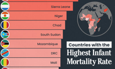
 Healthcare1 week ago
Which Countries Have the Highest Infant Mortality Rates?
-
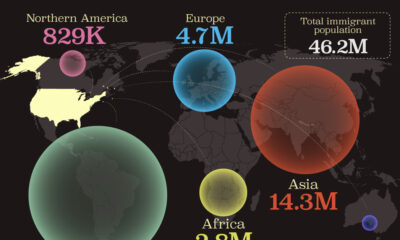
 Demographics1 week ago
Mapped: U.S. Immigrants by Region
-
 Maps1 week ago
Mapped: Southeast Asia’s GDP Per Capita, by Country