
Despite the advent of renewable sources of energy, fossil fuels and their carbon emissions, haven’t gone anywhere.
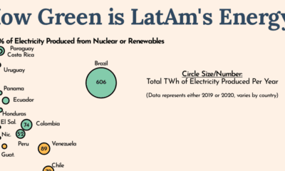

Countries around the world are looking to decarbonize, but Latin America is leading the charge in green energy usage.
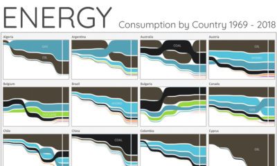

For the last 50 years, fossil fuels have dominated energy consumption. This chart looks at how the energy mix is changing in over 60+ countries.
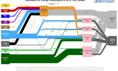

This incredible flow diagram shows how U.S. energy use broke down in 2019, including by source and end sector.


 Creator Program