Mapped: Europe’s GDP Per Capita, by Country
The Growth of a $1,000 Equity Investment, by Stock Market
Mapped: The Most Valuable Company in Each Southeast Asian Country
Visualizing Global Inflation Forecasts (2024-2026)
The World’s Fastest Growing Emerging Markets (2024-2029 Forecast)
Countries With the Highest Rates of Crypto Ownership
Mapped: The Number of AI Startups By Country
All of the Grants Given by the U.S. CHIPS Act
Visualizing AI Patents by Country
How Tech Logos Have Evolved Over Time
Visualizing the Tax Burden of Every U.S. State
Charted: What Frustrates Americans About the Tax System
Ranked: The Top 20 Countries in Debt to China
Charted: Which Country Has the Most Billionaires in 2024?
Charted: Which City Has the Most Billionaires in 2024?
Mapped: Countries Where Recreational Cannabis is Legal
Which Countries Have the Highest Infant Mortality Rates?
Life Expectancy by Region (1950-2050F)
What Causes Preventable Child Deaths?
The Cost of an EpiPen in Major Markets
Who’s Building the Most Solar Energy?
Mapped: The Age of Energy Projects in Interconnection Queues, by State
Ranked: The Top 10 EV Battery Manufacturers in 2023
The World’s Biggest Nuclear Energy Producers
The World’s Biggest Oil Producers in 2023
Mapped: U.S. Immigrants by Region
Mapped: Southeast Asia’s GDP Per Capita, by Country
The Largest Earthquakes in the New York Area (1970-2024)
Mapped: Average Wages Across Europe
Visualizing Copper Production by Country in 2023
Where the World’s Aluminum is Smelted, by Country
Visualizing Global Gold Production in 2023
Gold vs. S&P 500: Which Has Grown More Over Five Years?
How People Get Around in America, Europe, and Asia
The Carbon Footprint of Major Travel Methods
Ranking the Top 15 Countries by Carbon Tax Revenue
Ranked: The Countries With the Most Air Pollution in 2023
Top Countries By Forest Growth Since 2001
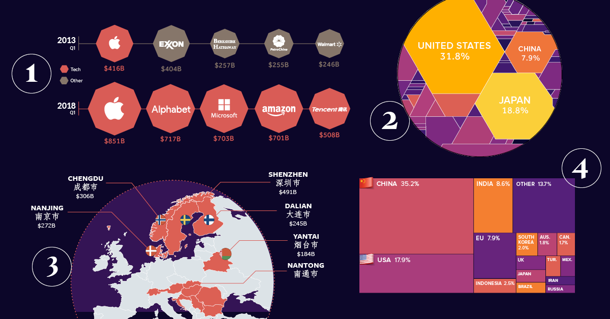
This special feature uses powerful charts and infographics to visualize the eight major forces that are shaping our global economy and the business landscape.
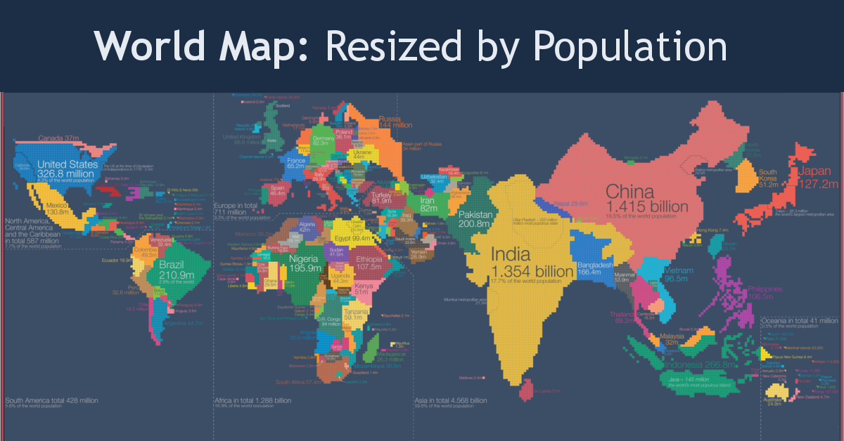
Look at global population in a whole new light, when countries on the world map are drawn based on population numbers instead of their usual borders.
Tech giants like Google, Microsoft, and Amazon are racing to acquire patents in AI. We look at the race results and the competitive advantages they could...
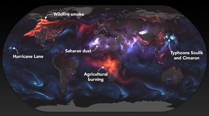
These stunning images from NASA give a whole new perspective on the massive wildfires engulfing the west coast of North America.
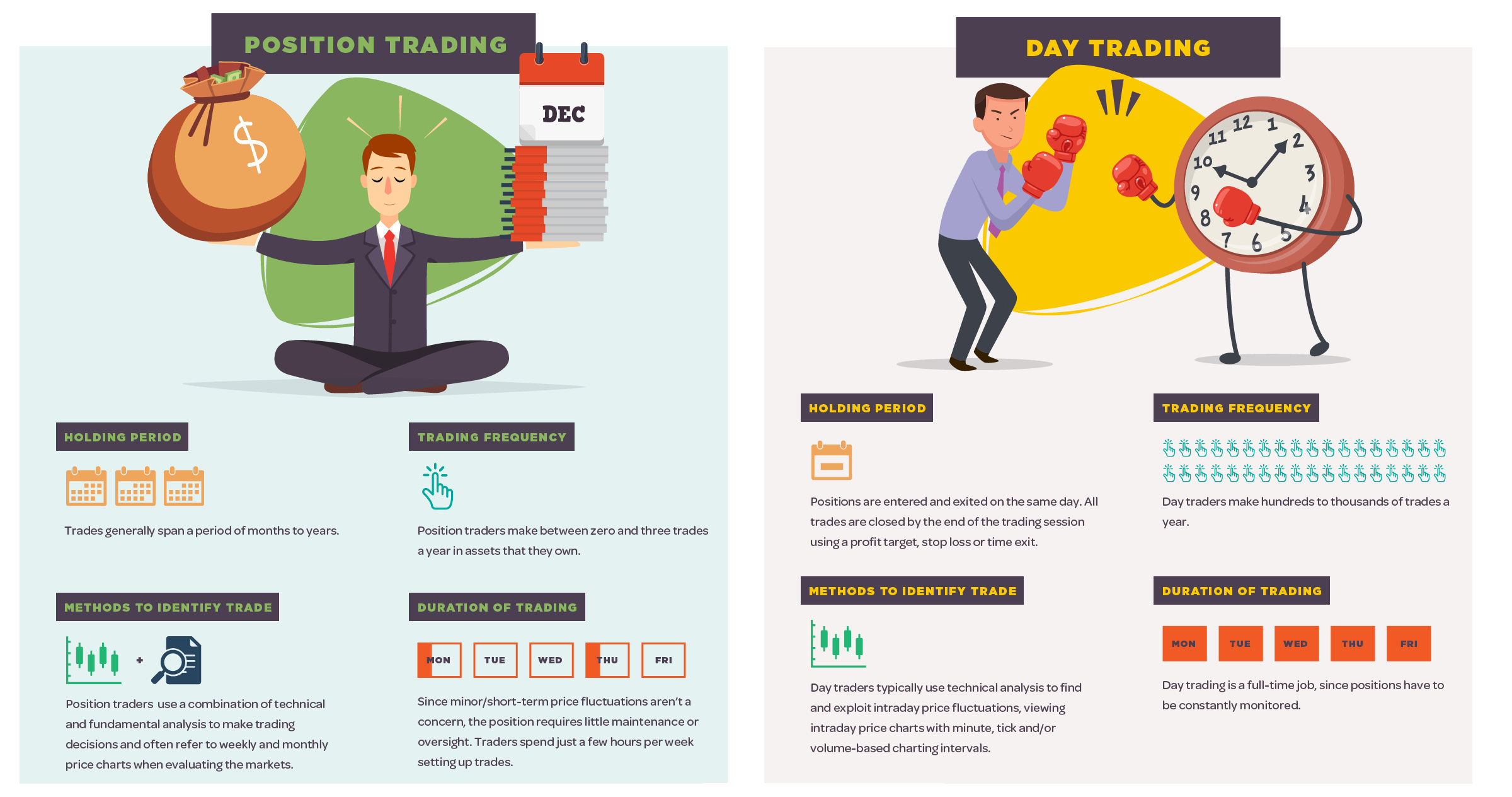
What are the major differences between the four main styles of trading stocks? See this handy infographic to find out.
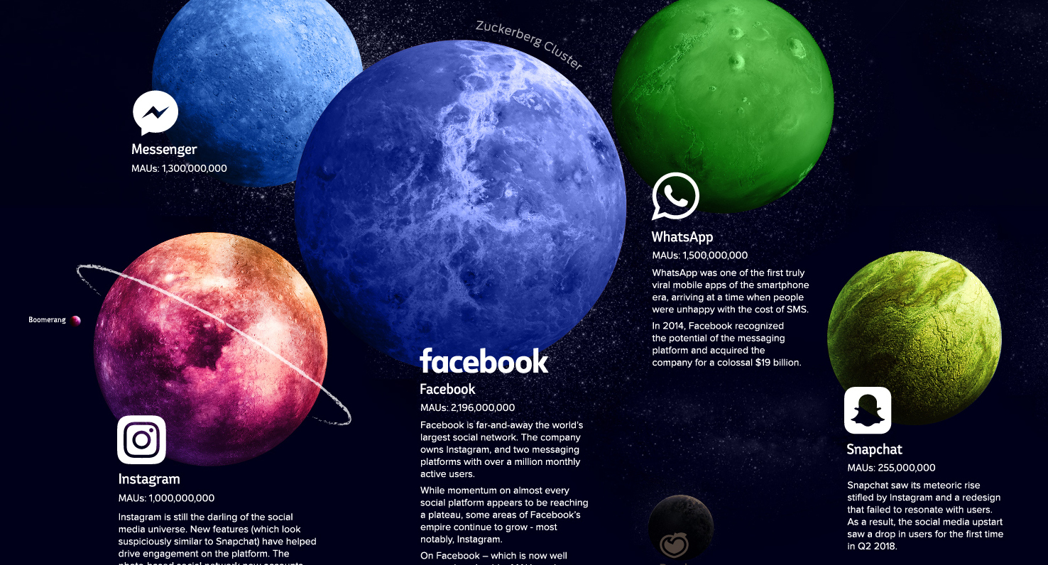
Explore the social media universe in this giant infographic, where every platform is a planet sized based on the amount of users it has.
Google tracks pretty much everything you do, including where you've been, what you look like, and your personal beliefs. See what Google knows about you.
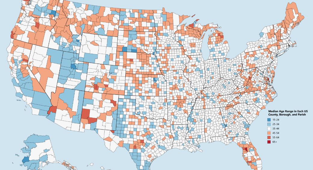
Which counties have the youngest populations, and which are meccas for aging retirees? This map shows the median age of every county in the United States.
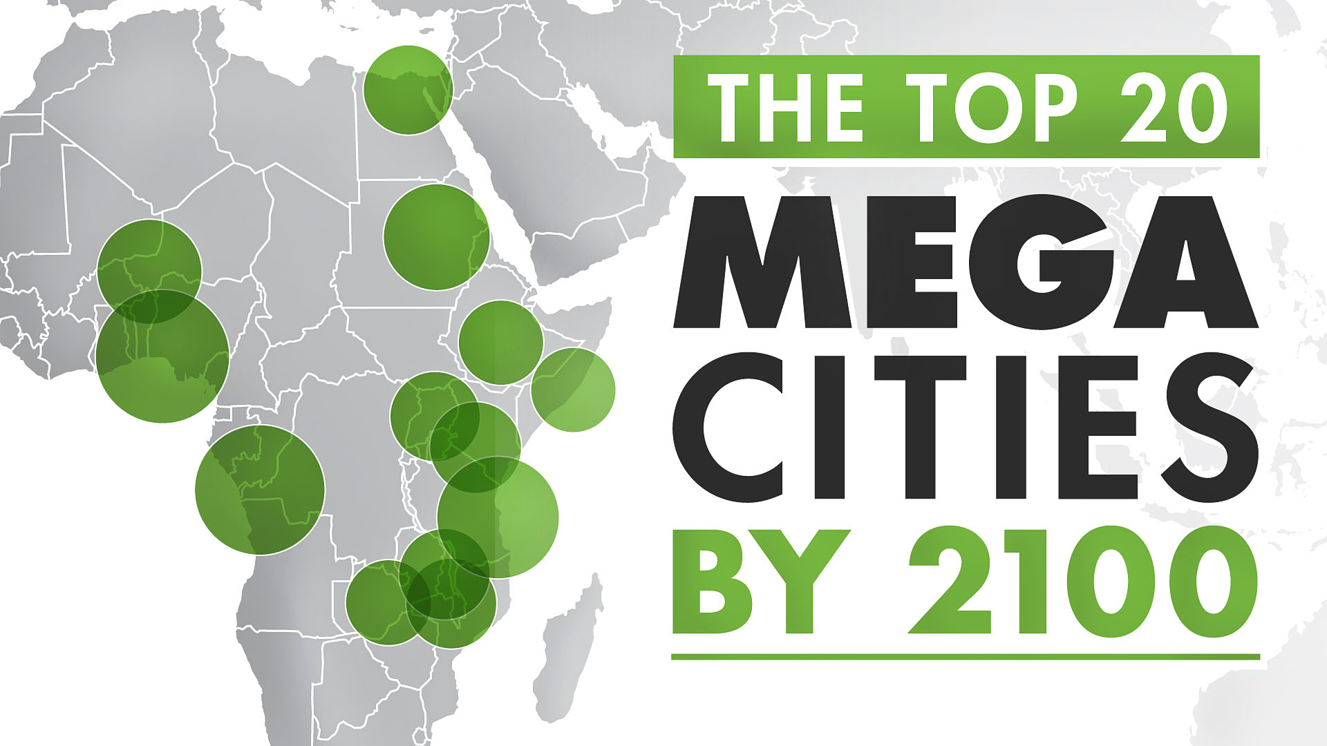
The world's population centers are shifting rapidly, and by 2100, it is projected that the world's largest megacities will exceed 70 million people.
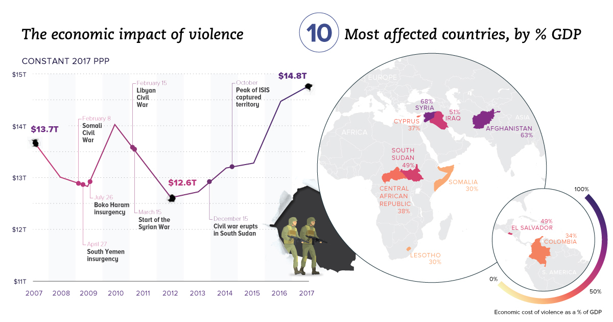
Aside from the obvious human toll, violence also hurts productivity and wealth creation. We visualize the real economic impact of violence in these charts.